General Information
Thank you for purchasing our theme. We are happy that you are one of our customers, and we assure you will not be disappointed. We do our best to produce top-notch themes with great functionality, premium designs, and clear code.
Attention! Important Notice on Third-Party Software!
Please ensure that you only use software, plugins, and themes obtained from trusted and official sources. Using pirated, nulled, or unauthorized software may lead to unexpected issues, security vulnerabilities, or even the complete malfunction of your website.
As the theme authors, we cannot take responsibility for problems caused by the use of untrusted or unofficial software. For the best performance and security, always use original and licensed products.
License
With ThemeForest regular license, you are licensed to use this theme to create one single End Product (the final website customized with your content) for yourself or one client.
What is allowed with the single regular license:
- You can create 1 website (on a single domain) for yourself or your client. You can then transfer that website to your client for any fee. In that case, the license is also transferred to your client.
-
You can install the theme on your test/development server for testing/development purposes.
As soon as the project is ready for moving from dev server to the main domain (create the backup to be on the safe side), please disconnect the license from staging domain and activate the theme on the live domain. You can have ONE active theme installation at a time (development or main).
Development installation will still be functional, except for importing/exporting demo data and installing updates. You can perform all other tasks there without any issues.
Moreover, you can easily transfer the license from your production site to the development one and back again at any time, if needed. -
You should have 1 license per 1 active site.
For Envato Elements, if you want to activate another theme or install the same theme on a new domain, please generate a new token (1 token = 1 domain). - You can modify or manipulate the theme, you can combine it with other works to create the End Product.
- The theme updates for the single End Product (website) are free.
What is not allowed:
- With a single regular license, you are not allowed to create multiple websites. For multiple websites, you will need multiple regular licenses.
- To resell the same website (Single End Product) to another client. You will need to purchase an extended license for this.
Attention! Any attempt to use the same license on multiple live sites may result in a temporary or even permanent block of the key by the licensing system.
For more information regarding license regulations and policies, see the links below:
XD Files & Images
IMPORTANT! We do not include theme-related .XD files into the theme package, because it significantly increases the theme archive size. If you need those files, feel free to submit a support request.
By getting this WordPress Theme, you get all the images FOR FREE. Moreover, you can use them on ANY OF YOUR PROJECTS!
Bundled Plugins
The theme package contains several bundled plugins. Please click here to view the list of plugins that come included in the theme.
If a new version of a bundled plugin is available, it will be included in the next theme release. You can also request it by submitting a support ticket.
Bundled plugins are fully functional without the activation using a registration license key. In case you are willing to receive automatic updates and support from the plugin team, you will need to purchase the plugin separately. Only the direct buyers get the plugin license key.
Help and Support
Support Policy
To receive technical support assistance, you need to have a valid purchase code. To get the code, please navigate to your ThemeForest "Downloads" page and click on the theme download link. Check this guide for more details.
PLEASE NOTE! As authors of this theme, we do provide support only for the theme-related features.
We do not provide support for additional customization, 3rd party plugins integration, or any other compatibility issues that might arise. Nevertheless, there is an exception that is only applied to the plugin(s) we have developed and integrated ourselves.
If you have any questions that are beyond the scope of this help file, feel free to contact us. We will respond as soon as possible (within 24 – 48 hours, usually faster). We are open from 10 am to 7 pm (CET), from Monday to Friday.
Please be aware that some questions are posted on our website. So, before submitting a new ticket, please try searching our website for an answer as well as checking our Video Tutorials and Articles. Our website has its inner search and also has been indexed by Google, so if you can not find your answer with our website search, it is worth typing it into Google too. Please make sure you have looked at all the available resources before submitting a support request.
Third-party Extensions
Unfortunately, we do not provide support for third-party extensions. Please contact the author of the extension if needed. If you feel that you might have trouble with installing an extension, we advise you to order a professional installation service.
Attention! Important Notice on Third-Party Software!
Please ensure that you only use software, plugins, and themes obtained from trusted and official sources. Using pirated, nulled, or unauthorized software may lead to unexpected issues, security vulnerabilities, or even the complete malfunction of your website
As the theme authors, we cannot take responsibility for problems caused by the use of untrusted or unofficial software. For the best performance and security, always use original and licensed products.
Articles & Video Tutorials
For more information regarding the theme’s functionality, we suggest checking our Video Tutorials and Articles.
The most popular video tutorials:
Installation
WordPress Information
To install this theme, you must have a working version of WordPress already installed. Below are some useful links regarding WordPress information.
- WordPress FAQ - General information about WordPress.
- WordPress Documentation - A great knowledge base for WordPress beginners.
- PHP Function References - Detailed information on WordPress PHP functions and a lot of usage examples.
Theme Requirements
To use this theme you must be running at least WordPress 6.5, PHP 7.4 or higher.
External plugins may require additional limitations, like Elementor - PHP 8.0+ (for all features), WooCommerce - WordPress 6.7+, etc.
If you use a hosting service with limited resources (e.g. GoDaddy!), you may experience issues with the "one-click" demo data installation.
We recommend that you contact your web hosting service provider to make sure that your server PHP configuration limits are as follows:
-
max_execution_time 600(recommended -600, minimum value -60) -
memory_limit 256M
(This applies exclusively to Elementor and Elementor Pro. If your site uses additional plugins with minimum requirements, such as WooCommerce, you may need to increase your memory limit to512Mto prevent loading issues.) -
post_max_size 32M -
upload_max_filesize 32M
If you are running an unmanaged dedicated server or VPS, you should check your php.ini file. Alternatively, you can edit .htaccess file at the root of your website and add the following values:
-
php_value max_execution_time 600(recommended -600, minimum value -60) -
php_value memory_limit 256M
(This applies exclusively to Elementor and Elementor Pro. If your site uses additional plugins with minimum requirements, such as WooCommerce, you may need to increase your memory limit to512Mto prevent loading issues.) -
php_value post_max_size 32M -
php_value upload_max_filesize 32M
Setting these values will ensure you will not get error messages during the installation. To safeguard your website, please use secure passwords and the latest version of WordPress and plugins.
Here is the list of web hosting service providers we recommend:
- Bluehost (Exclusive Offer for our Customers: -70% OFF)
- SiteGround
- InMotion Hosting
Theme Installation
Unpacking the theme
Before installing the theme, please make sure you unpacked the archive and extracted the theme files. Some of the folders’ names may slightly vary. Treat the screenshot below as an example only.
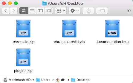
The main package contains archives with the main theme, child theme, a file with the documentation link, and bundled plugins (if any paid plugins are provided in the theme).
If you try to install the wrong files, you will get the missing style.css error. This is the most common error that means you are trying to install an incorrect package.
To install the theme, you need to have a working version of WordPress installed on your server first. Check out this guide for detailed information on how to install WordPress. We also highly recommend updating your WordPress to the latest stable version.
Below, you can find a video tutorial on how to install the theme.
There are 2 ways to install the theme:
- via FTP:
- Log into your web server with FTP client software.
-
Unzip the
chronicle.zipfile and ONLY use the extracted/chronicletheme folder. -
Upload the extracted
chronicletheme folder into/wp-content/themes. - Navigate to the Appearance > Themes tab and activate the theme.
- via WordPress admin panel:
- Log into the WordPress admin panel.
- Navigate to Appearance > Themes and click on Add New and Upload Theme.
-
Select the
chronicle.zipfolder and click the Install Now button. - After the successful installation, click on Activate or navigate to Appearance > Themes and click on the Activate button to activate the newly installed theme.
- Install and activate the ThemeREX Addons plugin.
-
Now, proceed to the WP Dashboard > Theme Panel > Theme Dashboard > General tab to enter your Purchase Code or Envato Elements Token and some personal information. Theme activation allows you to get access to plugins, demo content, support, and updates.
To get the purchase code, please navigate to your ThemeForest "Downloads" page and click on the theme download link. Check this guide for more details.
In case you have downloaded the theme from Envato Elements, please view our guide to find out how to generate the Envato Elements token.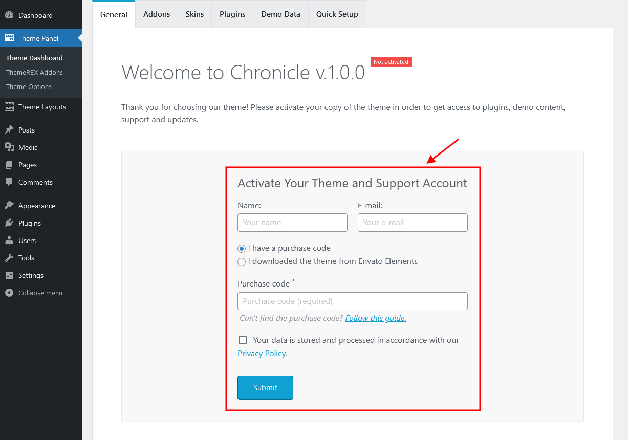 IMPORTANT! The number of theme activations (with purchase code/Envato Elements token) is LIMITED! For Envato Elements, if you want to activate another theme, please generate a new token (1 token = 1 domain).
Anyway, you are allowed to activate your theme locally or on the dev server, disconnect the license, and then move the theme to the main domain.
If you accidentally removed your WordPress installation without disconnecting the purchase code:
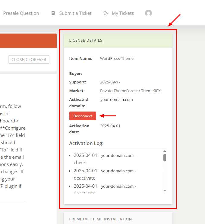
- with active support - log into the support system and click the "Disconnect" button in the right panel under "License Details";
- with inactive/expired support - use this 1-time disconnection service:
https://deactivate.themerex.net/.
Please feel free to contact our support department if any issues arise. -
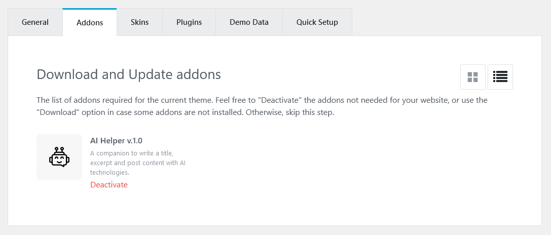
Make sure the required Advanced Theme Add-ons are active (under the "WP Dashboard > Theme Panel > Theme Dashboard > Addons" tab). You can find the description of each add-on here.
Attention! If you want to make changes to the theme’s templates or functions, we strongly recommend activating a child theme before demo data installation. Please see the Child Theme section for more information.
The theme license allows you to install the theme on ONE domain only! To connect the license to a different domain, first, click "Disconnect domain" (Theme Panel > Theme Dashboard > General) and then re-enter the purchase key/token on a different WordPress installation.
For Envato Elements, if you want to activate another theme or install the same theme on a new domain, please generate a new token (1 token = 1 domain).
If you accidentally removed your WordPress installation without disconnecting the purchase code:
- with active support - log into the support system and click the "Disconnect" button in the right panel under "License Details";
- with inactive/expired support - use this 1-time disconnection service:
https://deactivate.themerex.net/.
If you have any questions, please contact our support department.
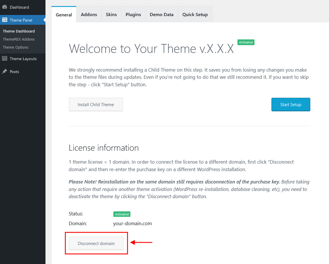
Attention! Before any manipulations that will require re-entering the purchase key/Elements token even on the same domain (e.g.: WordPress reinstallation or cleaning the database), please FIRST disconnect the domain!
If you have accidentally removed your WordPress installation without domain disconnection, please use this 1-time disconnection service: https://deactivate.themerex.net/.
Plugins Installation
Below is the list of the plugins that come included into the theme.
Some of these plugins can also be installed from the WordPress.org repository.
- AMP for WP – Accelerated Mobile Pages
- Advanced Popups
- AI Engine
- Contact Form 7
- CookieYes | GDPR Cookie Consent
- Elementor (required)
- Kadence Blocks (free version)
- Limit Modified Date
- MailChimp for WordPress
- Powerkit
- ThemeREX Addons (required)
- ThemeREX Updater
- WooCommerce
- WooCommerce Advanced Product Labels (free version)
PLEASE NOTE! Our theme is compatible with The GDPR Framework and Social Login (Discord, Google, Twitter, LinkedIn) – WordPress plugins, though they are not included into the theme’s package. You can install them yourself if needed.
You can find a detailed overview of each plugin in the Plugins section of this documentation file.
There is only one required plugin for proper theme functioning, and that is ThemeREX Addons. The rest of the plugins are recommended for installation, but not required.
To make the theme look exactly as on the demo page, after the installation/activation of the ThemeREX Addons plugin and theme activation you would need to install the recommended plugins. Our theme supports two ways: through the "Theme Dashboard" menu or a prompt with a list of plugins to install. Let’s look closer to both.
Through the "Theme Dashboard" menu
We suggest using this method, as it consolidates all controls related to theme activation, domain connection, selection of addons and skins (if available for a specific theme), plugin installation/activation, demo data installation, and basic website settings. This approach eliminates the need to navigate through multiple menus in the WordPress Dashboard when configuring the theme.
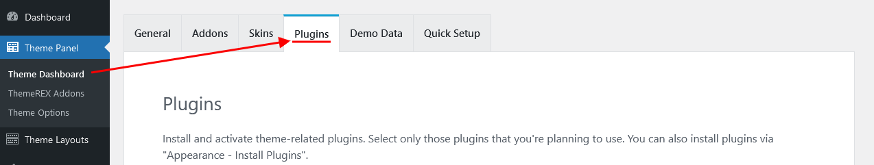
Navigate to WP Dashboard > Theme Panel > Theme Dashboard and under the "Plugins" tab choose all plugins you need by clicking on them.
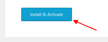
To proceed, click on the "Install & Activate" button at the bottom. This process may take a while.
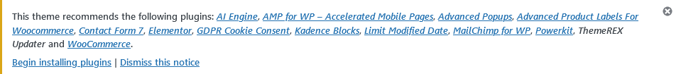
Through a prompt
This is an old method of installing plugins, though it still works.
-
At the top of the screen find a prompt with a list of plugins to install. Click on the Begin installing plugins link or go to Appearance > Install Plugins.
-
Check the plugins you want to install, select the Install option, and click Apply. Installation may take a few minutes, please be patient and do not refresh the page.
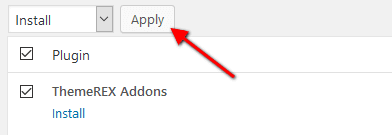
- Now, activate the plugins. Go to Appearance > Install Plugins, check all the listed plugins, choose Activate option, and click Apply.
In case you are running a shared hosting with limited resources (e.g. GoDaddy), we do recommend enabling only the essential plugins (e.g. ThemeREX Addons, Elementor) and disabling the rest. Otherwise, it may significantly increase memory consumption, which might lead to unwanted issues.
PLEASE NOTE! The installation and activation of bundled plugins run automatically. Anyway, if you have any issues, please extract plugins.zip archive from the theme package (if provided with the theme) and proceed with the installation of the plugins manually.
Gutenberg Compatibility
Our theme is compatible with the Gutenberg page builder. You can create new pages using this editor, though you can still use pre-built custom header and footer layouts.
All existing demo pages and layouts are built through the Elementor Page Builder and should be customized via Elementor ONLY.
PLEASE NOTE! It is possible to switch between the page builders. Please use One page builder for creating/customizing One particular page/post/layout.
Child Theme
If you want to make changes to the theme’s files and functions, we strongly recommend installing a child theme. This ensures that your theme customizations stay in place after the theme update. If you are not planning to change the core theme files, you are free to skip this chapter.
IMPORTANT! Install the child theme before importing the demo data. Otherwise, all of your theme options will be reset.
A child theme is installed the same way you install a parent theme. Locate the chronicle-child.zip file in the theme package and upload it via the WordPress admin panel. Alternatively, you can unzip it and upload it via FTP (see main theme installation chapter).
Using a Child Theme
Your child theme has its own functions.php file. Use it to copy modified functions from the parent theme’s functions.php, or register new functions.
You can copy all files from the parent theme into the child theme, except files located in the following folders:
-
/includes -
/plugins -
/theme-options -
/theme-specifics
In the /front-page folder, you can copy all files except front-page.options.php.
If the file you want to edit is in one of these folders, you need to copy the required function from that file and register it in the child theme’s functions.php.
The rest of the files can be copied and edited directly in the child theme folder.
When copying parent theme files into the child theme, preserve the original folder structure. Create respective folders and make sure that the file path is the same as in the parent theme.
Demo Content
Our theme includes a simple One-click demo data installation, which allows your site to look exactly as on the theme demo.
Before installing demo data, please make sure you have activated your theme copy (entered the purchase code or Envato Elements token in the WP Dashboard > Theme Panel > Theme Dashboard > General tab) and installed all the required plugins. Check the Plugins installation section for more information about the required plugins.
In case you do not have your Purchase Code, please navigate to your ThemeForest "Downloads" page and click on the theme download link. Check this guide for more details.
To generate the Envato Elements token, follow the link from your WP admin panel. Please view this guide for more information.
IMPORTANT! Our theme supports RTL text direction (compatibility, without rtl-demo content)! Please FIRST choose the correct language in your WordPress settings (WP Dashboard > Settings > General > Site Language), then proceed with the demo data installation.
Our theme contains RTL styles. The page content should be manually adjusted for RTL text direction using Elementor settings (e.g.: changing the alignment of icons, etc.).
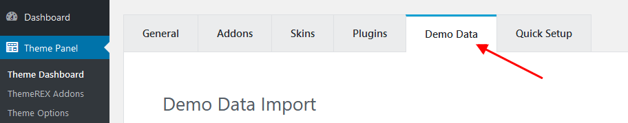
To import the demo content, go to Theme Panel (WP Dashboard) > Theme Dashboard > Demo Data.
On the page that showed up, set the required parameters.
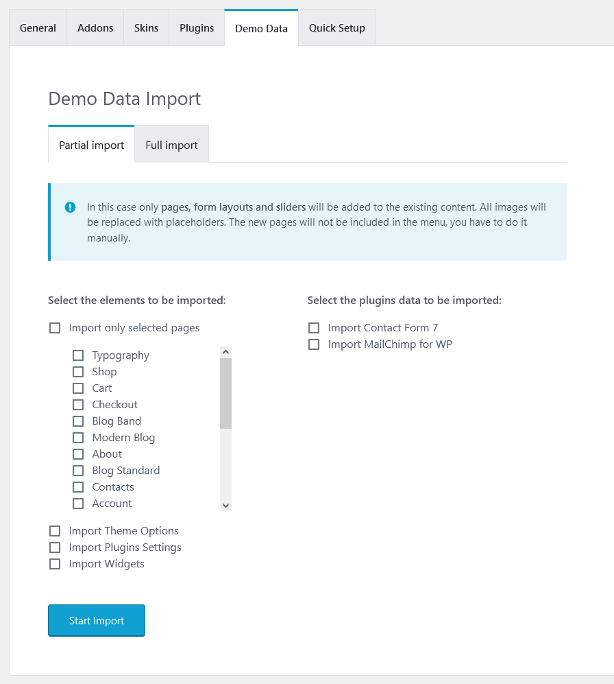
Partial Import
When choosing the partial demo data import, the new content will be added to your existing data.
Although this will not overwrite your existing content, we still recommend backing up your website before doing this.
Note, that the pages are imported without the original images. Instead, the image placeholders are used. This is done to keep your existing content intact.
Import separate pages means that you receive the page structured like on our demo, just widgets set that requires further customization: you should replace demo categories/post IDs with your own ones.
Full Import
When choosing this option, all the existing content of your website will be lost and replaced with new data. We recommend using this option for new WordPress installations only.
Use the full import option if you want to have an exact copy of the theme demo. It enables you to import all media files, pages, theme options, and plugin settings.
Some plugins increase memory consumption. For example, BuddyPress and bbPress (not included in the theme’s package) require additional 60-80Mb. If you are having trouble installing the demo data, deactivate massive plugins and try again.
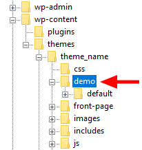
In case the demo data installation is stuck, and you see "Error load data from the file ... " error message, you can manually install it by downloading the default.zip archive with demo data from our server. The archive should be unzipped. Then create demo/ folder in wp-content/themes/chronicle/ directory and copy /default folder to wp-content/themes/chronicle/demo.
Treat the screenshot below as an example only. The list of folders inside a theme package may vary.
If the issue persists, please contact your hosting service provider to make sure that your server configuration meets the Theme Requirements. Otherwise, please refer your request to our support department.
Installation FAQs
- Contact your web hosting service provider to increase your
upload_max_filesizeto80M. - Upload the extracted theme package via an FTP client to the
wp-content/themesdirectory.
memory_limit. You can increase memory_limit on your server in several ways, namely by editing:
- wp-config.php file:
define('WP_MEMORY_LIMIT', '256M'); - php.ini:
memory_limit = 256M; - .htaccess file:
php_value memory_limit 256M;
mbstring PHP function in server settings. The function is needed for some languages, such as Japanese, Chinese, etc. In case you can not enable the settings, please contact the support team to get assistance with disabling the function in the theme.
wp-config.php file and add the following lines after the database information:
define( 'FS_METHOD', 'direct' );define('FS_CHMOD_DIR', 0770);define('FS_CHMOD_FILE', 0660);
max_execution_time 600memory_limit 256Mpost_max_size 32Mupload_max_filesize 32M
Then re-import demo data - it will be successful. In case you still have any issues, please contact our support team.
- Recover the website and switch to a default WordPress theme.
- Try to install your premium theme, but do not activate it.
- Install the child theme (also comes in the package, you may possibly need to upload it via SFTP) and then activate this child theme via your admin dashboard.
- Install and activate the ThemeREX Addons plugin.
There may be three reasons you get the error: "Sorry, the theme is not activated!"
-
Reactivation on the same domain
In the error message, you may see - "Reason: This purchase code is already in use.".
Most likely, you have removed the previous installation without disconnecting the license key in Theme Panel > Theme Dashboard > General.
Please follow the steps below:
- with active support - log into the support system and click the "Disconnect" button in the right panel under "License Details";
- with inactive/expired support - use this 1-time disconnection service:
https://deactivate.themerex.net/.
Then, you can use the purchase code again. You may also check our guide concerning this matter. -
Trying to use the same purchase code on a different domain
In the error message, you may get - "Reason: This purchase code is already in use on a different domain.".
To connect the license to a different domain, first, open your previous installation, click "Disconnect domain" (Theme Panel > Theme Dashboard > General), and then re-enter the purchase key on another WordPress installation.
If you accidentally removed your WordPress installation without disconnecting the purchase code:
- with active support - log into the support system and click the "Disconnect" button in the right panel under "License Details";
- with inactive/expired support - use this 1-time disconnection service:
https://deactivate.themerex.net/.
If you still have any questions, please view our article or contact our support department. - Theme activation with incorrect purchase code
Error Reason: "Invalid purchase key: ...".
If you get this kind of error, you have tried to use the purchase code from another theme, or you have copied it incorrectly (not all characters or using the wrong language on your keyboard layout).
To find the correct purchase code, please navigate to your ThemeForest "Downloads" page and click on the theme download link. Click "License certificate & purchase code" (available as a PDF or a text file). Open the PDF document with your purchase key and copy and paste it to the "Purchase Code" field. Check this guide for more details if needed.
If you have downloaded the theme from Envato Elements and want to reactivate the theme or install the same theme on a new domain, please generate a new token (1 token = 1 domain). You can also view our guide to find out how to generate the Envato Elements token.
In this case:
- with active support - log into the support system and click the "Disconnect" button in the right panel under "License Details";
- with inactive/expired support - use this 1-time disconnection service:
https://deactivate.themerex.net/.
Then, you can use the purchase code again. You may also check our guide concerning this matter.
For Envato Elements, if you want to reactivate the theme or install the same theme on a new domain just generate a new token (1 token = 1 domain).
If you unintentionally deleted your WordPress installation without disconnecting the purchase code:
- with active support - log into the support system and click the "Disconnect" button in the right panel under "License Details";
- with inactive/expired support - use this 1-time disconnection service:
https://deactivate.themerex.net/.
If you still have any questions, please view our article or contact our support department.
If you are using Envato Elements token, please generate a new one (1 token = 1 domain). You can also view our guide to find out how to generate the Envato Elements token.
To find the correct purchase code, please navigate to your ThemeForest "Downloads" page and click on the theme download link. Click "License certificate & purchase code" (available as a PDF or a text file). Open the PDF document with your purchase key and copy and paste it to the "Purchase Code" field. Check this guide for more details if needed.
For Envato Elements, you can generate a new token (1 token = 1 domain).
Theme Update
This step is required if you received the notification that a new version of the theme or plugin is available. You can see this information in the Changelog section at the bottom of the item’s details page.
Before you go ahead with the update, make sure to back up your old theme’s folder. Download it to your computer locally.
Update Option 1. Update using the ThemeREX Updater plugin
- Please make sure the ThemeREX Updater plugin is installed and activated. This plugin is provided with the theme.
-
Optional! If you have activated your theme copy (entered a purchase code in the Theme Panel (WP Dashboard) > Theme Dashboard > General tab) you can omit this step.
Otherwise, navigate to Appearance > ThemeREX Updater and enter your purchase code to get the latest versions of bundled plugins and theme updates through the WordPress admin panel. To get the code, please navigate to your ThemeForest "Downloads" page and click on the theme download link. Check this guide for more details.
Please note, this section requires a purchase code ONLY! Envato Elements token will not work here!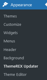
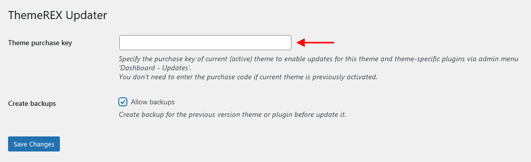
- We recommend that you check the "Create backups" option (Appearance > ThemeREX Updater tab) to allow the system to create backups for plugins versions and the theme automatically.
-
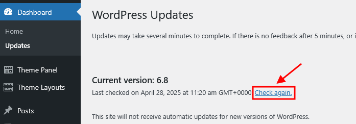
Proceed to WP Dashboard > Updates and check if any updates are available.
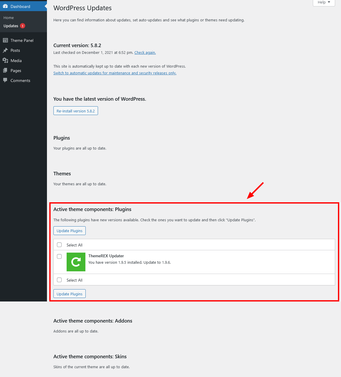 The system automatically checks for updates, but you can also click the "Check Again" link to manually search for updates to your installed themes and plugins, not just the WordPress version.
- Choose the options for an update (plugin, theme, etc.) and click on the Update button.
-
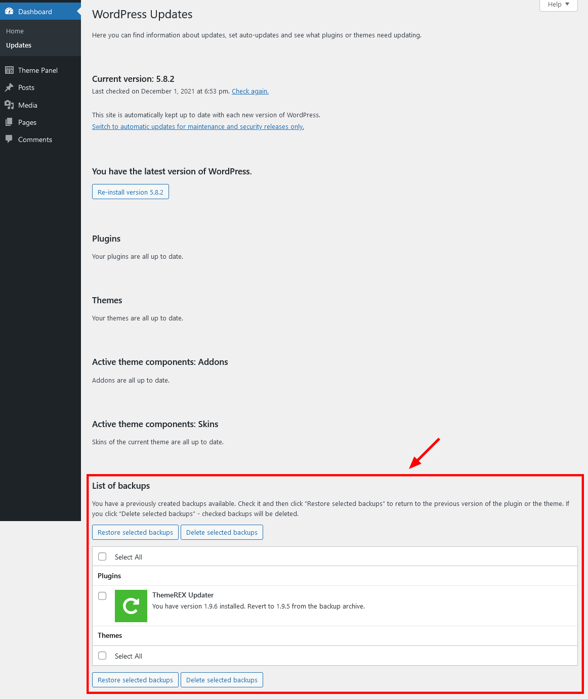
You can restore the backups created by the system in WP Dashboard > Updates or in Appearance > ThemeREX Updater (if the "Create backups" option was checked before the update).
Update Option 2. Update using WordPress uploader
-
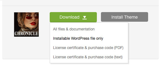
Log into your ThemeForest account and navigate to the Downloads tab. Find the theme and download the Installable WordPress file only.
- Log into your WordPress website and go to Appearance > Themes.
- Activate a default WordPress theme. Delete the older version of your theme and re-upload the new WordPress Installable files that you have downloaded from ThemeForest during the 1st step.
-
Once it is uploaded, activate the theme.
IMPORTANT! If you're using a child theme, do not activate the newly uploaded parent theme. Activate your old child theme instead. Otherwise, all the child theme customizations will be lost. -
Update (if necessary!) the included plugins, if you see a notification message prompting about a newer version.
- Navigate to WP Dashboard > Plugins > Installed Plugins.
- Update ThemeREX Addons plugin. You can click on the "Update" button (if available in a particular theme) or deactivate and delete this plugin. Then follow the prompt to install it again. This will load a new plugin version on the site.
- Deactivate and delete the rest plugin(s) of the old version.
- Go to Appearance > Install Plugins and install the plugin(s) like it was described in the Plugins Installation section of this documentation.
Update Option 3. Update using FTP client
- Log into your ThemeForest account and get the last version of the theme as described above.
- Connect to your server using desktop client software (we recommend Filezilla and CyberDuck).
-
Change the directory to
/wp-content/themes. - Remove/rename existing folder with old theme files.
-
Unpack theme installable files downloaded from ThemeForest and upload them to the
themesfolder. - Update (if necessary!) the included plugins in the way described above, if you see a notification message prompting about a newer version.
PLEASE NOTE! We carefully monitor the relevance of our themes and continuously make improvements, functional extensions, and necessary fixes. Some of these changes occur automatically in many themes immediately after adjustments are made in the framework. Due to the large number of themes in our portfolio, there may be a delay between making changes and uploading the theme to ThemeForest. You should not worry, as immediately after installing and activating the theme downloaded from ThemeForest, you will be offered a theme update in the admin panel if a more recent version is available on our server. Furthermore, to update the theme in the future, there is no need to download it from ThemeForest again - notifications of new versions will appear in the admin panel. The theme and bundled plugins can be updated directly from the Dashboard > Updates menu.
Theme Customizer
Now let’s navigate to Appearance (WP Dashboard) > Customize to flexibly control the appearance and behavior of the whole website as well as individual types of posts, pages, and categories.
IMPORTANT! Please be aware that our theme provides a special inheritance hierarchy system for "Theme Options" settings. It means that individual settings of each page may override global settings made with Customizer Panel.
Settings of "Blog", "WooCommerce", and other groups (depending on the plugins installed) may also override default/general settings available through Customizer.
Moreover, you can see the changes in the front end right after the alterations - when the needed parameter is selected, without switching from admin to front end each time. When you are done with the changes, you should click on Publish button at the top of the Customizer’s side menu.
IMPORTANT! Please be aware that all the Customizer’s settings are also available for editing through Theme Panel (WordPress Dashboard Menu) > Theme Options section.
PLEASE NOTE! The screenshots from this chapter are given for demonstration purposes only. The theme settings (enabled/disabled options) may vary from the ones provided in the screenshots.
Logo & Site Identity
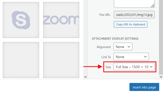
The settings of this group are responsible for managing site identity features. This is the initial place where you should upload your logo.
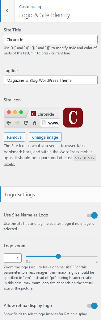
Site Title
The text entered into this field appears as the logo title (if the image logo is not uploaded and the "Use Site Name as Logo" option is enabled) and as the website’s title in your browser tab.
Tagline
The text entered into this field appears as the website slogan under the logo. By default, the tagline is used if no image logo is selected and the "Use Site Name as Logo" option is enabled.
You can modify the site title and tagline appearance by inserting special characters, e.g.:
||- line break;{{...}}- modifies style and color of parts of the text;[[...]]- makes the text bold;
Site Icon (Favicon)
The site icon (favicon) is used as a browser and app icon for your site. Icons must be square, and at least 512 pixels wide and tall.
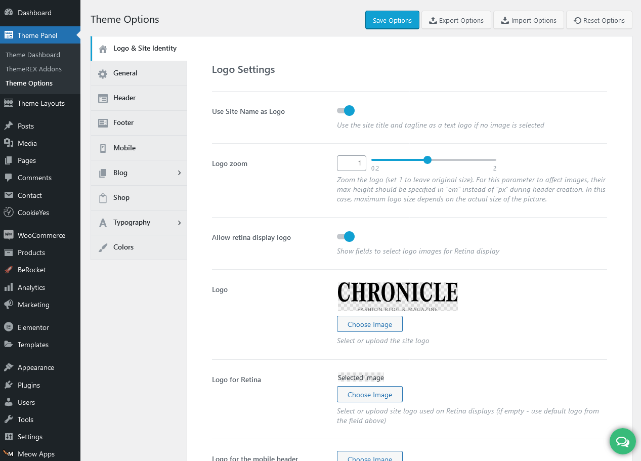
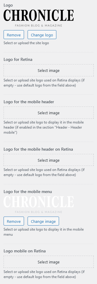
Logo-related settings
These settings allow managing your logo images (main, for mobile header, and mobile menu) as well as their Retina versions (if the "Allow retina display logo" option is checked). As a rule, the retina logo should be twice as big as the regular logo to be displayed properly.
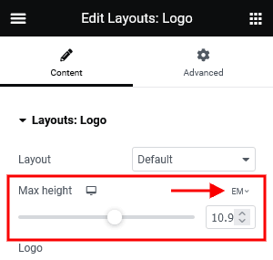
Here, you can also zoom the logo. 1 - original size. Please note, that the maximum size of the logo depends on the actual size of the image. This option works if the max height of the logo is set in em in the Elementor "Layouts: Logo" widget.
The "Use Site Name as Logo" option displays the site title and tagline as a text logo if no image is selected.
Uploading Logo via Layouts
The logo uploaded in the Customizer can be overwritten by the logo image selected in the Header layout. This allows you to upload a different logo image for each page.
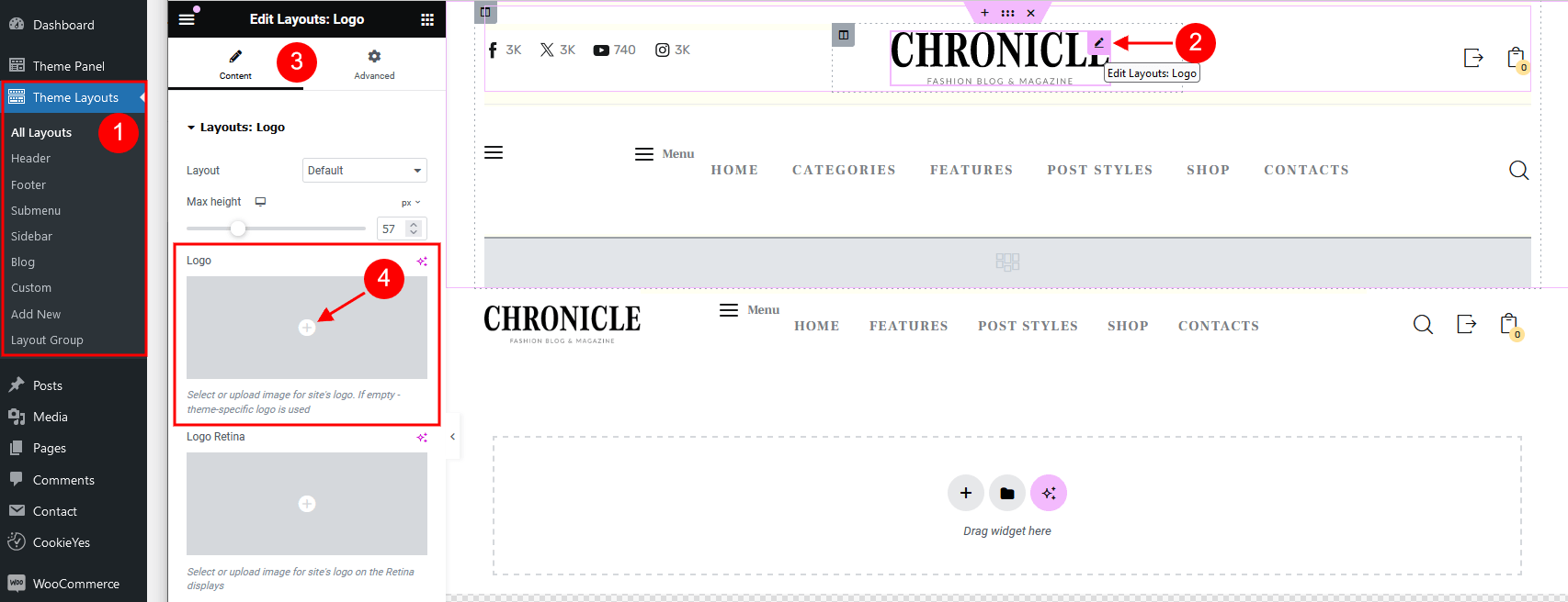
- Check what header style is selected in the Appearance > Customize > Header > Header style. (You can choose a different header style for a particular page in its Theme Options.)
- Navigate to the Theme Layouts > Header and open this header layout.
- Locate the Elementor Layouts: Logo widget (ThemeREX Addons Layouts group) and click on the Edit button.
- Upload a new logo in the panel > Content tab and save the changes.
General
The settings of this group are responsible for managing the overall look of the site.
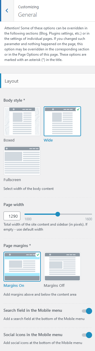
Layout settings:
Here you can choose the body style, page margins, the page width (site content + sidebar) in pixels as well as apply a background image and page extra spaces for the "Boxed" body style.
- Boxed - the page’s body is in the area of limited screen width, and the background image is visible.
- Wide - the page’s body occupies an entire screen width (the background image is behind it and is not visible), and the content occupies the fixed width area in the center of the screen.
- Fullscreen - the page’s body occupies an entire screen width.
PLEASE NOTE! When you upload your background image, please pay attention to the image size. By default, WordPress may resize images.
The WordPress also limits the size of uploading images, thus allowing you to upload any image to your media library up to 2560px ONLY!
Navigation settings
These settings allow adding additional elements to the Mobile Menu.
- Search field in the Mobile menu - adds a search field to the bottom of the Mobile menu.
- Social icons in the Mobile menu - adds social icons to the bottom of the Mobile menu. The social icons inherit the links (URLs) to your social profiles specified in the Theme Panel (WP Dashboard) > ThemeREX Addons > Socials tab.

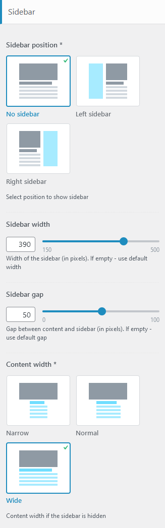
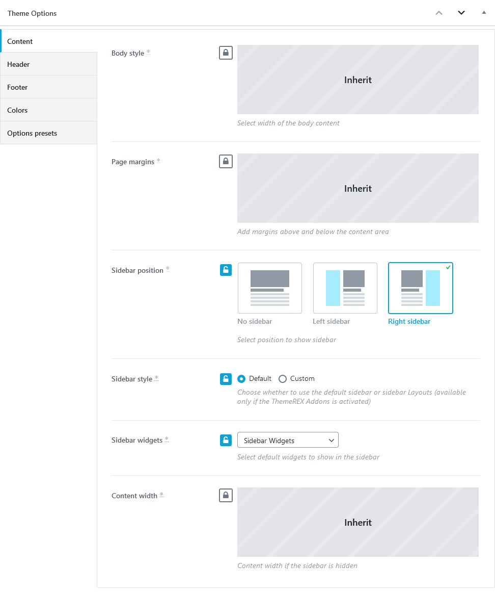
Sidebar-related settings
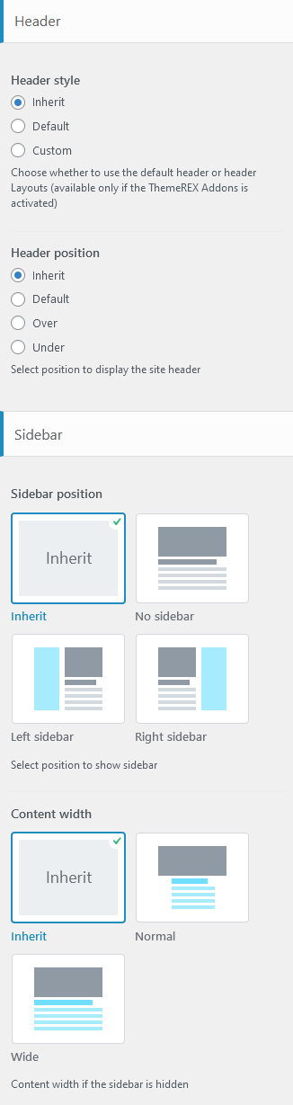
- Sidebar position - moves the sidebar to the right or left-hand side of the page, or hides it.
Additional options for "Left/Right" sidebar position:
- Sidebar style - choose whether to use a default sidebar or a custom sidebar layout (available only if the ThemeREX Addons plugin is activated).
For a "Default" sidebar style:
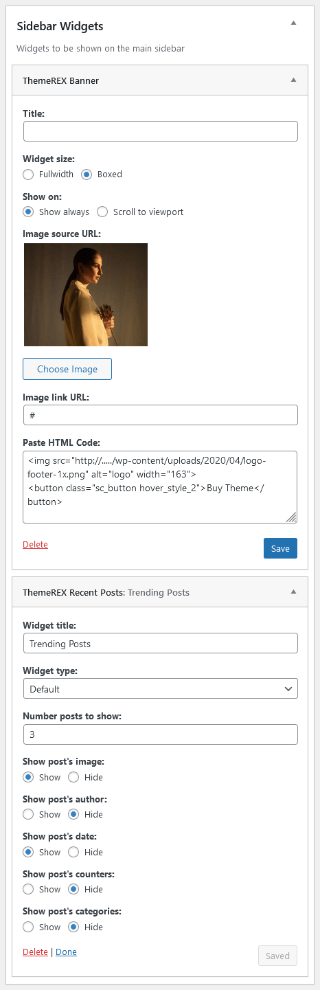
- Sidebar widgets - specify which widgets set to show in the sidebar area. The widgets are available in Appearance (WP Dashboard) > Widgets.
- Select custom layout - select already built sidebar layout. You can create new sidebar layouts or customize the existing ones in the Dashboard > Theme Layouts tab, using a user-friendly Elementor. Check the Theme Layouts section for more information.
- Sidebar width - specify the width of the sidebar (in pixels).
- Sidebar gap - specify the gap between content and sidebar (in pixels).
- Sidebar style - choose whether to use a default sidebar or a custom sidebar layout (available only if the ThemeREX Addons plugin is activated).
- Content width - choose the content width if the sidebar is hidden.
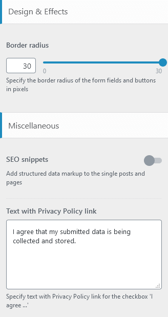
Design & Effects-related setting
Here you can select a border radius for the form fields.
Miscellaneous setting
This setting is responsible for specifying SEO-related parameters.
Text with Privacy Policy link
Specify the text for the checkbox in a comment form on single posts, review form on single products (if the WooCommerce plugin is installed), and in a registration form ("Layouts: Login Link" widget). This text will be displayed before the Privacy Policy link.
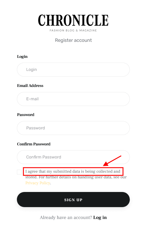
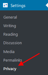
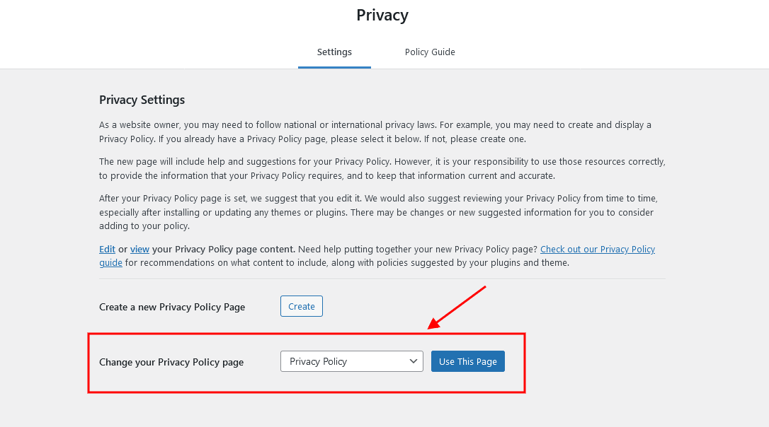
To add/customize the Privacy Policy link, navigate to Settings (WP Dashboard) > Privacy and specify the page that will be used as a Privacy Policy one. If you do not want to display the "For further details on handling user data, see our Privacy Policy" text, just leave this setting empty.
PLEASE NOTE! In case you are planning to use default forms without consent checkboxes, just leave the "Text with Privacy Policy link" option empty!
Header
The settings of this group allow you to manage the overall look and behavior of the header elements.
You can set up header settings for a specific page in the Theme Options > Header section of that page.
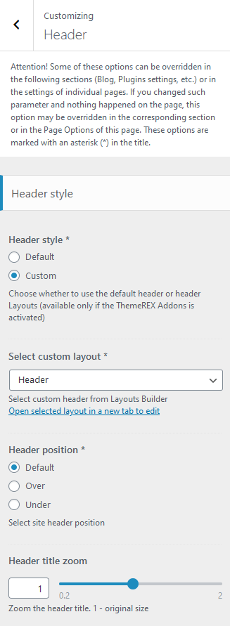
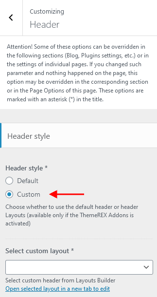
Style-related settings
These settings allow managing the style ("Default" or "Custom") and position of the header area as well as zooming the header title. For custom header style, you can specify the header layout (available only if the ThemeREX Addons plugin is activated).
Available Custom Header Layouts:
- Header – Main
 Sticky Menu

- Header – Single Post
 Sticky Menu

Please also see the header-related layouts section of this documentation file. All elements of pre-built custom header areas can be edited in the Dashboard > Theme Layouts > Header tab, using a user-friendly Elementor. Check the Theme Layouts section and this video tutorial for more information.
To avoid "Sticky Menu" behavior, select the "Disable" option in the Edit Section > Advanced > Sticky Section > Make this row sticky (for the section with the menu element). Check also the Sticky Sections description.
You can also watch this video tutorial on how to enable a sticky header:
Available Default Header Style:
 Sticky Menu

The header area in the "Default" style is created via the Global Customize settings (Appearance > Customize). You can also navigate to the .../wp-content/themes/chronicle/skins/default/templates/ folder and edit the corresponding template file header-default.php.
Header Position
The Header position setting controls the way your header behaves regarding the main body area.
- Default - the default header position. The header occupies a separate section and does not collide with other website elements.
- Over - ideally is used for pages with sliders. The header elements overflow the section that follows next, and the header background becomes transparent.
- Under - sets the header area stuck behind the content area when scrolling down the page.
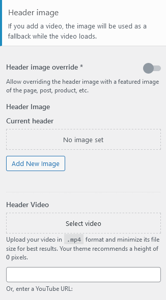
Header Background Image-related settings
These settings allow selecting a header background image or background video as well as choosing whether to override the header image with the post’s/page’s featured image or not.
Mobile header settings (for Default Header style)
Here you can enable a mobile header. It lets you show/hide such elements as a logo, search form, login link, and shopping cart. You can also use the Additional Info section, a text block where you can add information about your business, such as telephone number, open hours, etc.
Header FAQs
 The "Default" header style is created via the Global Customize settings (Appearance > Customize). You can also navigate to the
 .../wp-content/themes/chronicle/skins/default/templates/ folder and edit the corresponding template file header-default.php.
For the "Custom" header style:
- Check which custom header Layout you are currently using in Appearance > Customize > Header in the Select custom layout option.
- In the WordPress admin panel, go to Theme Layouts > Header, and open the currently active header layout.
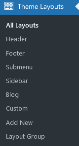 If you do not see the "Theme Layouts" menu item - activate the ThemeREX Addons plugin first.
- Make the required changes and save it.
-
In the Customizer (WP Dashboard > Appearance > Customize > Logo & Site Identity) or global Theme Options (WordPress Dashboard Menu > Theme Panel)
By default, the header logo settings can be adjusted here. -
Ask AI Assistant to replace logo if it is set in the global settings (Customizer or global Theme Options). Find a chat icon in the right bottom corner of your Dashboard.
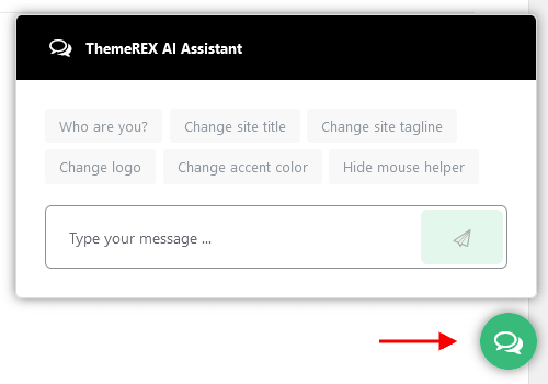 By default, the AI Assistant is enabled. Otherwise, proceed to WP Dashboard > Theme Panel > ThemeREX Addons > AI Helper > Common Settings, find the "Allow AI Assistant" option, and turn it on.
-
Via Header Layouts
If you are using custom header styles, you can manage the logo in your header Layout through the Elementor "Layouts: Logo" widget (ThemeREX Addons Layouts group).
IMPORTANT! The logo specified in your header Layout overwrites the logo set in the Customizer or global Theme Options.
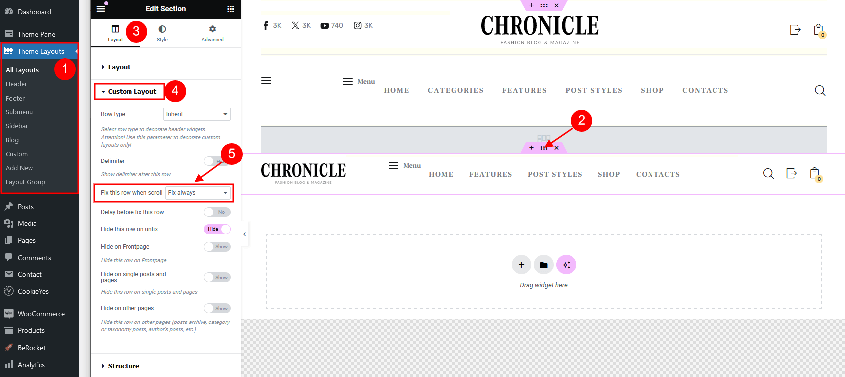
- Open the header Layout you are currently using in Theme Layouts > Header.
- Locate the section that contains the menu element (or any other section that should have the sticky behavior) and click on the "Edit section" button:
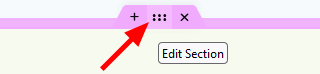
- Go to the panel > Advanced > Sticky Section > Make this row sticky and choose the needed option from the drop-down list (depending on whether you want to enable or disable the sticky menu).
- Save the changes.
- Via header Layouts - navigate to Theme Layouts (WP Dashboard) > All Layouts. Please see Elementor video tutorial or article.
We recommend that you create a separate custom header layout for mobile devices and specify it in the Appearance > Customize > Mobile section. This will increase the load speed of your website on mobile devices. - In the Customizer - enable it in the Mobile Header section in Appearance > Customize > Header (works for Default Header style only!).
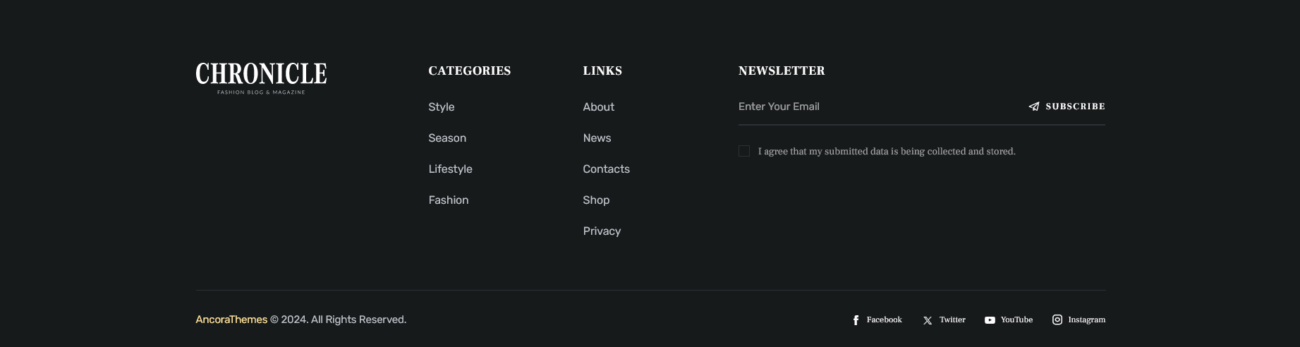
Footer
The setting of this group is responsible for choosing the style of the footer area.
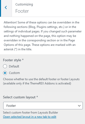
Style-related settings
These settings allow choosing a footer style: "Default" or "Custom". Please note that custom footer layouts are available only if the ThemeREX Addons plugin is activated.
Available Custom Footer Layouts:
- Footer – Main
- Footer – Shop
The "Related Products" section is visible on single products only!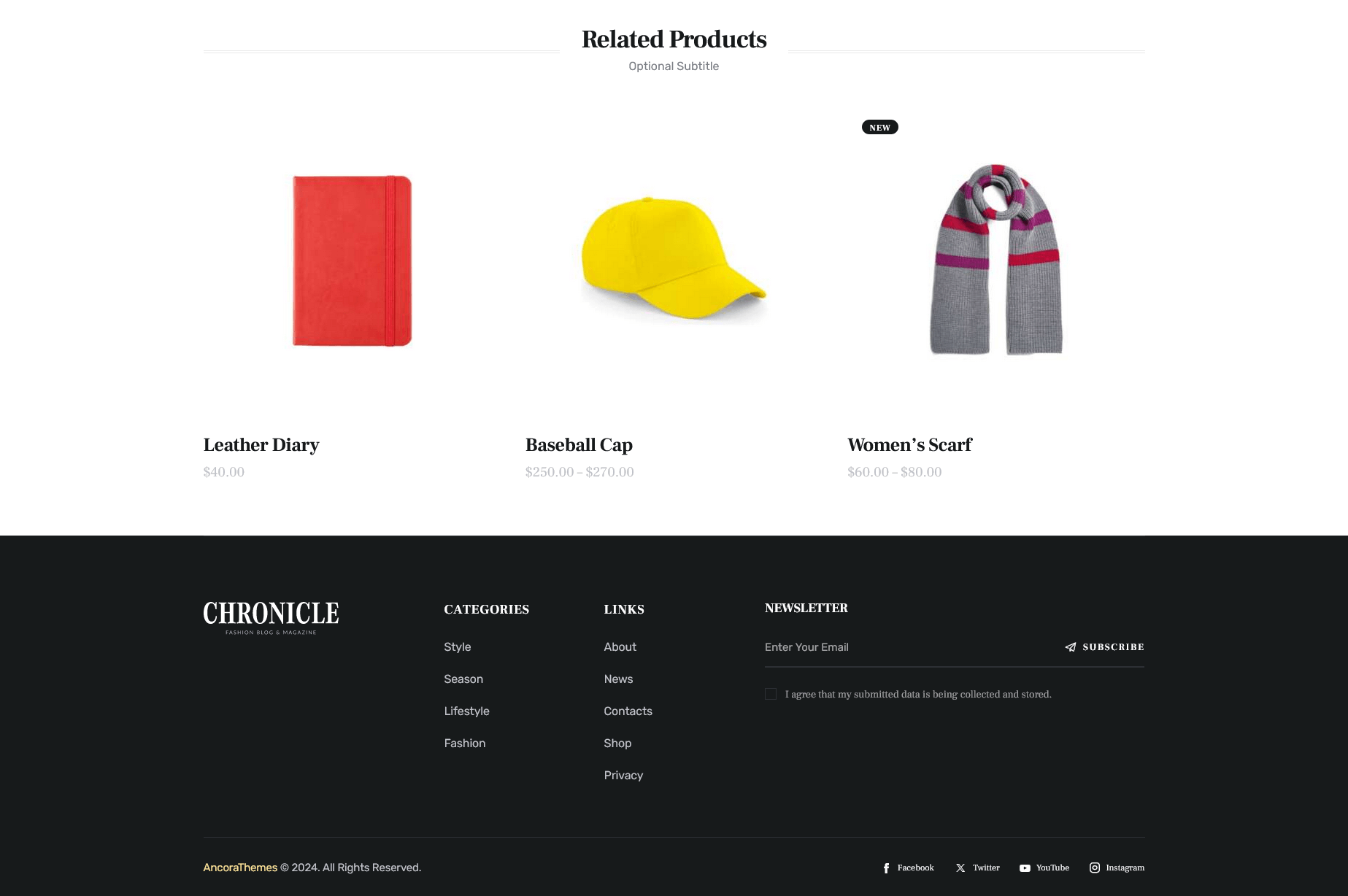
- Footer – Single Blog
Please also see the footer-related layouts section of this documentation file. All elements of custom footer areas can be edited in the Dashboard > Theme Layouts > Footer tab. Check the Theme Layouts section and this video tutorial for more information.
Available Default Footer Style (without footer widgets):
The footer area in the "Default" style is created via the Global Customize settings (Appearance > Customize). You can also navigate to the .../wp-content/themes/chronicle/skins/default/templates/ folder and edit the corresponding template file footer-default.php in any text editor.
Additional options for the Default Footer style:
- Footer widgets - select a preferred footer widgets set. Check the Widgets section for more information.
- Footer columns - set the necessary columns’ quantity to display the widgets in. Choose
0to autodetect the number of columns based on how many widgets you have got in the set. - Footer fullwidth - expands the footer for the whole width of the page.
- Show logo - displays logo in the footer area. If this option is checked, you can upload the logo for your footer as well as its Retina version.
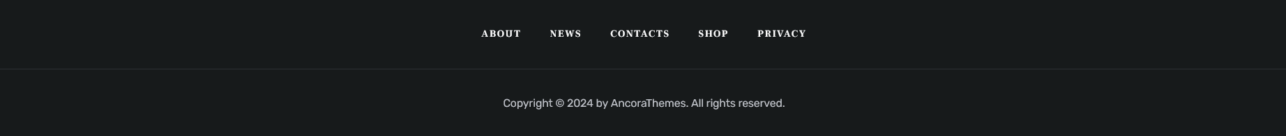
- Show social icons - displays social icons in the footer area. The social icons inherit the links (URLs) to your social profiles specified in the Theme Panel (WP Dashboard) > ThemeREX Addons > Socials tab.
- Copyright - enter the copyright message. Use the
{Y}symbol to indicate the current year.
Mobile
In case you care about page speed optimization and want your website to load faster on mobile devices, this section is just for you. The settings of this group allow you to set separate header and footer layouts as well as specify a sidebar to be displayed on mobile devices only.
We recommend that you create alternative custom header and footer layouts for mobile devices (without any hidden elements for other screen resolutions), as these hidden elements still take time while loading your website.
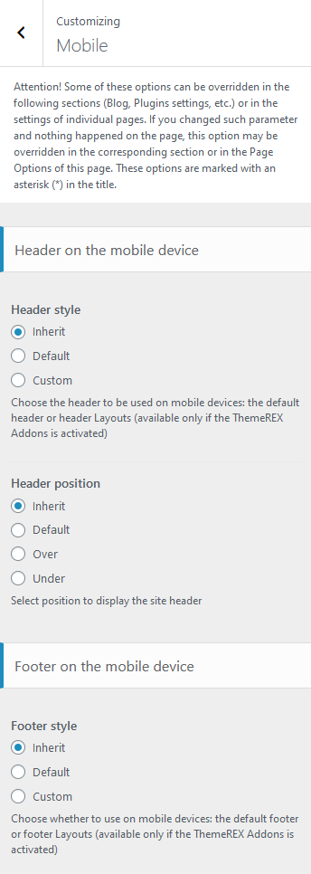
Header-related settings
These settings allow selecting a header style and position. For custom header style, you can specify a header layout, that is available for customizing in WP Dashboard > Theme Layouts > Header.
The Header position setting controls the way your header behaves regarding the main body area.
- Inherit - the value is inherited from the Appearance > Customize > Header section.
- Default - the header occupies a separate section and does not collide with other website elements.
- Over - ideally is used for pages with sliders. The header elements overflow the section that follows next, and the header background becomes transparent.
- Under - sets the header area stuck behind the content area when scrolling down the page.
Footer-related settings
These settings allow selecting a footer style. The Inherit option inherits the value specified in the Appearance > Customize > Footer section. For a "Default" footer style, you can also specify widgets sets and column quantity. For a "Custom" footer style, the "Select custom layout" option is available. You can manage these footer layouts in the WP Dashboard > Theme Layouts > Footer tab.
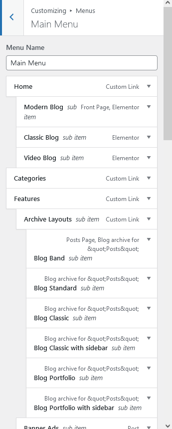
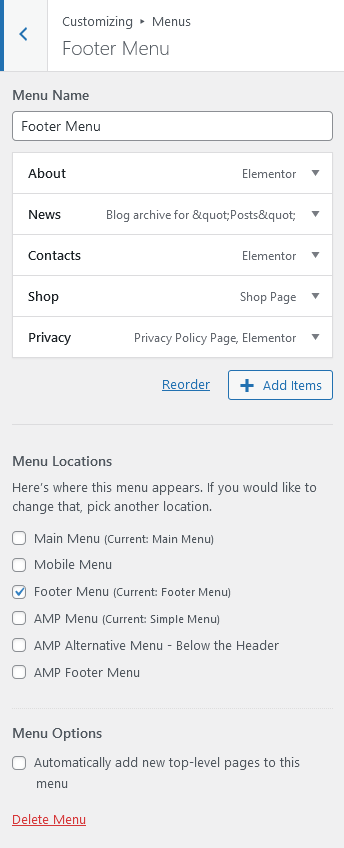
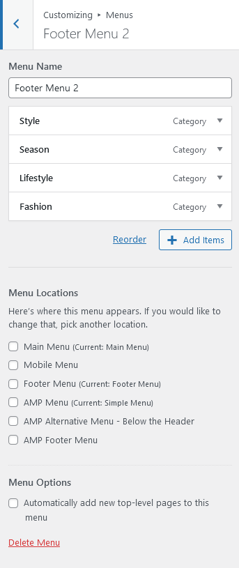
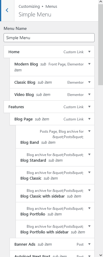
Menus
The settings of this group are responsible for managing Menus. Each menu location is available for filling with any of the predefined menu sets.
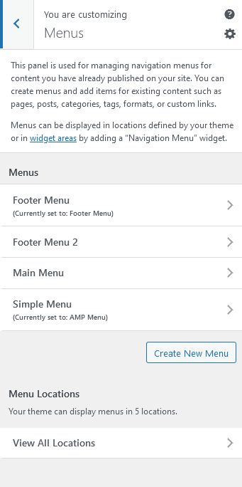
Menus are also available for editing through the "Appearance > Menus" options.
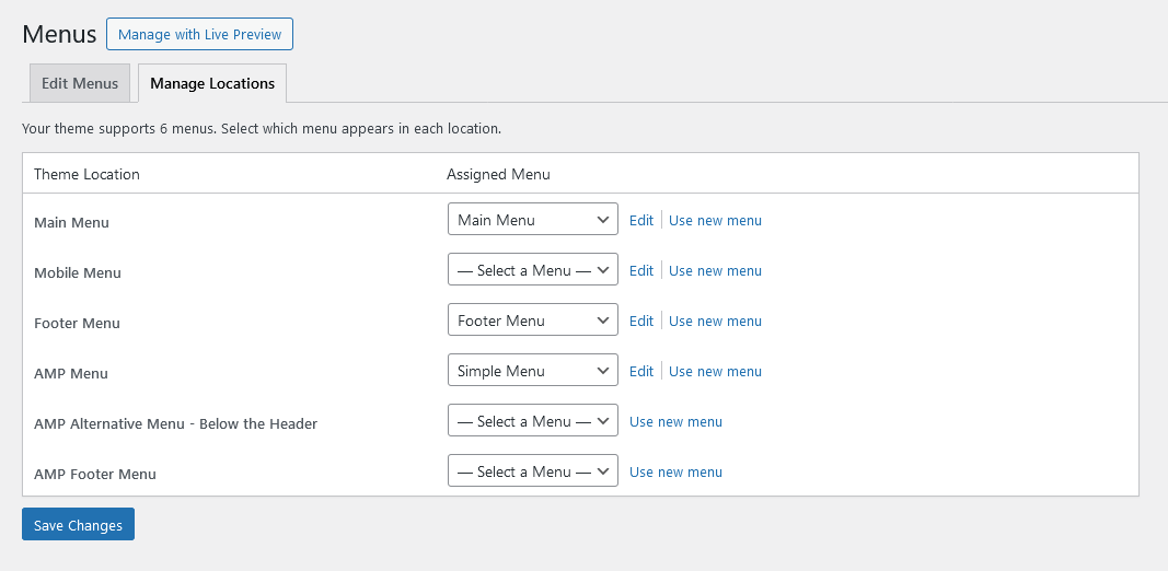
Below are predefined Menu locations:
- Main Menu - displays the main menu.
- Mobile Menu - outputs the menu on mobile devices.
- Footer Menu - shows the menu in the footer area.
- AMP Menu - displays the menu on mobile devices. This menu location requires the AMP for WP – Accelerated Mobile Pages plugin to be active.
- AMP Alternative Menu - Below the Header - shows the alternative menu below the header area on mobile devices. This menu location requires the AMP for WP – Accelerated Mobile Pages plugin to be active.
- AMP Footer Menu - outputss the menu in the footer area on mobile devices. This menu location requires the AMP for WP – Accelerated Mobile Pages plugin to be active.
Predefined Menu sets:
Within custom header & footer layouts, you can add menus using the Elementor Layouts: Menu widget.
Custom Mega Menus
The functionality of creating custom menus, or any kind of complex menus is embedded into the theme. Thus, you do not need to install any external plugins, like Uber Menu or Mega Menu.
To build a complex menu:
-
Navigate to Theme Layouts (WP Dashboard) > Add New and create a new layout with a Submenu type.
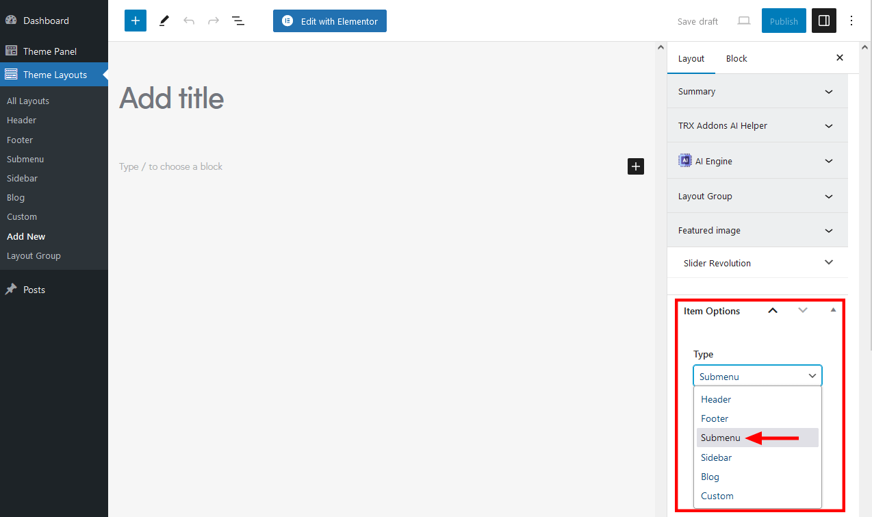
- Add content you want the submenu to contain. Save your changes and publish the layout.
- Proceed to Appearance > Menus and apply your submenu layout to a menu item: open the menu item, click on "Settings", in the newly opened popup window find the "Layout of submenu (optional)" field, and choose the created Submenu layout.
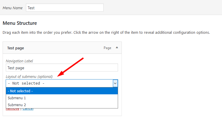 The "Layout of submenu" field appears only when at least one submenu layout is created. The Submenu layout may contain different types of content, even other layouts.
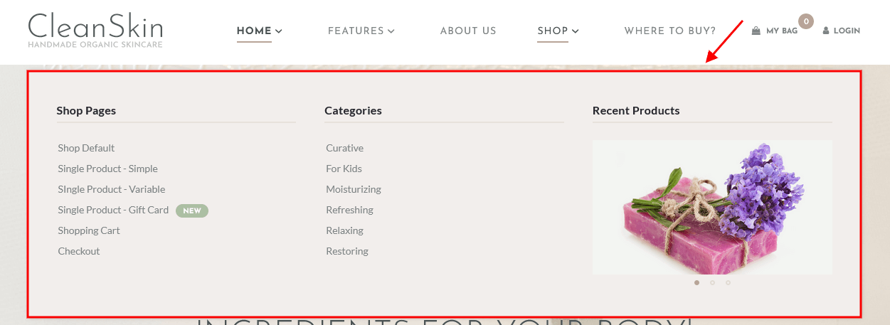
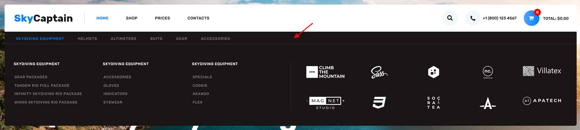
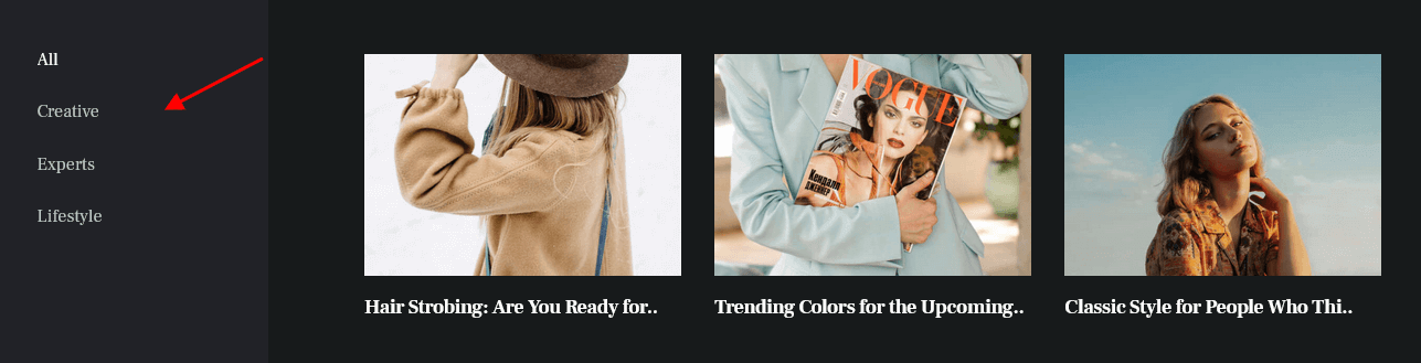
Here are some examples of custom menus from our themes:
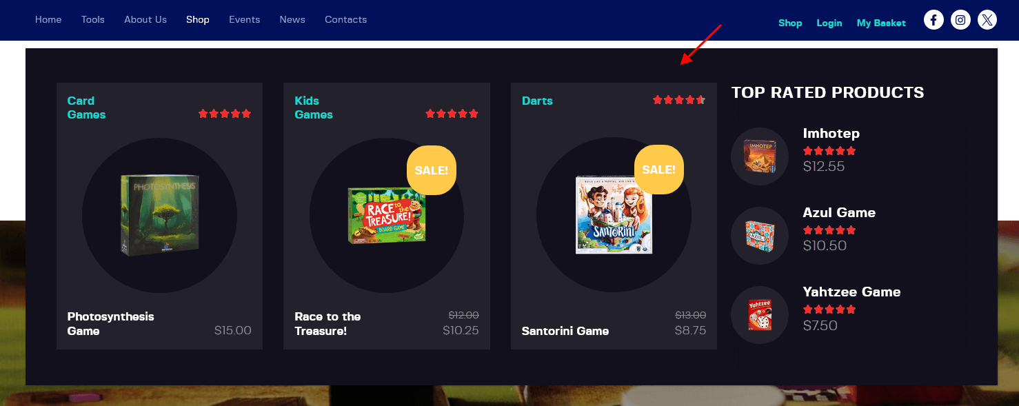
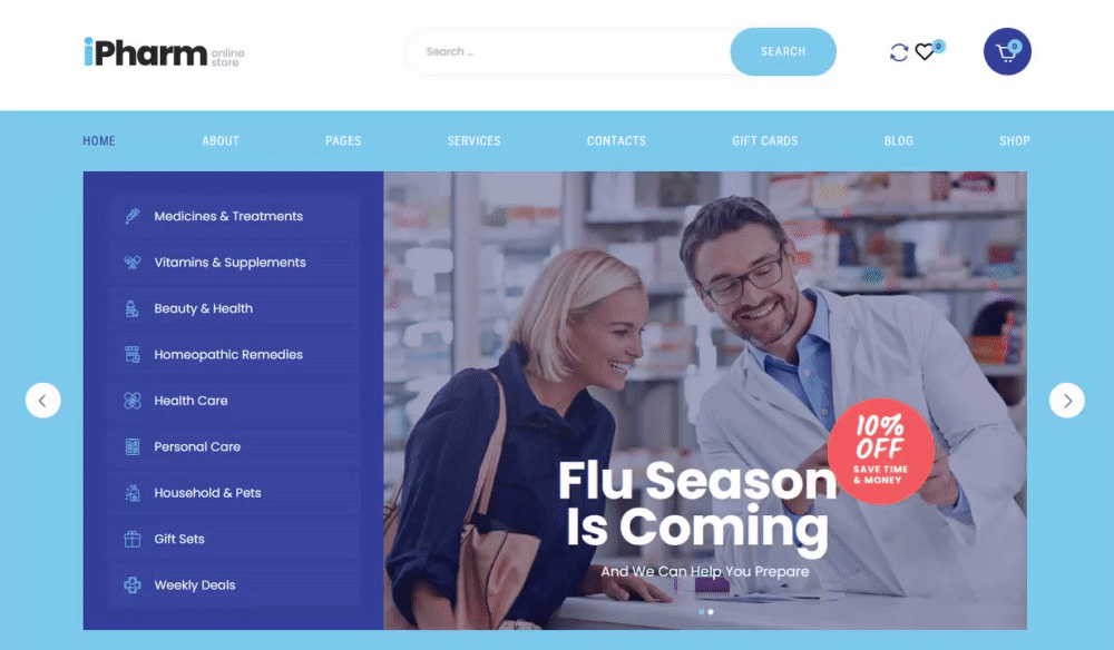
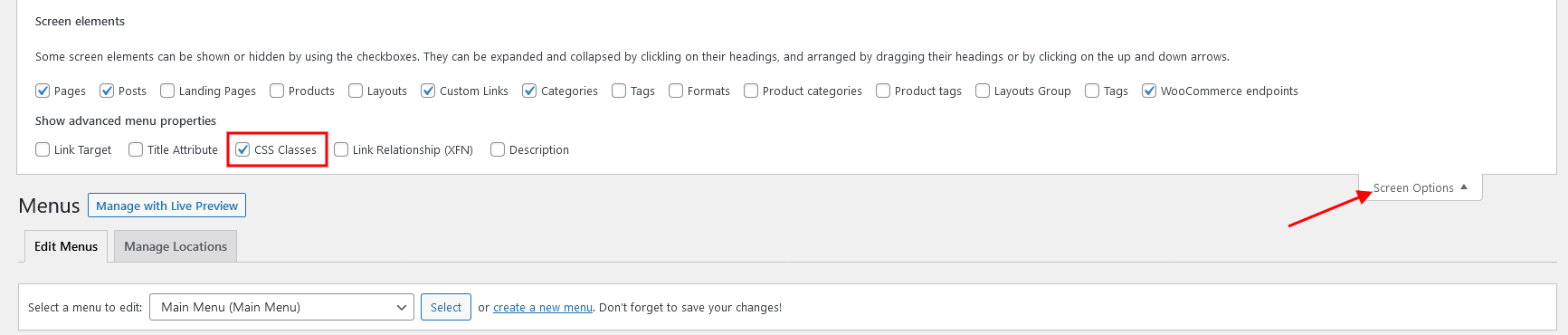
Additional CSS Classes
We have added the following custom CSS class to make the menu look like in our demo:
.submenu_with_blogger_left_filters- adds grey background gradient behind the filter tabs.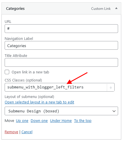
You can enable or disable the CSS Classes option in the Screen Options in the top right corner of the WordPress admin.
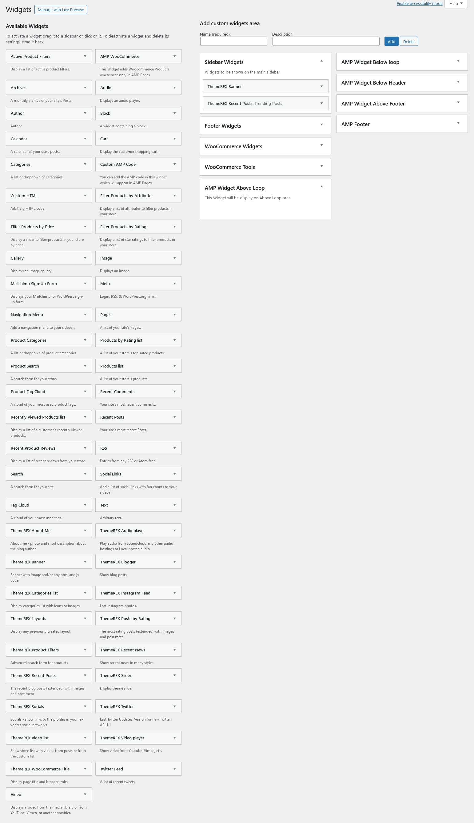
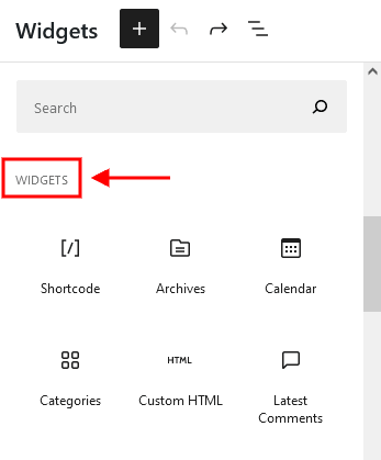
Widgets
Widgets are the blocks of content that can be placed into specifically designed widget areas.
You can find the list of available widgets and widget areas under Appearance (WP Dashboard) > Widgets. Here it is possible to create additional widgets sets, that can be assigned to available default widget areas. This is useful when you have different widgets sets for different pages.
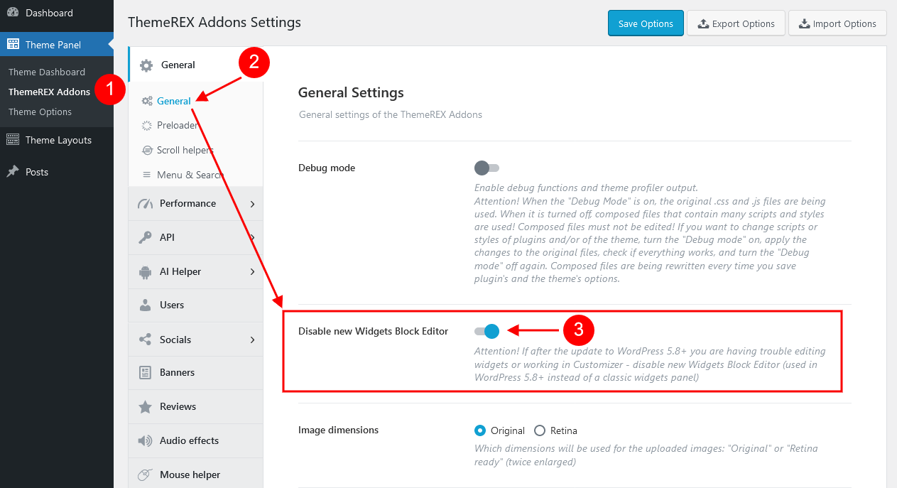
IMPORTANT! Our theme supports both Classic Widgets Editor and New Block Widgets Editor (WordPress 5.8+). You can easily switch between the editors using the "Disable new Widgets Block Editor" option in Theme Panel (WP Dashboard) > ThemeREX Addons > General section.
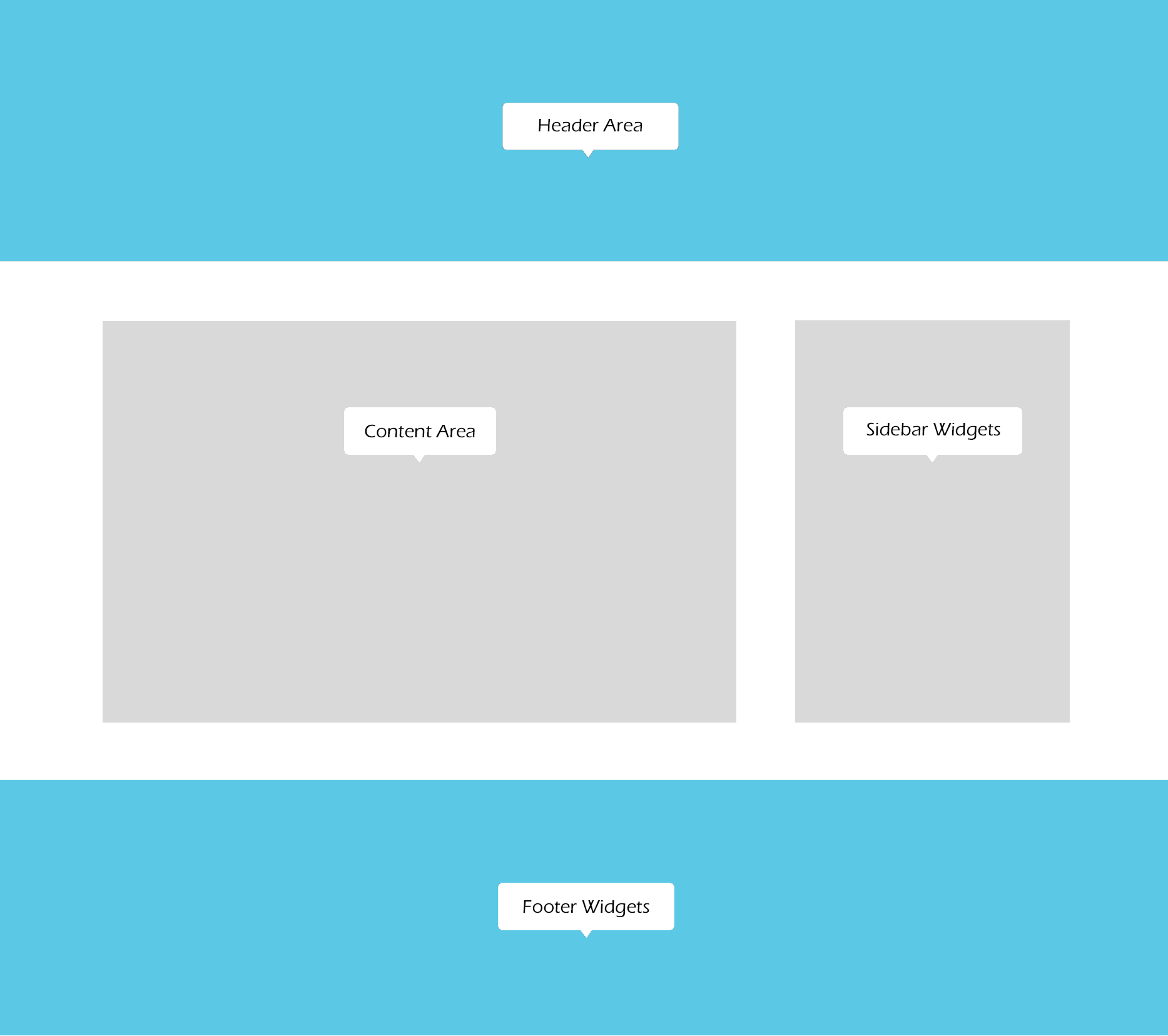
By default our theme supports 2 widget areas:
- Sidebar
- Footer
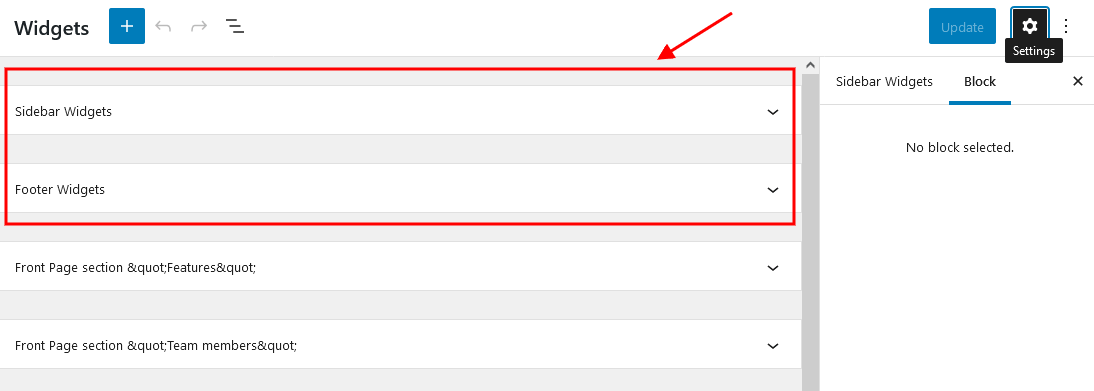
You can add widgets into widget areas by simply dragging and dropping.
But to see them on your website, you need to make sure you have a particular widgets set assigned to a particular default widget area. You can assign widgets sets either for the whole website (in Appearance > Customize), or for a specific page (single Page > Theme Options > Content/Footer).
IMPORTANT! The Sidebar/Footer widgets are available for "Default" sidebar/footer styles ONLY!
To manage custom sidebar or custom footer styles, proceed to the Dashboard > Theme Layouts tab and update the corresponding sidebar/footer layout.
Widgets Sets Assignment for the Whole Site
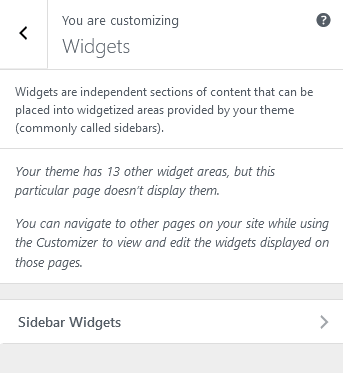
Body widgets (for sidebar) are accessible in the Appearance > Customize > General section.
The sidebar widgets work for the Default Sidebar Style only! Otherwise, navigate to the WP Dashboard > Theme Layouts > Sidebar tab to manage the sidebar layout.
Footer widgets are available for managing in the Appearance > Customize > Footer section. The footer widgets work for Default Footer Style only! Otherwise, you need to customize the corresponding footer Layout in WP Dashboard > Theme Layouts > Footer.
Widgets Sets Assignment for a Specific Page
If you want to specify a widgets set for a separate page, open that page in your WordPress admin, and in the Theme Options section choose the required widgets. The widgets assigned in Theme Options would be applicable only to that particular page.
Customizing Widgets Sets that are already enabled on a Specific Page
Depending on the selected page that is available for editing with Customizer’s tools, you can notice different kinds of widgets sets on a particular page. The same can be done through Appearance (WP Dashboard) > Widgets.
Below are options responsible for managing widgets/blocks.
- Add a Widget (for Classic Widgets Editor) or Add a Block (for New Block Widgets Editor): just click on the "Add a Widget/Block" button to see the available widgets, then choose the one you want to use:
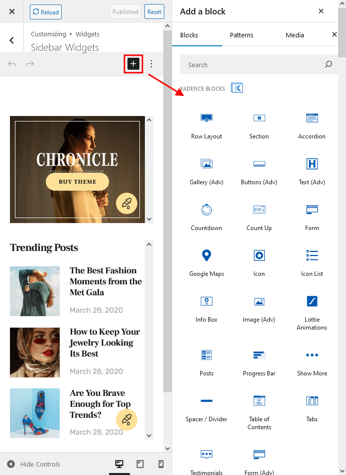 Click on the block itself to open its settings (for New Block Widgets Editor).
- Reorder the position of widgets using three icons:
- Move - moves the widget to another sidebar.
- Down - moves the widget down.
- Up - moves the widget upwards.
After you reorder the position of the widgets/blocks in the sidebar, save your changes.
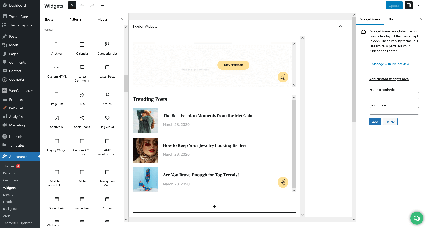
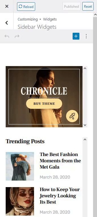
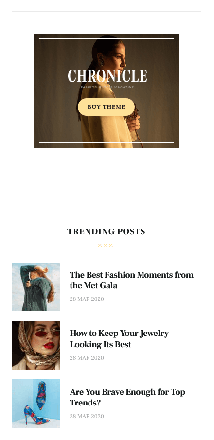
See the example of how the Sidebar Widgets Set may look like ("Default" sidebar style):
Custom Widgets
Moreover, our theme provides a few Custom Widgets that are available in the Appearance > Widgets section (for New Block Widgets Editor - under the "Widgets" group).
- ThemeREX About Me: Displays a photo and description of the website’s owner or any other person. If you leave the options empty, they will inherit data from the following options on the admin’s profile page: "Profile Picture" (for photo), "Username" (for name), and "Biographical Info" (for description). You can hide any option by inserting the
#sign in the corresponding field in the widget’s settings. - ThemeREX Audio Player: Shows an audio player to play an audio file uploaded locally (from your Media library) or an external one (through embedded HTML code). The system ignores the "Audio caption" and "Author name" options, if the embedded code is used.
- ThemeREX Banner: Displays a regular banner image linked or not as well as any object inserted using HTML code (banner, iFrame for video, audio, etc.).
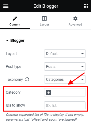
- ThemeREX Blogger: Shows posts, pages, or custom post types from a specified category or group. By default, the widget outputs single posts.
You can create additional layouts to output the posts in WP Dashboard > Theme Layouts using the Blog layout’s type (Item Options section). Please see Creating Layouts section of this documentation file for more information. - ThemeREX Categories list: Shows a list of post or product categories/tags/formats, layouts, or CPT groups. By default, it inserts post categories. In this case, the images are inherited from Posts (WP Dashboard) > Categories > single category (if this function is available for a particular theme).
- ThemeREX Instagram Feed: Outputs the latest photos from your Instagram account or demo photos in a form of a feed on your WordPress website. You can connect to your Instagram account in the Theme Panel (WP Dashboard) > ThemeREX Addons > API section (you need a valid Instagram Access Token).
Demo mode means that the images will be taken from your demo folder (/wp-content/uploads/). - ThemeREX Layouts: Displays already built custom layout from the Theme Layouts (WP Dashboard) > All Layouts menu.
- ThemeREX Posts by Rating: Outputs the most rated posts (extended) with images and post meta.
- ThemeREX Product Filters: Displays advanced search form for products. This widget requires the WooCommerce plugin to be active. Please note that the widget in "Inline" style works on all pages. The rest available styles work on a shop list page only!
- ThemeREX Recent News: Shows the most recent news.
- ThemeREX Recent Posts: Displays the most recent posts.
- ThemeREX Slider: Outputs the slides via Posts (Swiper) Slider or Revolution Slider (if the Slider Revolution plugin is provided with the theme).
- ThemeREX Socials: Shows the links to social network profiles. The social icons inherit the links (URLs) to your social profiles specified in the Theme Panel (WP Dashboard) > ThemeREX Addons > Socials tab.
- ThemeREX Twitter: Displays latest tweets from Twitter account.
- ThemeREX Video List: Shows a video list with videos from posts of "Video" post format type. A URL or embed code for the video should be specified in the single post’s settings, Item Options > Video > Video List section.
- ThemeREX Video Player: Shows a video player. The widget supports direct links from YouTube, Vimeo, or locally downloaded video files. You can also insert a video through HTML code from any video hosting platform.
- ThemeREX WooCommerce Title: Displays a page title, breadcrumbs, and a description of a product category on shop-related pages (shop list pages and single products). This widget works if a header layout does NOT contain the page title and breadcrumbs. The description inherits content from the back-end settings of a definite product category. The description becomes visible on product category pages ONLY! This widget requires the WooCommerce plugin to be active.
PLEASE NOTE! Please be aware that this theme does not provide any examples of custom sidebar layouts. Feel free to create your own ones, using a user-friendly Elementor. Check the "Theme Layouts" section for more information.
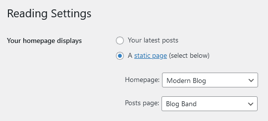
Homepage Settings
The settings of this group are responsible for selecting the way to display a homepage (front page), as a blog stream or a static one and specifying the pages to be set as a static homepage and as a posts page.
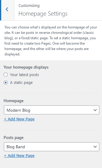
IMPORTANT! Please be aware that these settings are also available for editing through the Settings > Reading section.
Blog
These settings are responsible for customizing blog-related pages.
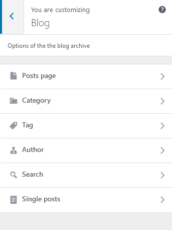
Blog > Posts page
The settings of this group allow you to manage the overall look and behavior of post pages.
These settings are applied to all types of blog pages, including post pages defined in the WordPress settings (Posts) as well as pages created via the Blog Archive template (unless no custom settings are specified in the Theme Options panel of a particular page/post).
Please check our article or visit this video tutorial for more information on how to add/customize the Posts pages.
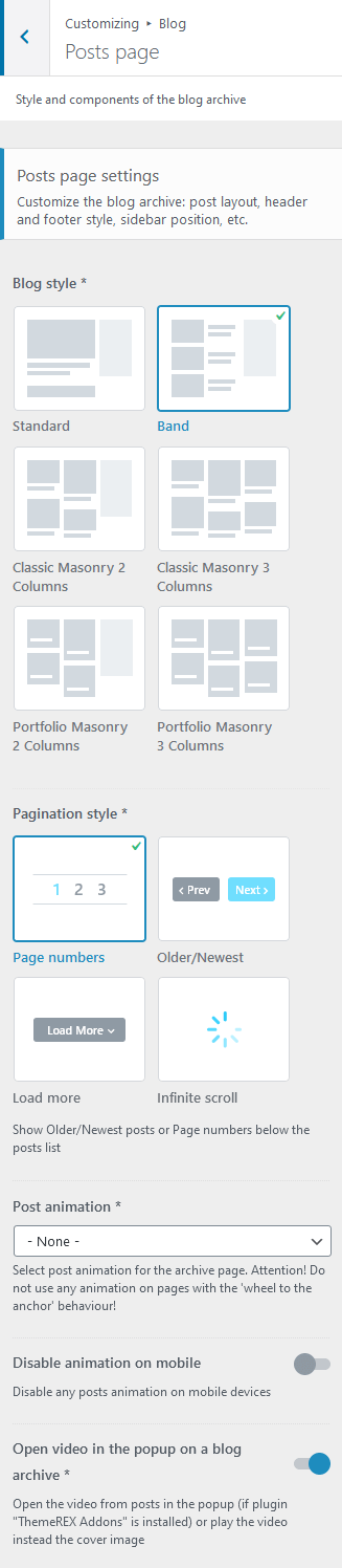
Posts page settings
- Blog style - choose the style to output blog posts.
You can create additional layouts to output the posts in WP Dashboard > Theme Layouts using the Blog layout’s type (Item Options section). Please see Creating Layouts section of this documentation file for more information. - Excerpt length - regulates the length of the post excerpt (in words) (for "Standard" blog style). If the post excerpt is explicitly specified - it appears unchanged.
- Pagination style - select between page numbers, older/newest posts links, load more button or infinite scroll.
- Post animation - choose one of the post animation styles. Do not use any animation for pages with full-screen scrolling behavior, such as Chess 2 columns.
- Disable animation on mobile - disable any posts animation and hover animation for metadata in custom layouts that are viewed on mobile devices.
- Open video in the popup on a blog archive - open the video from posts in the popup window (if plugin "ThemeREX Addons" is installed) or play the video instead of the cover image on a blog stream page.
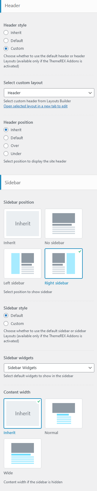
Header-related settings
These settings allow selecting a header style and position. For custom header style, you can specify a header layout, that is available for managing in WP Dashboard > Theme Layouts > Header.
Sidebar-related settings
- Sidebar position - moves the sidebar to the right or left-hand side of the page, or hides it. The Inherit option inherits the value specified in the Appearance > Customize > General panel.
Additional options for "Left/Right" sidebar position:
- Sidebar style - choose whether to use a default sidebar or a custom sidebar layout (available only if the ThemeREX Addons plugin is activated).
For a "Default" sidebar style:
- Sidebar widgets - specify which widgets set to show in the sidebar area. The widgets are available in Appearance (WP Dashboard) > Widgets.
- Select custom layout - select already built sidebar layout. You can create new sidebar layouts or customize the existing ones in the Dashboard > Theme Layouts tab, using a user-friendly Elementor. Check the Theme Layouts section for more information.
- Sidebar style - choose whether to use a default sidebar or a custom sidebar layout (available only if the ThemeREX Addons plugin is activated).
- Content width - choose the content width if the sidebar is hidden.
Advanced settings
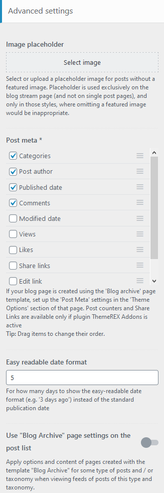
- Image placeholder - if a post has no featured image, this image will be used instead.
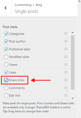
- Post meta - choose which post meta elements to display. Views and Likes are available only if the ThemeREX Addons plugin is active.
- Easy Readable Date Format - specify for how many days to show the human-friendly date format (e.g.: 2 days ago) instead of the regular publication date.
- Use "Blog Archive" page settings on the post list - if checked, this option allows all posts (post lists) from subcategories to inherit page settings from their parent category and not the general ones.
If the page is created using the Blog Archive template, the post meta settings should be specified in the Theme Options > Content section of that page.
Blog > Category/Tag/Author/Search
Here you can set the overall view of a single category/tag/author/search posts page.
Category/Tag/Author/Search posts page settings
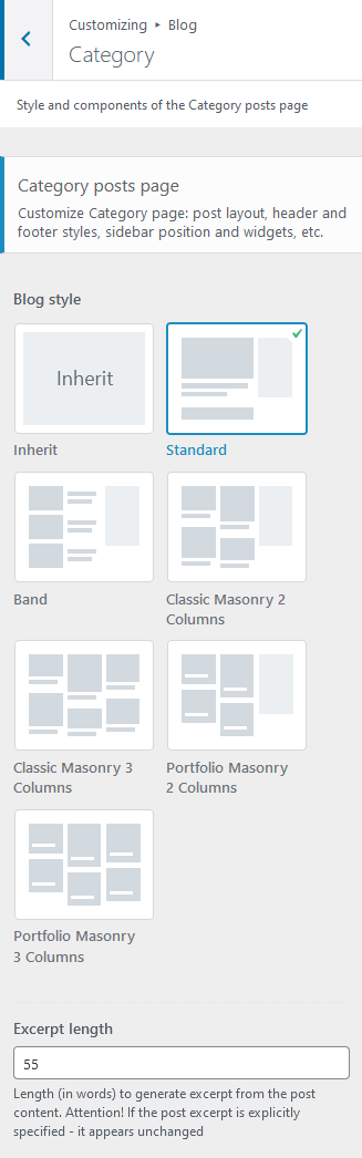
- Blog style - choose the style to output single category/tag/author/search posts.
You can create additional layouts to output the category/tag/author/search posts in WP Dashboard > Theme Layouts using the Blog layout’s type (Item Options section). Please see Creating Layouts section of this documentation file for more information. - Excerpt length - regulates the length of the post excerpt (in words) (for "Standard" blog style). If the post excerpt is explicitly specified - it appears unchanged.
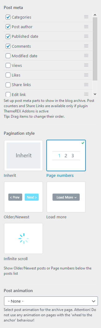
- Post meta - enable/disable the additional post information, such as date, author, comments, etc. You can also change their order by dragging and dropping.
- Pagination style - select between page numbers, older/newest posts links, load more button or infinite scroll.
- Post animation - choose one of the post animation styles. Do not use any animation for pages with full-screen scrolling behavior, such as Chess 2 columns.
Header-related settings
These settings allow selecting a header style and position. For custom header style, you can specify a header layout, that is available for managing in WP Dashboard > Theme Layouts > Header.
Sidebar-related settings
- Sidebar position - moves the sidebar to the right or left-hand side of the page, or hides it. The Inherit option inherits the value specified in the Appearance > Customize > General panel.
Additional options for "Left/Right" sidebar position:
- Sidebar style - choose whether to use a default sidebar or a custom sidebar layout (available only if the ThemeREX Addons plugin is activated).
For a "Default" sidebar style:
- Sidebar widgets - specify which widgets set to show in the sidebar area. The widgets are available in Appearance (WP Dashboard) > Widgets.
- Select custom layout - select already built sidebar layout. You can create new sidebar layouts or customize the existing ones in the Dashboard > Theme Layouts tab, using a user-friendly Elementor. Check the Theme Layouts section for more information.
- Sidebar style - choose whether to use a default sidebar or a custom sidebar layout (available only if the ThemeREX Addons plugin is activated).
- Content width - choose the content width if the sidebar is hidden.
Blog > Single posts
The settings of this group are responsible for managing the overall look and behavior of single posts’ pages.
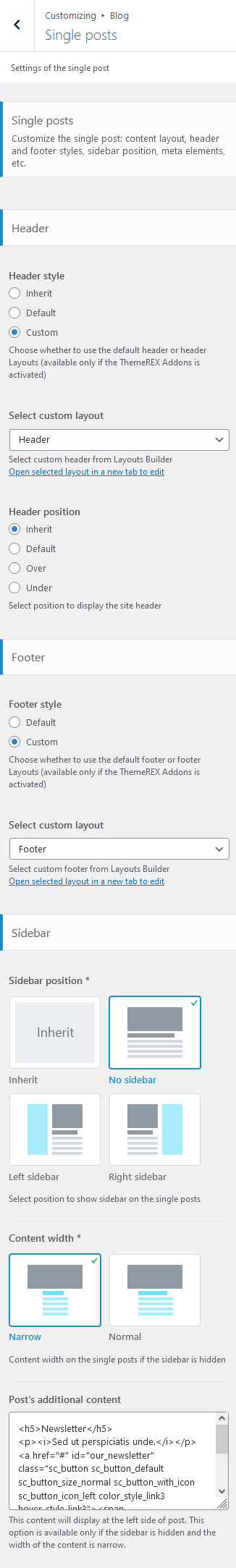
Header-related settings
These settings allow selecting a header style and position. For custom header style, you can specify a header layout, that is available for customizing in WP Dashboard > Theme Layouts > Header.
Footer-related settings
These settings are responsible for selecting a footer style. For a "Custom" footer style, the "Select custom layout" option is available. You can manage these footer layouts in the WP Dashboard > Theme Layouts > Footer tab.
Sidebar-related settings
- Sidebar position - moves the sidebar to the right or left-hand side of the page, or hides it. The Inherit option inherits the value specified in the Appearance > Customize > General panel.
Additional options for "Left/Right" sidebar position:
- Sidebar style - choose whether to use a default sidebar or a custom sidebar layout (available only if the ThemeREX Addons plugin is activated).
For a "Default" sidebar style:
- Sidebar widgets - specify which widgets set to show in the sidebar area. The widgets are available in Appearance (WP Dashboard) > Widgets.
- Select custom layout - select already built sidebar layout. You can create new sidebar layouts or customize the existing ones in the Dashboard > Theme Layouts tab, using a user-friendly Elementor. Check the Theme Layouts section for more information.
- Sidebar style - choose whether to use a default sidebar or a custom sidebar layout (available only if the ThemeREX Addons plugin is activated).
- Content width - choose the content width if the sidebar is hidden.
- Post’s additional content - specify info to be displayed on the left side of a post. This option is available only if the sidebar is hidden and the width of the content is narrow.
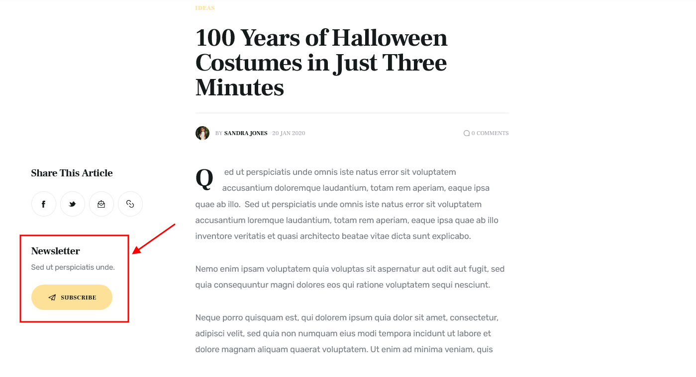 By default, the button opens a popup window with a subscription form. The popup requires the Advanced Popups plugin to be active. You can manage the popup in WP Dashboard > Settings > Popups tab > "Our Newsletter" popup. The subscription form is created using the MailChimp for WordPress plugin.
<h5>Newsletter</h5>
<p><i>Sed ut perspiciatis unde.</i></p>
<a href="#" id="our_newsletter" class="sc_button sc_button_default sc_button_size_normal sc_button_with_icon sc_button_icon_left color_style_link3 hover_style_link3"><span class="sc_button_icon"><span class="icon-plain"></span></span><span class="sc_button_text"><span class="sc_button_title">Subscribe</span></span></a>
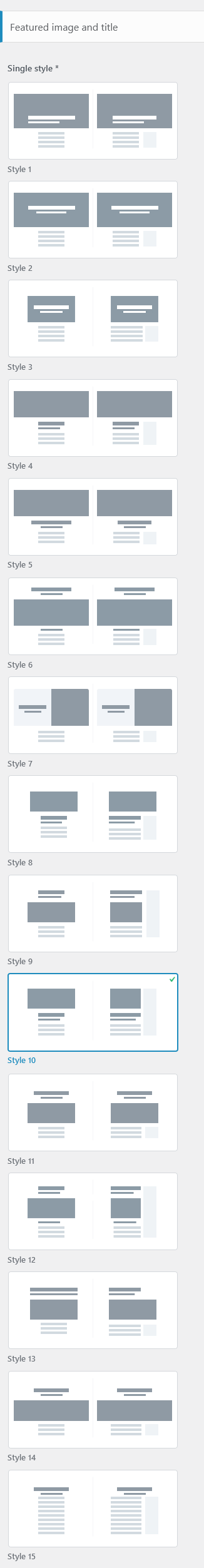
Featured image and title
- Single style - choose the style to output the featured image and the title on a single post;
The position of the featured image, post title, and meta can be overridden by the settings of "Layouts: Title and Breadcrumbs" and Elementor "Layouts: Featured Image" widgets in a custom header layout!
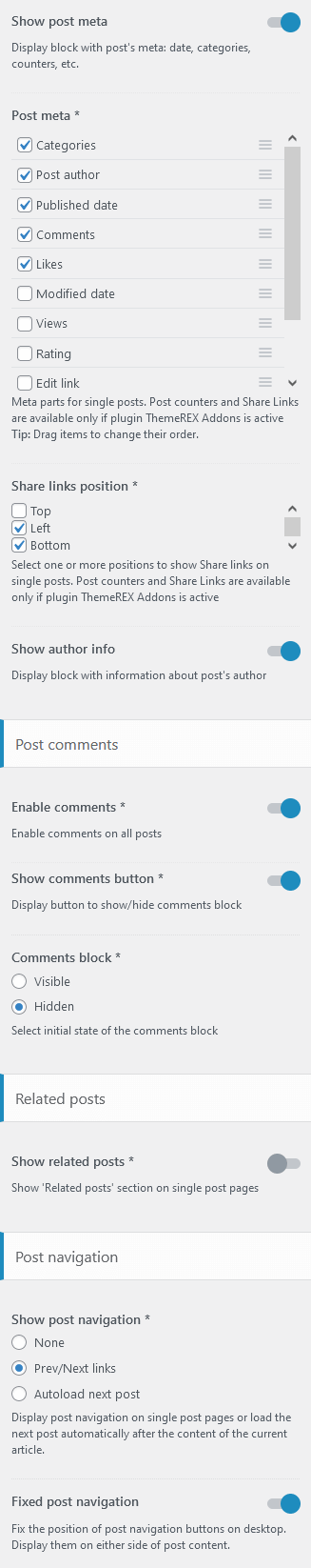
- Show post meta - enable/disable the additional post information, such as date, author, comments, etc. If this option is enabled, choose which post meta elements to display. You can also change their order by dragging and dropping.
- Share links position - specify the position of social media sharing buttons on single posts (top/left/bottom);
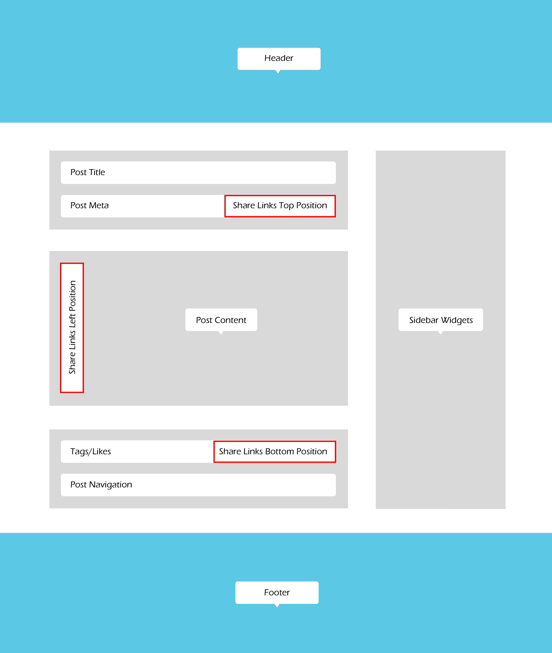 In order to output the social links in the "Top position" (above the content area), please make sure the social links are enabled in the post meta section (Appearance > Customize > Blog > Single Posts).
- Show author info - show/hide the author bio section;
Post Comments settings
You can enable comments on a single post’s page.
- Show comments button - enables comments button;
- Comments block - specify the initial state of the comments block: fully displayed or hidden under a button;
Related Posts settings
Here, you can enable related posts on a single post’s page ("Show related posts" option).
- Related posts style - select the related posts style;
- Related posts position - specify the position to display the related posts;
- Related posts - select the number of related posts to show;
- Related columns - set the number of columns the section should be divided into (from 1 to 4);
- Use slider layout - enable this option to display related posts in a form of a slider if the related posts count is more than columns count.
- Slider controls - enable the arrows in the slider and choose their position.
- Space between slides - specify the space between the slides in pixels.
Posts navigation
This option enables/disables post navigation on a single post’s page. The following styles of the post’s navigation are available:
- None - without navigation;
- Prev/Next links - displays thumbs and links for prev/next posts below the post’s content. "Fixed posts navigation" fixes the Prev/Next links to the sides of the screen below the post’s content.
- Autoload next post - inserts the next posts inside the content area of a viewed post, just under the content of the viewed post itself. Here, you can specify whether to load only the content or the full post as well as show or hide the author bio/related posts/comments of the next posts.
Shop
These settings are responsible for customizing shop-related pages (works only if the WooCommerce plugin is installed).
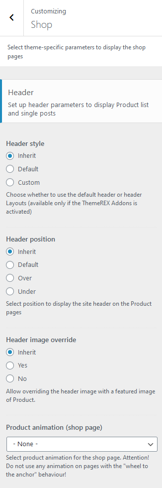
Header-related settings
These settings allow selecting a header style and position, and choosing whether to override the header image with the post’s featured image or not. For custom header style, you can specify a header layout, that is available for customizing in WP Dashboard > Theme Layouts > Header.
Product List settings
- Product animation (shop page) - select product animation for the shop archive page. Do not use any animation on pages with the "wheel to the anchor" behavior!
Sidebar-related settings
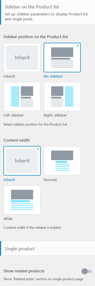
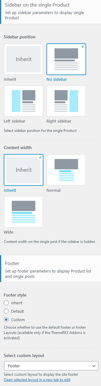
These settings are responsible for specifying a sidebar style and the position of the sidebar area on the Shop List page and single product posts.
- Sidebar position - moves the sidebar to the right or left-hand side of the page, or hides it.
Additional options for "Left/Right" sidebar position:
- Sidebar style - choose whether to use a default sidebar or a custom sidebar layout (available only if the ThemeREX Addons plugin is activated).
For a "Default" sidebar style:
- Sidebar widgets - specify which widgets set to show in the sidebar area. The widgets are available in Appearance (WP Dashboard) > Widgets.
- Select custom layout - select already built sidebar layout. You can create new sidebar layouts or customize the existing ones in the Dashboard > Theme Layouts tab, using a user-friendly Elementor. Check the Theme Layouts section for more information.
- Sidebar style - choose whether to use a default sidebar or a custom sidebar layout (available only if the ThemeREX Addons plugin is activated).
- Content width - select the content width if the sidebar is hidden.
Single Product settings
- Show related products - enable/disable the "Related Products" section on a single product page.
- Related products - specify the number of related products to be displayed on a single product page.
- Related columns - specify the column quantity to divide the related products in on a single product page.
PLEASE NOTE! By default, the related products section (without a subtitle) is hidden globally for single products. The related products section (with a subtitle) on demo single products is a part of custom footer layout and should be customized in the WP Dashboard > Layouts tab.
Footer-related settings
These settings allow you to manage a footer style. For a "Default" footer style, specify widgets sets and widgets’ column quantity as well as choose whether to expand the footer for the whole width of the page ("Footer fullwidth" option). For a "Custom" footer style, the "Select custom layout" option is available. You can manage these footer layouts in the WP Dashboard > Theme Layouts > Footer tab.
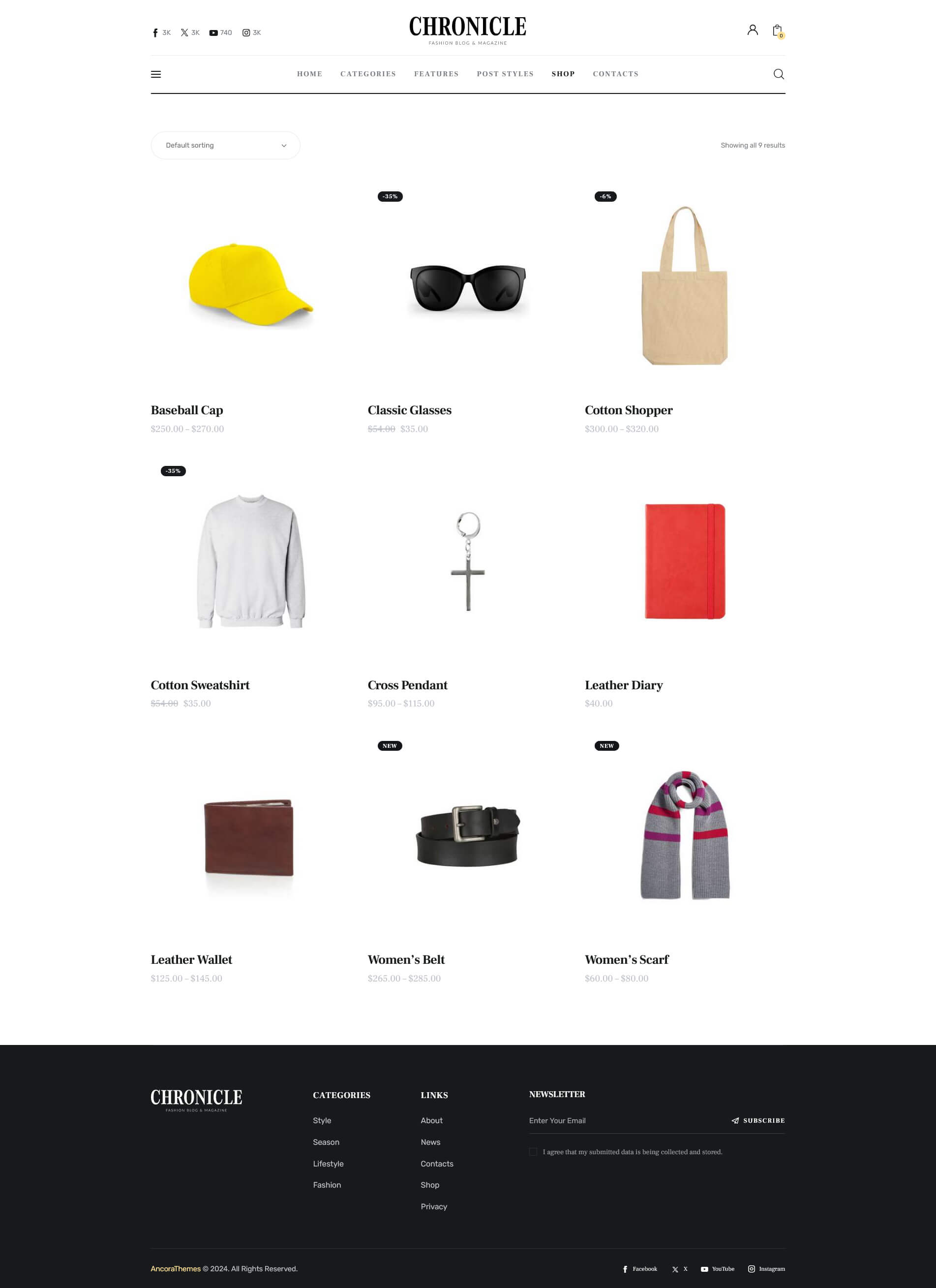
This is how the pre-built Shop page looks like with default settings.
WooCommerce
The settings of this group allow managing the overall look of the WooCommerce elements (works only if the WooCommerce plugin is installed). The single products can be added/customized in WordPress Dashboard Menu > Products.
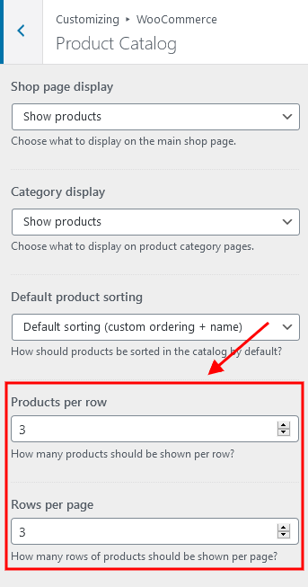
The quantity of products displayed on a shop page is inherited from the Appearance > Customize > WooCommerce > Product Catalog section.
Typography
Here you can upload fonts and adjust font settings for specific typography elements.
Check this article or video tutorials for more information on how to add new Google Fonts and Custom Fonts.
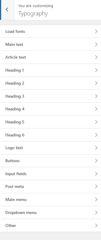
The theme enables you to use both Google Fonts and custom fonts in your design. You can load up to 5 different font families, including different styles and weights for each typeface.
IMPORTANT! To manage the fonts quantity available for upload, edit 'max_load_fonts' => 5 variable in theme-specific/theme.setup.php file.
Colors
The theme allows you to assign color schemes to specific parts of your website. This is useful for highlighting certain areas and giving them a distinctive look.
The theme supports 2 color schemes: default (light) and dark.
Check this video tutorial for more information on how to customize color schemes.
IMPORTANT! Due to specifics of CSS rules, you are unable to assign a light color scheme to any website part, if the dark color scheme is enabled.
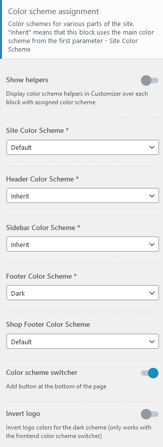
Here are the website parts to which you can assign color schemes:
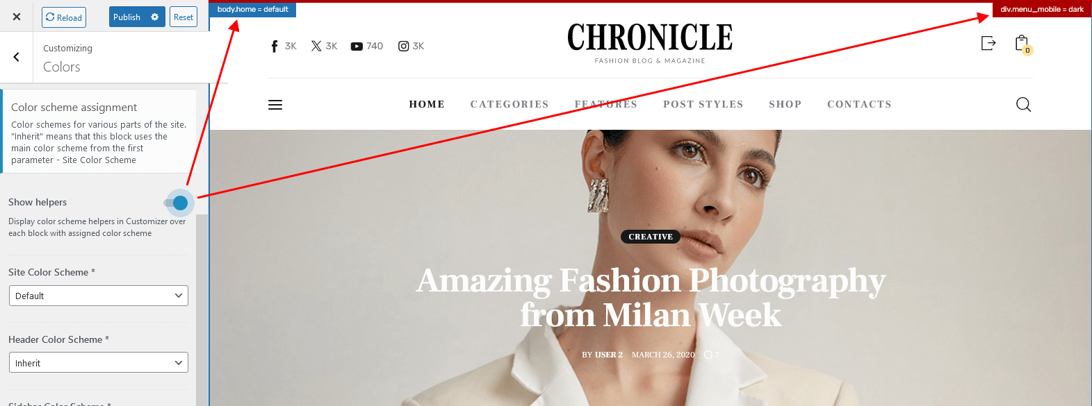
- Show Helpers - enables a colored border around a block in the Customizer with an element’s name and color scheme applied to this particular element. The helper can be useful for editing the theme’s color schemes. It helps you understand the colors of what elements you are customizing.
- Site Color Scheme - defines the main color scheme of your website. If no other part of the website has a color scheme specified explicitly, affects the whole website. Otherwise, affects the body background color, body typography, and pretty much anything that is located below the header and above the footer areas (except the sidebar).
- Header Color Scheme - modifies the color scheme of the header.
- Sidebar Color Scheme - affects the color of the sidebar. The Inherit option inherits the value specified in the Site Color Scheme setting.
- Footer Color Scheme - specifies the color of your footer.
- Shop Footer Color Scheme - specifies the color of your footer on shop-related pages.
- Color scheme switcher - adds a button with a color scheme switcher to the right bottom corner of the page.
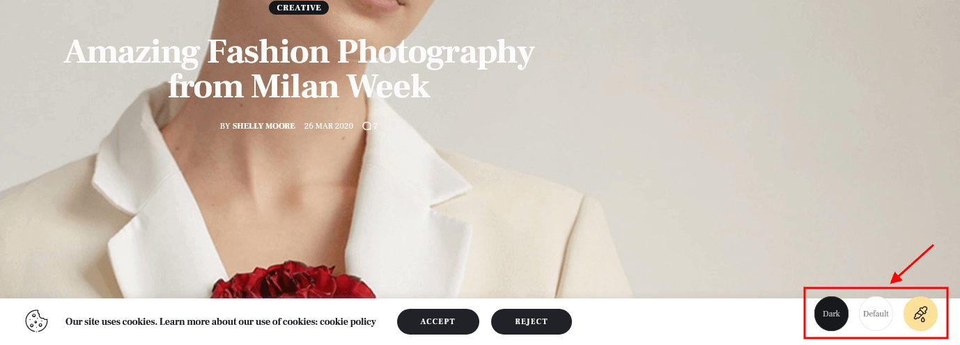
- Invert logo - inverts logo colors for the dark scheme (works only with the frontend color scheme switcher).
IMPORTANT! The color scheme switcher works only if the colors are set through the theme styles (are inherited from Appearance > Customize > Colors settings) and NOT through a page builder.
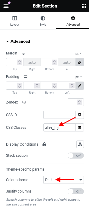
The alternative light background color for a section can be created using an additional CSS class .alter_bg. The background color inherits the value from "Alter > Background color" option in Appearance > Customize > Colors > your color scheme.
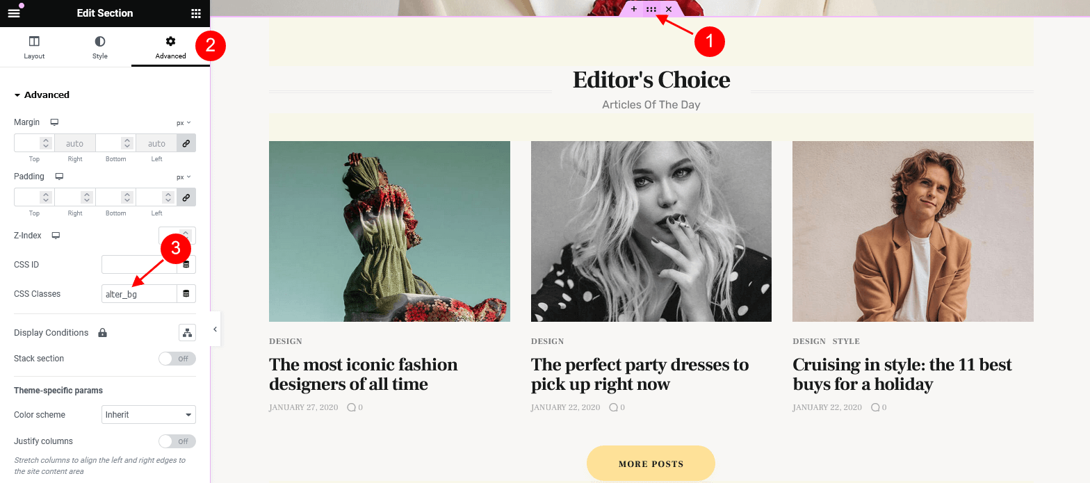
For the dark background just set "Dark" color scheme for a section/column.
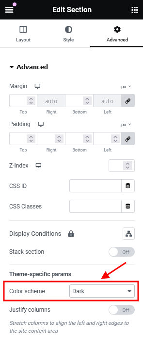
For middle grey background color (#212227) use a combination of "Dark" color scheme with CSS class .alter_bg, like it is done here.
You can also assign color schemes for individual pages in the Theme Options > Colors panel of those pages.
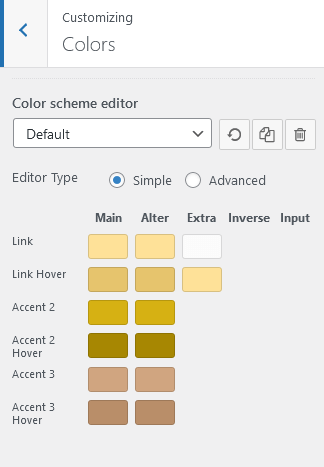
Color Scheme Editor
Here you can customize the color schemes of your website.
Three additional buttons are available:
- Reset - removes the current changes, made after your last saving.
- Copy - creates a new color scheme by duplicating the default one. Thus, it is possible to set different color schemes for particular pages and their parts.
- Delete - removes the current color scheme. You can delete only newly created color schemes. All default ones will remain.
Select the color scheme you want to customize and choose one of 2 modes (editor types) - simple or advanced.
In a simple mode, you can customize the accent colors (link colors) of a theme. If you want to dig deeper, switch to the advanced mode. You can entirely change the theme colors.
Both modes contain the following groups of settings:
MAIN
The main color group of a website. Here you can find the following elements:
- Background color - the main background color of a website; (for advanced mode only)
- Border color - color used for elements with a border and for content delimiters; (for advanced mode only)
- Text - color for the main body text; (for advanced mode only)
- Text dark - color is mainly applied for headings and page/post titles; (for advanced mode only)
- Text light - color used for additional meta elements, such as post author, date, comments, etc. (for advanced mode only)
- Link - the main accent color of a website. The color can be used as a links color, a background color for buttons, and the color for minor elements, like list item markers, etc. By default, this setting sets the Link hover color for the Alter color group.
- Link hover - the hover color of the elements with the main accent color and the hover color for links. It can also be used as the main accent color for the Alter color group.
- Accent 2 - the second accent color;
- Accent 2 hover - the hover color of the elements with second accent colors;
- Accent 3 - the third accent color;
- Accent 3 hover - the hover color of the elements with third accent colors;
ALTER
Alter means alternative color group, mostly applied for the sidebar and footer, if a color scheme is assigned to them and it coincides with the site color scheme (NOT inherited). This group of colors can also be applied to page widgets or blocks that are output on some background by default (the background is NOT added through the page builders). Alter colors include the same elements as the Main color group, plus two additional hover colors for the border and background.
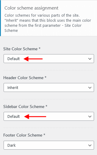
EXTRA
An additional color group for extra elements such as dropdowns, price blocks, table headers, blockquotes, etc.
As a rule, the text and background colors from the Extra group should contrast against the respective colors from the Main color group.
INVERSE (for advanced mode only)
Inverse elements are the elements that use the theme accent color (usually the main one) ("Link", "Accent 2", and "Accent 3" options) as a background color. In this way, they get a distinctive look and stand out from the rest of the content. You can apply these settings for buttons, blockquotes, dropdowns, etc.
- Border color;
- Border hover;
- Text color - the main body text color;
- Text dark - used for headings or other elements that need a darker color;
- Text light - used for meta elements that provide additional information;
- Link color - since the main accent color (i.e. the link color) sets the background color, you need to specify a different link color;
- Link hover - the hover color of the link;
INPUT (for advanced mode only)
Colors for form fields: input fields, text areas, select fields, etc.
- Background - background color of an input field;
- Background hover - background color when an input field is active;
- Border color;
- Border hover - border color when a field is active;
- Text - a regular text color;
- Text dark - the color of the text when a field is active (as you type in);
- Text light - used for the placeholder text when a field is not active before you type in;
In case the changes of the color schemes are not applied, please enable Debug mode (in Theme Panel > ThemeREX Addons > General tab) and save ThemeREX Addons settings.
Additional CSS
The settings of this group allow you to specify additional custom styles.
Homepages
This section covers the information about Pages on your website: included page templates, how to edit existing pages and add new ones.
You can import required pages, along with the page settings, using the Importer tool. Learn more about it in the Demo Content chapter.
New Page Creation
To create a new page navigate to the "Pages" dashboard menu item in your WordPress admin panel and click on the Add New button.
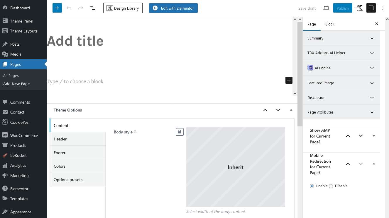
Page Templates
Choose either the "Blog Archive" (blog page) or "Default Template" (regular page) option in right panel > Page > Template. Check the Posts pages article to find out more information on how to customize them.
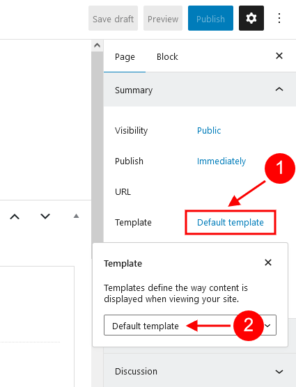
Elementor Page Builder-related tutorials
Usually, the page consists of Sections, Columns, Widgets, and some other elements that can be edited via Elementor. Before you start, please check the following tutorials:
- Official Elementor Tips page;
- Getting Started With Elementor;
- Official Documentation for Elementor page builder;
- Official Elementor Video Tutorials;
- Elementor Flexbox Containers - our video tutorial;
- How to Create a One-Page Website with WordPress & Elementor. And How to Convert a Multipage Site. - our video tutorial;
Custom Page Settings
Each page has a Theme Options panel, where you can specify custom page parameters.
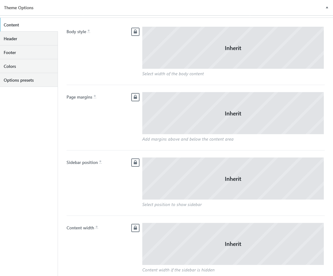
In Theme Options, you can assign a different header/footer style, widgets set, body style, as well as many other options for each individual page.
These settings are applied to the page you are editing and will overwrite the global settings specified in the Customizer.
Options Presets Group
Here you can save the page settings (for header, widgets, footer, etc.) as a preset template and duplicate these settings on a new page without checking the required options in each section of the Theme Options panel (Content/Header/Footer/Colors). All you need to do is to apply the already created preset template on a new page by using control icons ("Apply selected preset"/"Create a new preset"/"Delete selected preset"). The tooltips for the icons will help you.
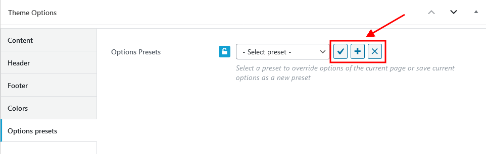
You can enable or disable the Theme Options panel in Preferences > General in the top right corner of the WordPress admin.
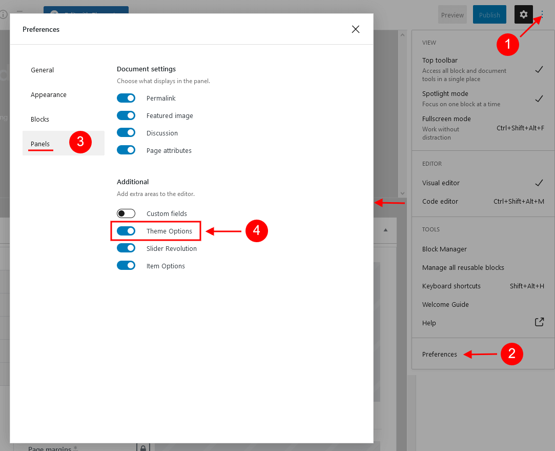
Assigning a Page as a Homepage
Once you finished building your page, assign it as a Homepage:
- Navigate to the Settings > Reading menu item in the WordPress dashboard menu.
-
In the Your homepage displays section select A static page (select below) option and choose the necessary page from the Homepage drop-down list.
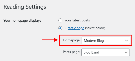
- Save the changes.
Alternatively, you can assign a page as a homepage in Appearance > Customize > Homepage Settings.
PLEASE NOTE! The Default skin comes with the following Homepages.
Modern Blog
Below, you can find the screenshots of "Modern Blog" front end with hotspots describing where you can customize content for a particular section and the "Theme Options" settings.
A color scheme switcher in our demo is enabled globally in the Appearance > Customize > Colors settings. You can easily enable/disable it, if needed.
IMPORTANT! The color scheme switcher works only if the colors are set through the theme styles (are inherited from Appearance > Customize > Colors settings) and NOT through a page builder.
The alternative light background color for a section can be created using an additional CSS class .alter_bg. The background color inherits the value from "Alter > Background color" option in Appearance > Customize > Colors > your color scheme.
For the dark background just set "Dark" color scheme for a section/column.
For middle grey background color (#212227) use a combination of "Dark" color scheme with CSS class .alter_bg, like it is done here.
In case you don't want to use the color scheme switcher on your website, you can also set or manage the background color/image for the page blocks in the Edit Section/Column > Style > Background tabs in the Elementor widgets panel.
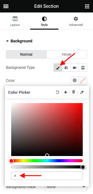
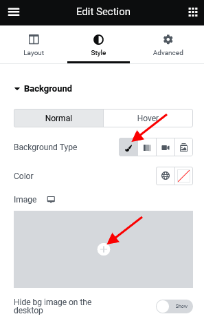
"Edit Section/Column > Advanced > Position" settings in the Elementor widgets panel let page blocks overlap each other, the following parameters are available:
- "Shift block" options - change the position of the selected block only, the rest blocks on the page remain unmoved.
- "Push block"/"Pull next block" options - move blocks by setting margins. All nearby blocks will shift accordingly.
You can also set the entrance animation for page elements in Edit Section/any element > Advanced > Motion Effects.
The main additional CSS classes used in the theme are described in the Custom CSS Classes chapter of this documentation file.
Theme Options settings (Modern Blog):
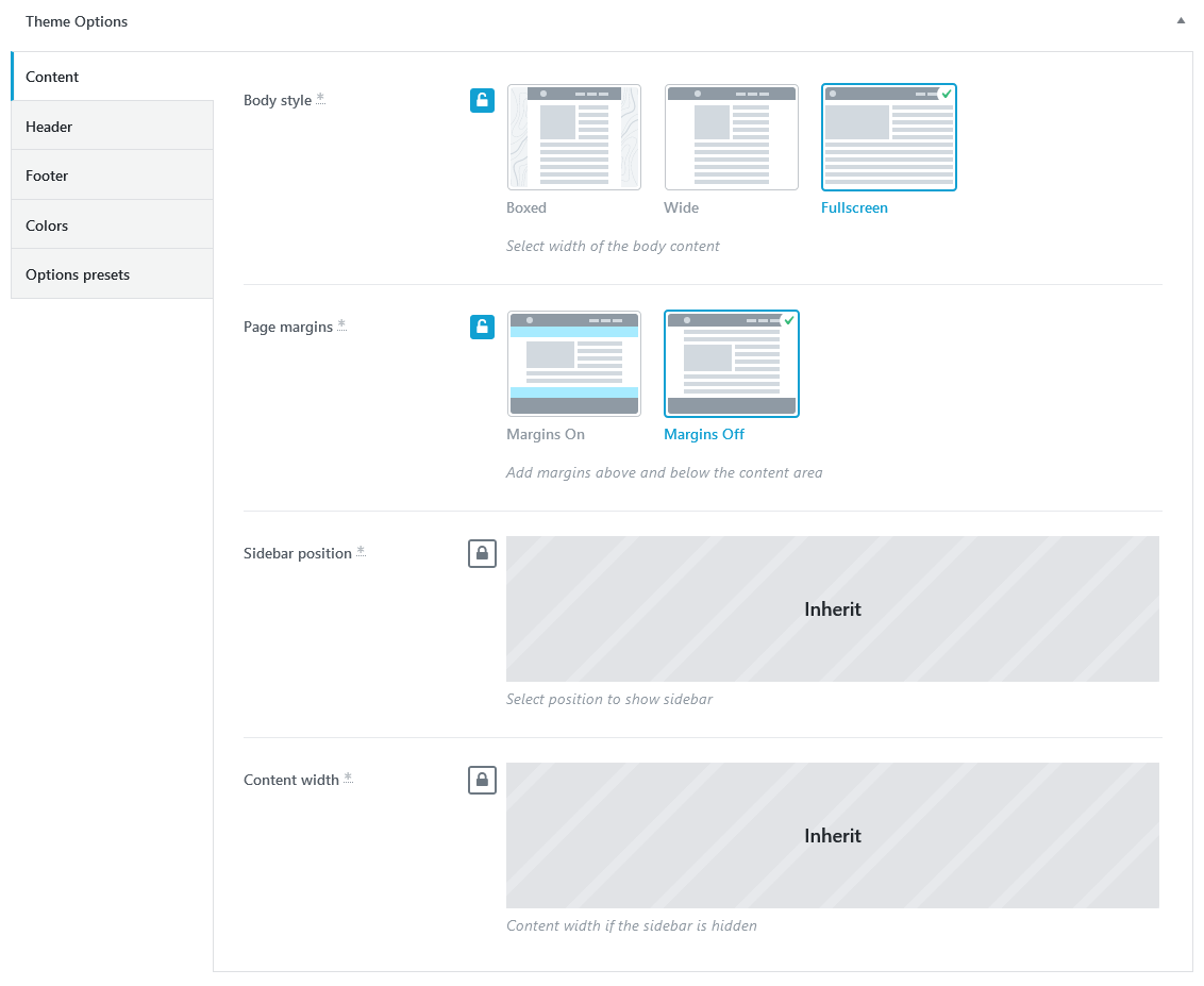
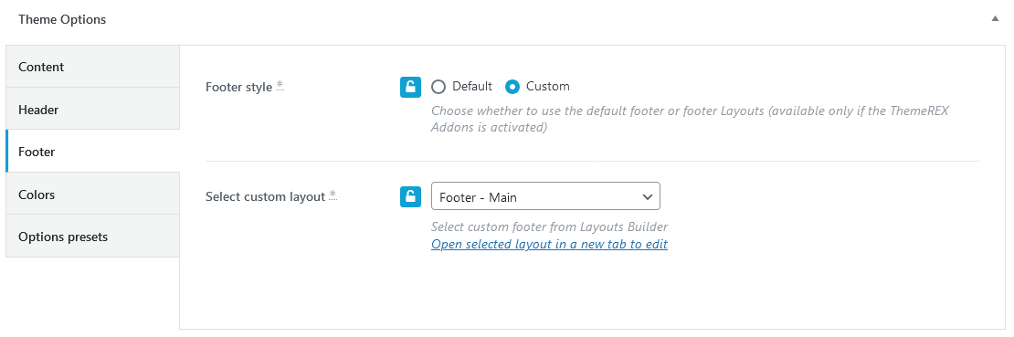
Classic Blog
This is what the second homepage looks like.
Theme Options settings (Classic Blog):
Video Blog
This is what the third version looks like.
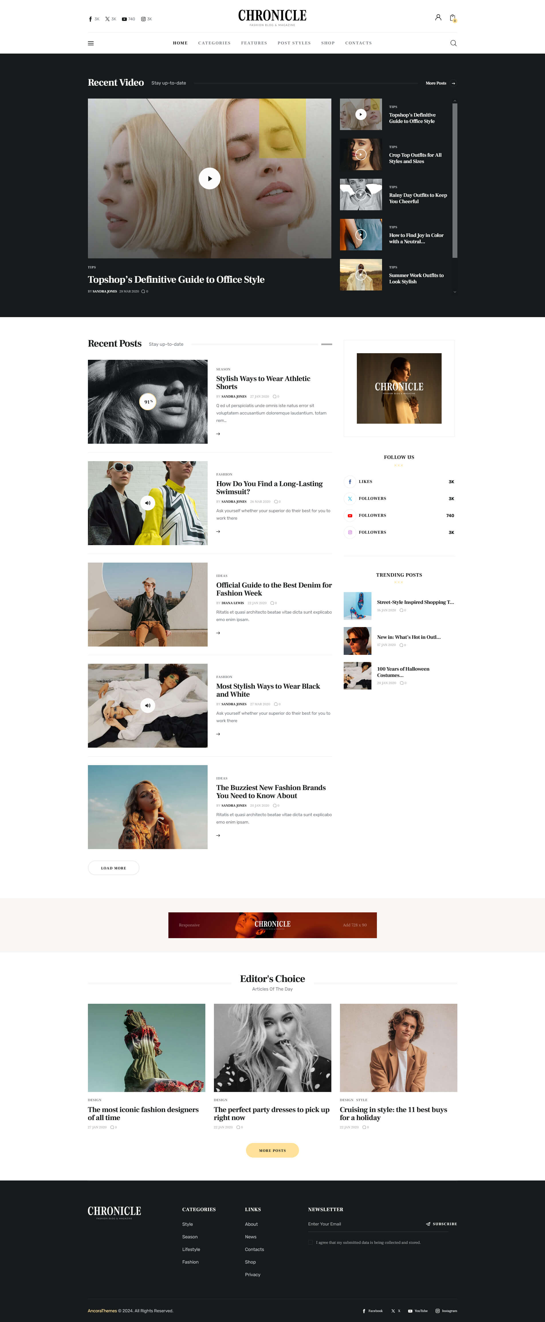
Theme Options settings (Video Blog):
About Page
In this chapter, we will show how the team section is created. The images and the names of the team members on our demo are for examples only! You will get the placeholders and default names, like "User 1", "User 2", etc. in the theme package.
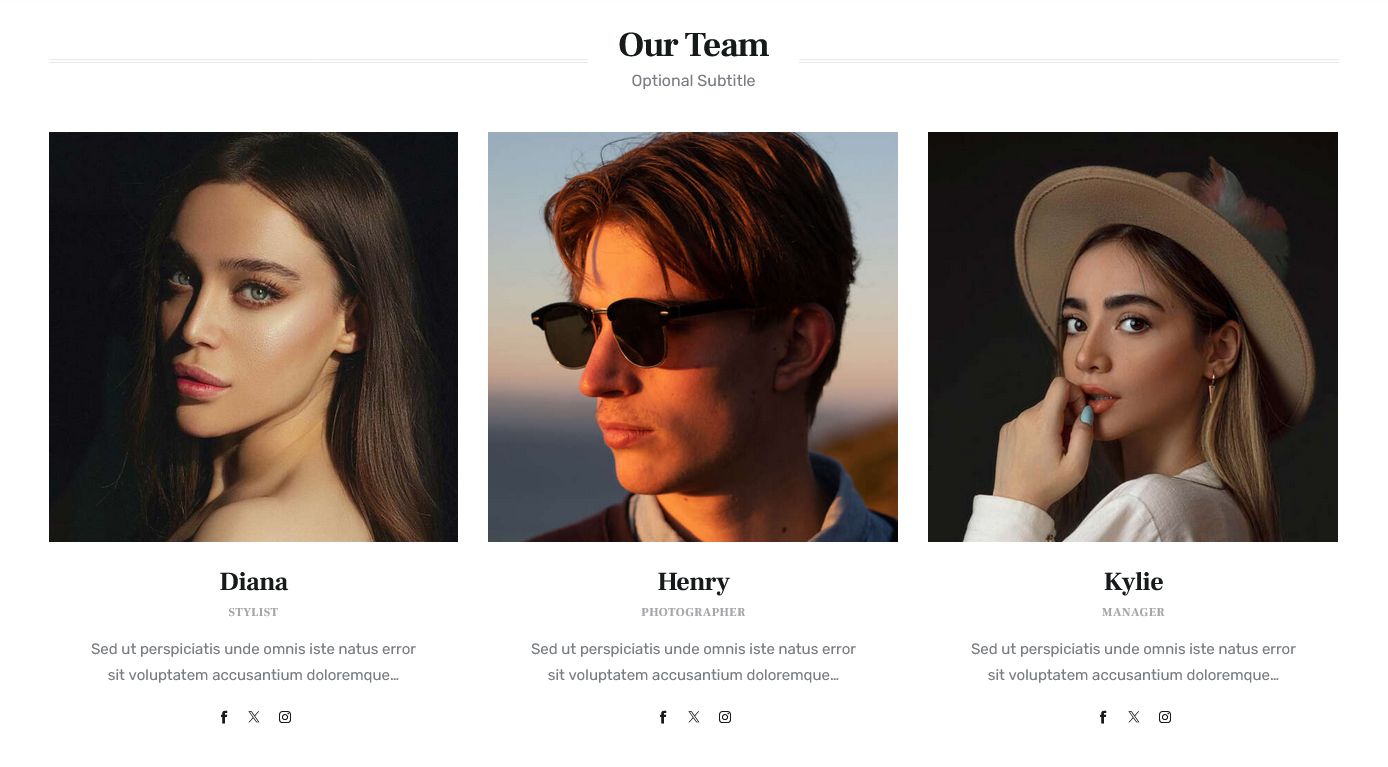
This section displays available users from Users (WP Dashboard) and requires the Powerkit plugin to be active, "Author Box" module.
The "Author Box" module adds an "Author" widget to the Elementor widgets panel. You can configure the widget options to your needs.
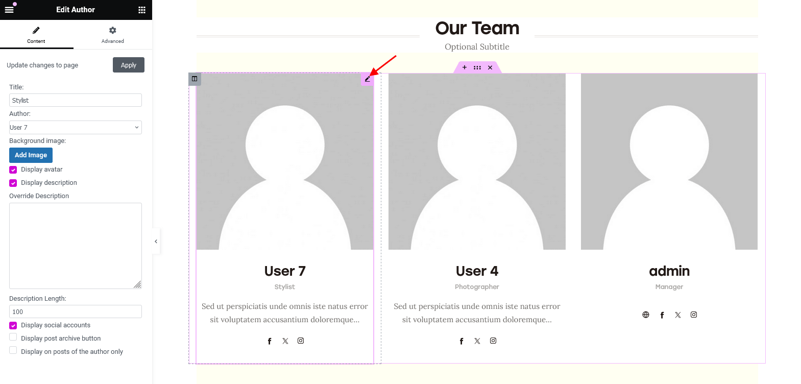
The users' photos on our demo are added using a third-party plugin, WP User Avatar, which is not provided with the theme.
Custom CSS Classes
PLEASE NOTE! We have used additional CSS classes to make the page blocks look like in our demo.
-
.plainAnimation- animates an image (for default Elementor "Image" widget).
-
.elementor-sidebar- stylizes a column with a sidebar on the demo homepages.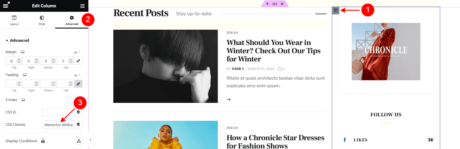
-
.link_hover_1- the color of the link hover is inherited from "Main > Text Dark" option in Appearance > Customize > Colors (for the default Elementor "Heading" widget).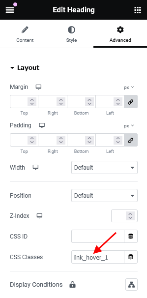 Since the color scheme of the main section is set to dark, the link hover is white:
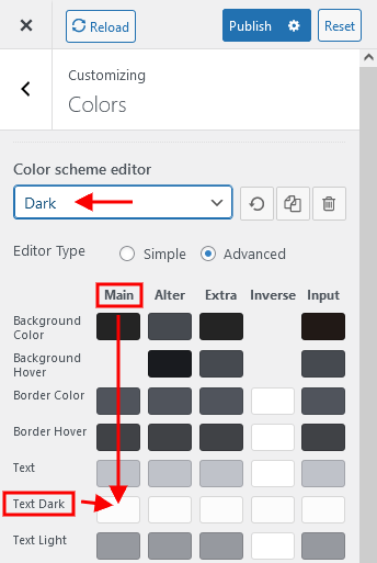
-
.alter_bg- the background color for the section is inherited from "Alter > Background color" option in Appearance > Customize > Colors. Please view the demo "Modern Blog" homepage for more information.
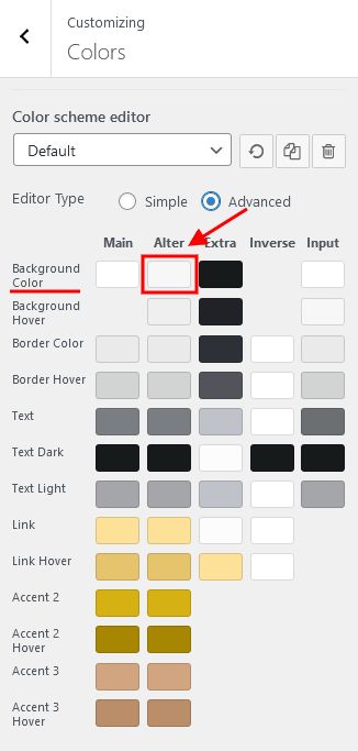
Responsive classes:
-
.blogger_columns_1and.blogger_columns_2- regulate the width of the column with Blogger widget on different screen sizes.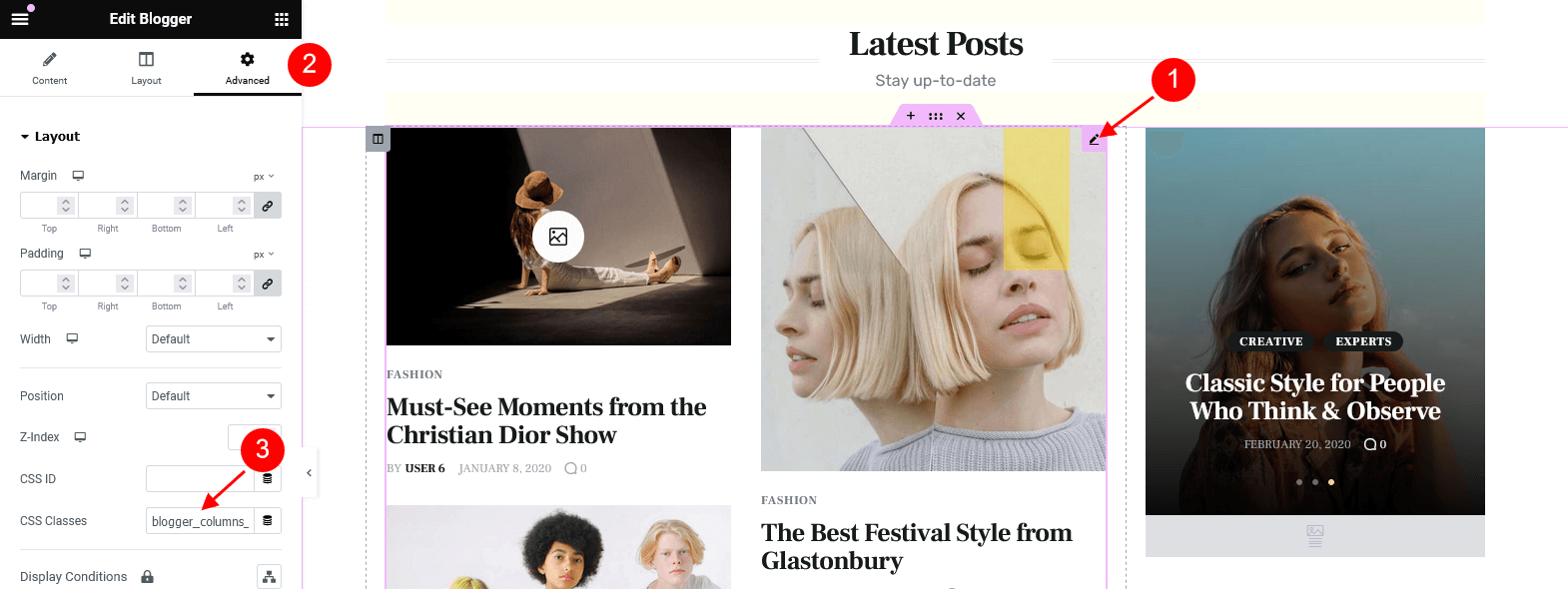
-
.blogger_content_1,.blogger_content_2,.blogger_content_3, and.blogger_content_4- control the output of Blogger widget on homepages on different screen sizes.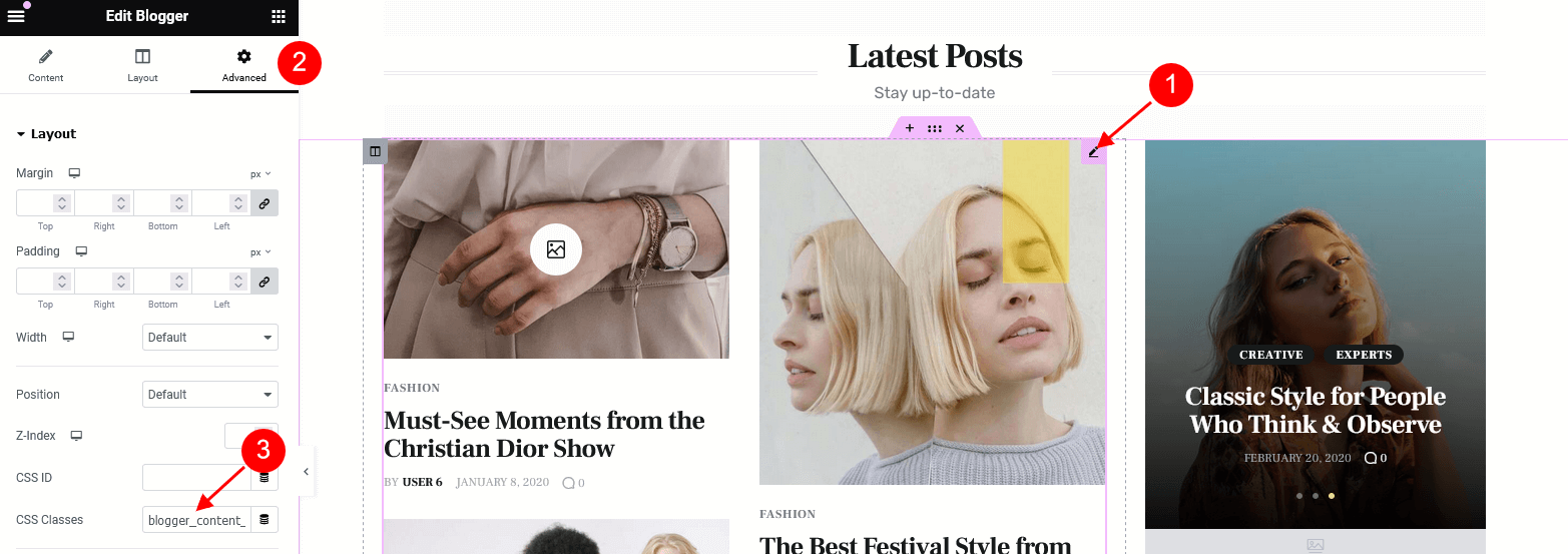
-
.blogger_ratio_1,.blogger_ratio_2,.blogger_ratio_3,.blogger_ratio_4,.blogger_ratio_5,.blogger_ratio_6,.blogger_ratio_7,.blogger_ratio_8,.blogger_ratio_9and.blogger_ratio_10- regulate the top paddings for smooth browsing (for Blogger widget).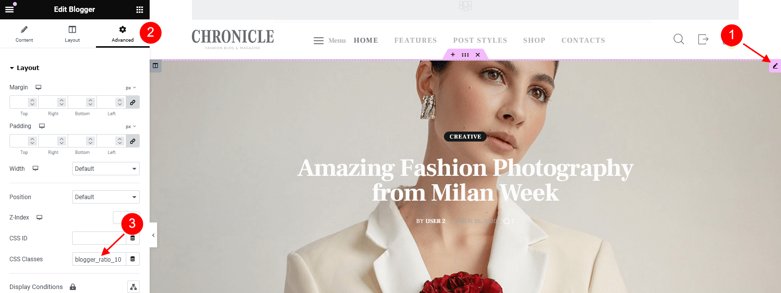
-
.blogger_info_1and.blogger_info_2- regulate the output of Blogger widget on different screen sizes.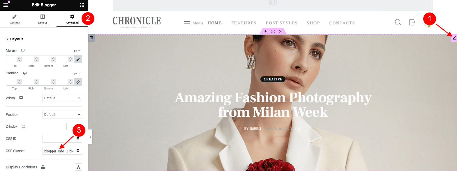
-
.blogger_title_1,.blogger_title_2,.blogger_title_3,.blogger_title_4,.blogger_title_5,.blogger_title_6,.blogger_title_7,.blogger_title_8,.blogger_title_9and.blogger_title_10- stylize the output of posts titles and posts categories (for Blogger widget) for smooth browsing.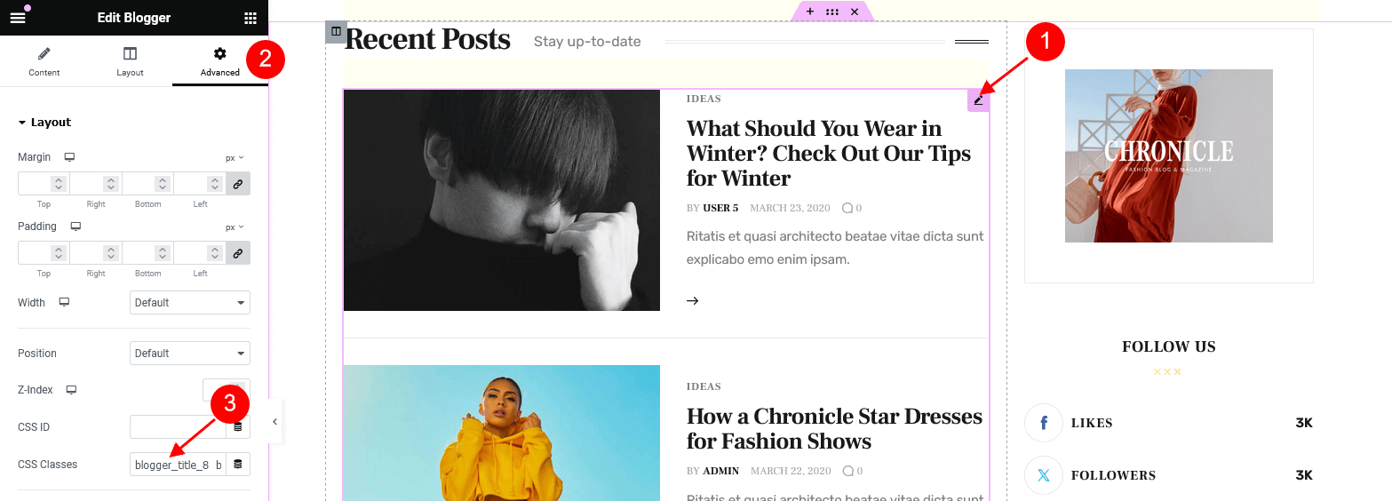
-
.recent_posts_1- stylizes the Recent Posts widget in Modern style on the demo "Classic Blog" homepage for smooth browsing.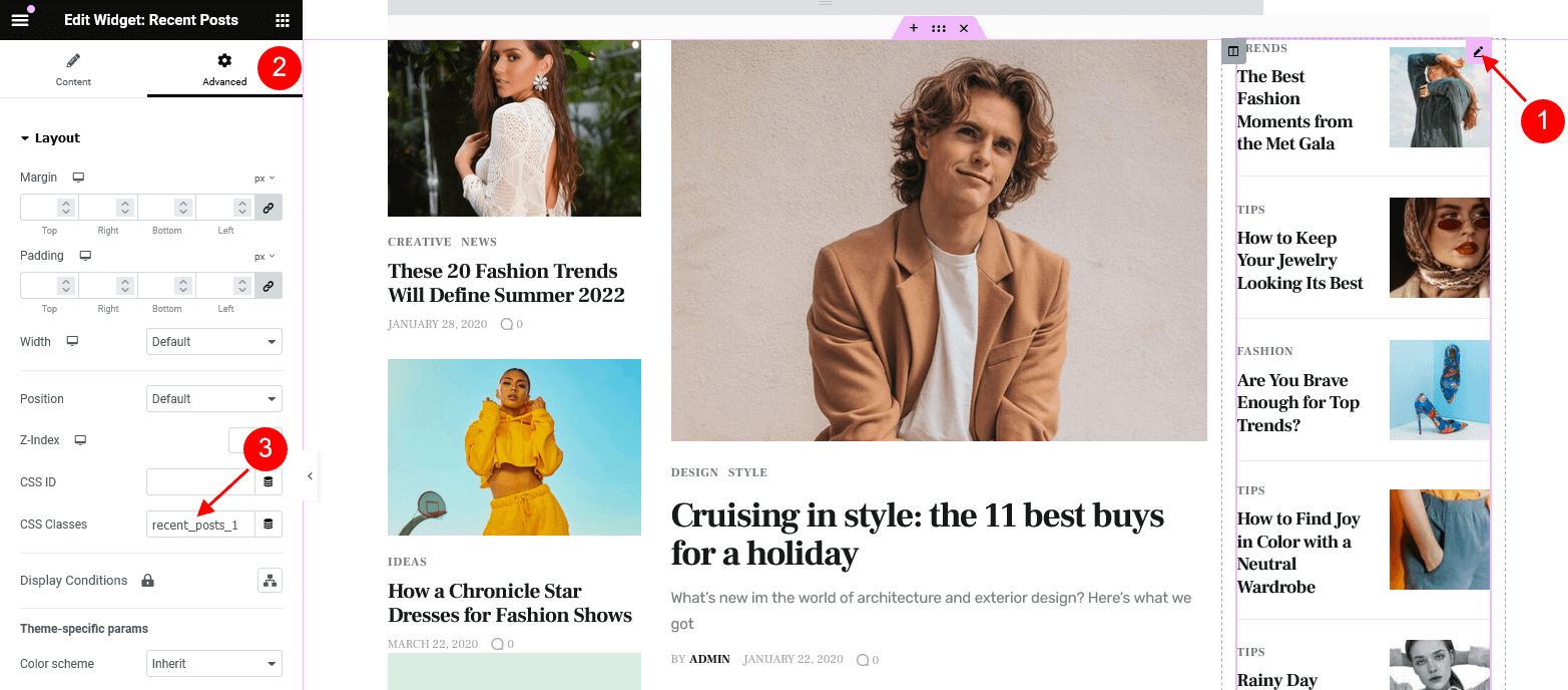
-
.recent_news_1and.recent_news_2- stylize the Recent News widget.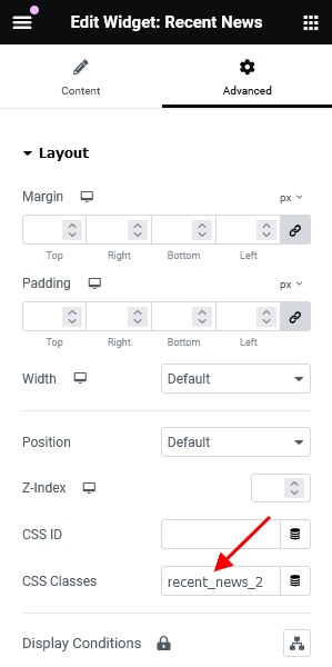
-
.extra_bg- makes the background color of an element inherit the value from "Extra > Background Color" .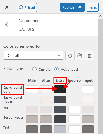
Theme Layouts
Introduction to Layouts
Layout is a tool that lets you create custom headers, footers, and other website sections and is based on the Elementor Page Builder.
Layouts are available after you activate the ThemeREX Addons plugin. After the activation, a new menu item appears in your WordPress admin panel.
Your theme comes with some pre-built Layouts. If you've imported the full content, the layouts will be available for you from the start. Otherwise, you would need to generate them in Theme Panel > ThemeREX Addons > Theme Specific > Theme Elements > Create Layouts.
Creating Layouts
To create a layout, navigate to Theme Layouts (WP Dashboard) > Add New.
Layouts are built in a similar way you build regular pages with the Elementor Page Builder. The difference is that Layouts expand the default list of widgets by adding layout-specific widgets and provide you with additional section settings.
Please check this article for detailed information regarding layouts customization.
You can also view our video tutorials about header and footer layouts customization.
When creating a Layout, first you need to specify the correct Layout type in the Item Options panel:
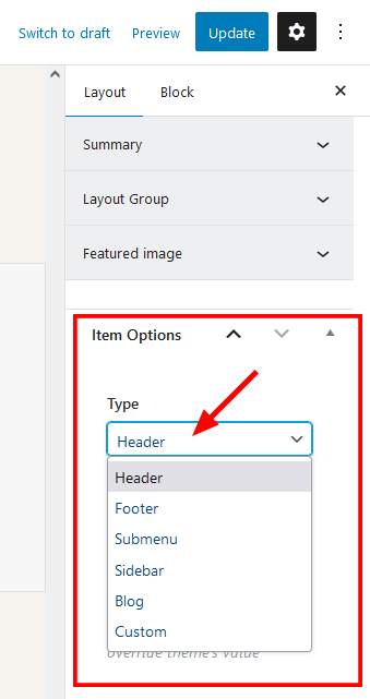
- Header - the layout is applied only to output in the header area. It appears in the list of available headers in Appearance > Customize > Header > Header Style > Custom.
-
Footer - the layout is applied only to output in the footer area. It appears in the list of available footers in Appearance > Customize > Footer > Footer Style > Custom.
You can also choose a different Header/Footer Layout for a specific page. Simply open that page in the WordPress admin, and in the Theme Options > Header/Footer panel edit the Header Style and Footer Style settings.
-
Submenu - the layout is used to create a custom dropdown menu without installing Uber Menu/Mega Menu plugins. You can apply the submenu layout in the Appearance > Menus > your menu item > Settings > Layout of submenu (optional) field.
The "Layout of submenu" field appears only when at least one submenu layout is created.
Please view this article for more information about submenu layouts.
- Sidebar - the layout is applied only to output in the sidebar area. It helps create custom sidebars using the Elementor page builder. Thus, you are not limited to standard widgets and can use any elements available in the page builder. It appears in the list of available sidebars in the Appearance > Customize > General/Mobile/Blog/Shop sections or in page > Theme Options > Content > Sidebar style > Custom.
- Blog - custom style or template to output the Blog Stream page or posts elements in Elementor "Blogger" widget, thus creating a blog stream page or page blocks with a unique overall look. Use it in combination with the Blog Item Parts widget, which lets you insert any post parts (featured image, title, metadata, content, custom fields) to a page in any combination and any quantity.
- Custom - the standard layout fragment that can be added to a web page using an Elementor Page Builder, "Layouts" widget.
Custom Layouts can be especially useful when you need to use the same section in different places on your website. Instead of building it from scratch on every new page, you can save it as a custom Layout and insert using a Layouts widget.
To add a custom Layout to a web page:
- Add a new Elementor Page Builder section in the website editing screen.
- In the left panel with Elementor elements open the "ThemeREX Addons Layouts" group, and drag and drop the Layouts widget from the panel into your section.
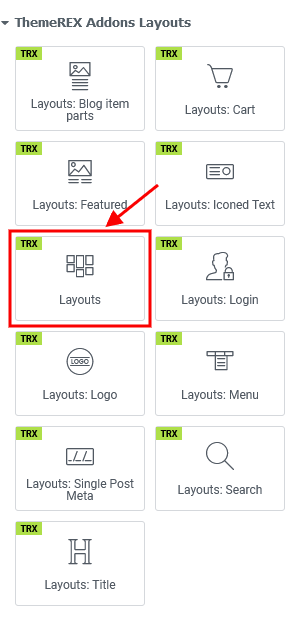
- Choose the desired custom Layout or Elementor’s template from the dropdown list (the "Type" option should be set to "Default").
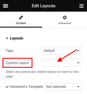
Blog Layout is just a scheme showing the position of post elements like featured image, post title, metadata, excerpt, etc. Use the Blog Item Parts widget to output each element, like in the example below.
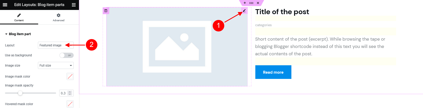
You can apply the blog layouts to:
-
Blog Stream Page - create a page, choose the "Blog Archive" template, and in the Theme Options > Content > Blog style option find your blog layout. Treat the screenshot below just as an example.
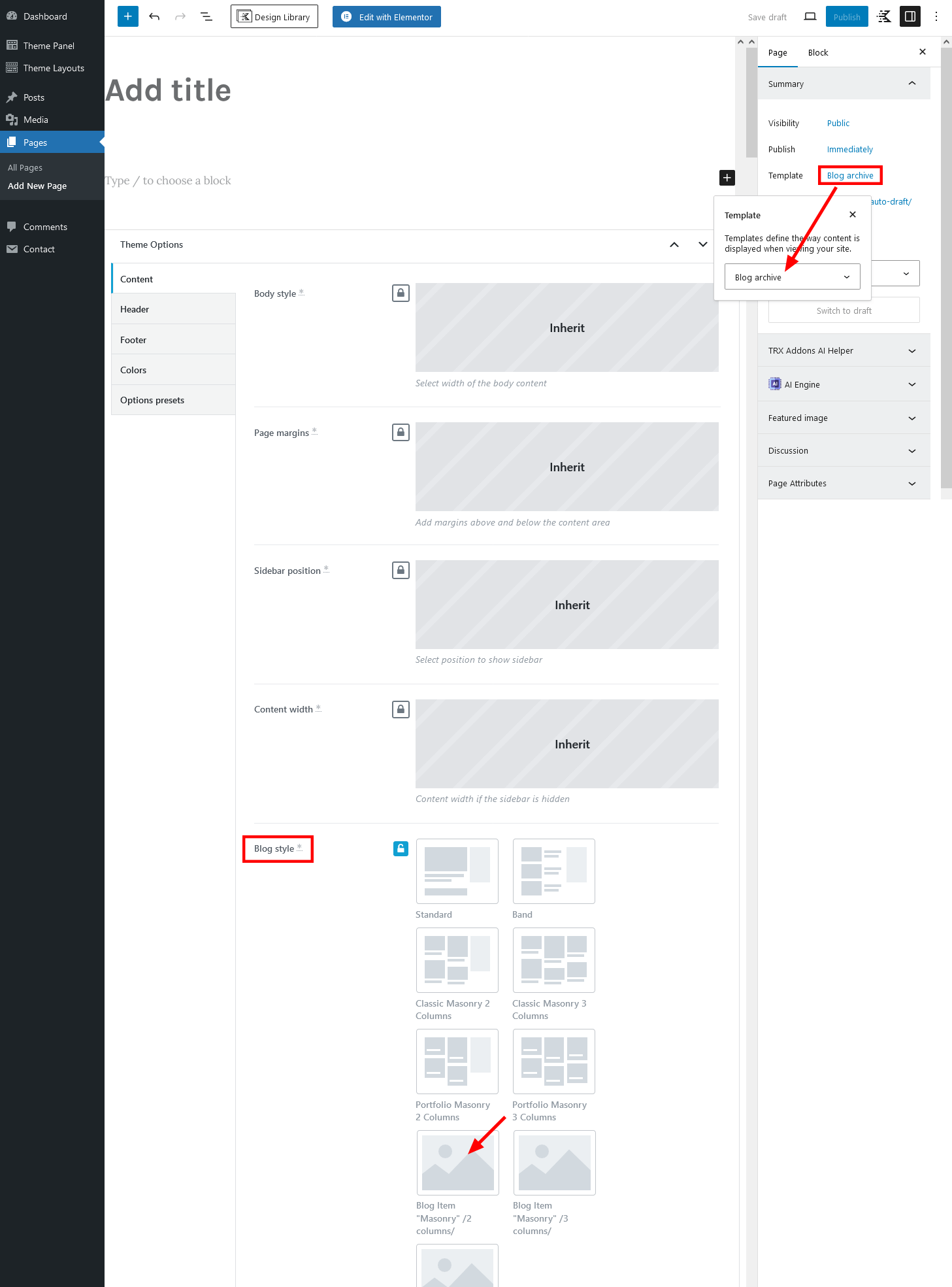
-
Blogger Widget - open a page/post, in the Elementor widget panel navigate to the "ThemeREX Addons Elements" group and insert the Blogger widget to the content area.
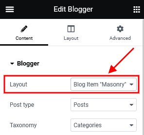
Layout Templates
In case there are some page fragments with more or less identical structure, you can create one layout using the Elementor Page Builder, save it as a template, and use it as a foundation for your new Layout. Thus, there is no need to create a new layout or block each time. Please see this article for more information.
Open a Layout and click on the Add Template button from the editing screen (Elementor Page Builder’s back-end editor). Scroll down to view the available templates:
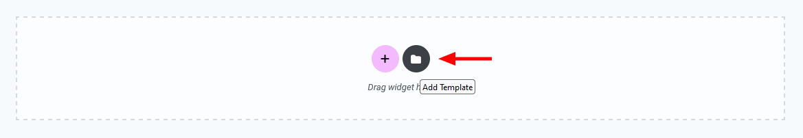
PLEASE NOTE! The demo content of the theme is assembled as separate pages that can be easily imported through Theme Panel (WP Dashboard) > Theme Dashboard > Demo Data > Partial Import. Our theme comes with empty Elementor library.
Creating a Mobile Header in Layouts
Layout is a preferred way of creating a mobile header since it gives you flexibility and control over your elements. Creating a mobile header is similar to creating a standard header, except there are several features you should know about to use Layouts more efficiently. Please see the official Elementor video tutorial or article for more information.
We recommend creating a separate custom header layout for mobile devices and specifying it in the Appearance > Customize > Mobile section. This will improve the website loading speed on mobile devices.
Layouts Widgets
Layout-specific widgets are additional widgets available for editing/creating layouts. They are especially useful for building headers and footers. You can find layout-specific widgets under the ThemeREX Addons Layouts group in the Elementor widgets panel.
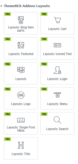
Layouts: Blog Item Parts
Inserts any post parts (featured image, title, metadata, content, custom fields) into your custom page fragment. This widget outputs 1 post part at a time. If you want to create a page block with a unique structure, just use as many "Blog Item Parts" widgets as you need and output post parts in any combination and any quantity.
Layouts: Featured Image
Should be used for headers only. Displays a featured image of the current post/page. Often used in combination with the Title and Breadcrumbs widget.
The widget has to contain at least one element, otherwise the featured image would be hidden.
Layouts: Iconed Text
Inserts an icon and two text lines. It is possible to add a URL to the icon.
Layouts
Inserts content in different ways, depending on the type of layout:
- Default - displays one of the custom layouts available in WP Dashboard > Theme Layouts post type. Please click here to view the list of available custom layouts.
- Popup - creates popup notifications that appear whenever a user clicks on a link or a button.
- Panel - creates a panel with some content/menu that appears whenever a user clicks on a link or a button.
Select which type of layout to use in the layouts widget’s content settings.
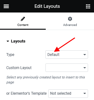
The algorithm of building a popup notification or panel:
- Create a custom layout with required content that will be displayed in the popup window or panel. If you want to use simple text/image or shortcode (like grid gallery, mailchimp form, etc.), just omit this step.
- Add a new Elementor Page Builder section to the page. In the left panel with Elementor elements open the "ThemeREX Addons Layouts" group, drag and drop the Layouts widget from the panel into your section. Select the desired widget’s type (popup/panel) and custom Layout from the dropdown list (Layout field) or enter simple text/shortcode/image from the Media Library in the Content field (if "Layout" option is set to "Use content").
You may navigate to Edit Layouts > Advanced tab to enclose the elements with paddings or set the background image/color. - In the widget’s settings under the Content tab, Popup (panel) ID field, assign the ID to your popup/panel, e.g.:
example_popup.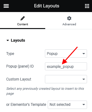
- Use the popup/panel ID, preceded by a pound sign (
#), as an address for the link or button that should trigger the popup/panel.
The background color for the panels is inherited from the "Layouts" widget’s color scheme, specified in a particular header layout. Use Elementor navigator to open the settings, if needed.
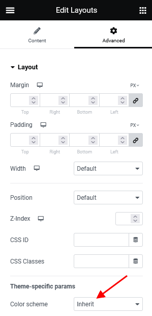
Layouts: Login
Displays a login/logout link with an icon.
The text for the checkbox "I agree..." (the registration form) is set in Appearance > Customize > General > Text with Privacy Policy link.
To add/customize the Privacy Policy link, navigate to Settings (WP Dashboard) > Privacy and specify the page that will be used as a Privacy Policy one.
PLEASE NOTE! In case you are planning to use the registration form without consent checkbox, just leave the "Text with Privacy Policy link" option empty in the Appearance > Customize > General section!
Layouts: Logo
Inserts a logo (any image). In case there is no logo (both in layouts and in the Customizer), the theme displays the website title and description specified in Appearance > Customize > Logo & Site Identity.
Uploading Logo
The algorithm of our actions would be as follows:
- Select the Layout where you want to place a new logo by going to Theme Layouts > All Layouts.
- Locate the Elementor Layouts: Logo widget (ThemeREX Addons Layouts group) and click on the Edit button.
- Upload a new logo in the panel > Content tab and save the changes.
IMPORTANT! The logo is available for editing for each particular layout. If no logo is selected in the Layouts: Logo widget, the initial logo from the Appearance > Customize > Logo & Site Identity will be used.
Layouts: Menu
Displays one of the available menus. Specify a preferred menu in the Menu field by its name, like in the screenshot below.
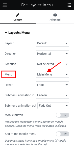
The Layout parameter allows selecting the Menu Layout:
- Default - standard menu with links.
Direction of the menu items: Horizontal or Vertical.
Specify a default behavior for a responsive menu in the Content tab:
- Mobile button - choose whether to replace the menu with a menu button when switching to the mobile version.
- Add to the mobile menu - use this menu as a mobile menu only.
Layouts: Single Post Meta
Displays elements from metadata of the current post (categories, post author, post date, post counters, share links, edit link).
Layouts: Title
Displays a title and breadcrumbs of the currently opened page/post.
Search Form
Adds a search button/input field. There are 2 layouts (default and modern) available and 3 styles for the default layout:
- Normal - a standard search field.
- Expand - displays a search button that expands a search field on click.
- Fullscreen - displays a search button that expands the search field to the entire screen.
Shopping Cart
Displays a shopping cart icon (in case the WooCommerce plugin is active). When clicked, the icon triggers a window with additional shopping details.
For narrow and normal row types, the cart displays the number of products in the cart, the sum total, and an icon label. The compact row type has a shopping cart with a product counter badge only.
Elementor Section Settings
Layouts have an extended number of settings for Section, default Elementor element.
Choose which section you want to edit, click on the Edit Section button and go to the panel > Edit Section > Custom Layout.
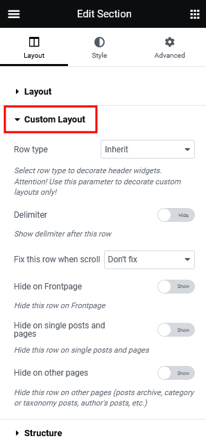
- Row type - defines a row type. It accepts the following values:
- Inherit - a default row with no layout-specific styles applied.
- Narrow - the smallest type of row. The Elementor widgets feature a small font size and small icons. The Layouts: Iconed Text widget places the text in 1 line (even for a two-line option).
- Compact - a smaller variation of the normal row type. The Elementor widgets have a standard font size and small icons. The Iconed Text widget puts the text in 1 line (even for a two-line option).
- Normal - a row of a normal height. The Elementor widgets inserted into this type of row have a standard font size and medium-sized icons. The Layouts: Iconed Text widget features text divided into 2 lines.
- Delimiter - adds a border to the row’s bottom.
- Hide on the Frontpage - hides the row on the page assigned as the Homepage (Frontpage) in Settings > Reading. In case the Blog Feed page is assigned as the Homepage, the row stays visible.
- Hide on single posts and pages - hides the row on single pages and posts.
-
Hide on other pages - hides the row on pages that are not single ones (other than
is_singular()).
Default Layouts
In this section, you can find examples of layouts that come with the theme (Default Skin). If you have imported the full demo content, the layouts will be available for you from the start. Otherwise, you would need to generate them in Theme Panel > ThemeREX Addons > Theme Specific > Theme Elements > Create Layouts. Feel free to create your own layouts.
You can view the list of available Layouts in Theme Layouts (WP Dashboard) > All Layouts.
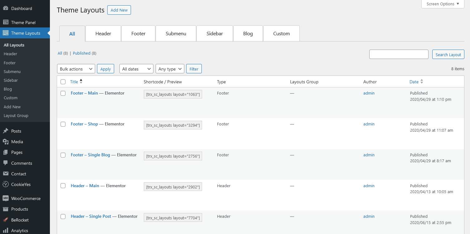
All layouts are divided into six types. For more information on how to add each type of layouts to the page, please view the Creating Layouts section of this documentation file.
- Header Layouts - displays layouts in the header area.
- Footer Layouts - inserts layouts in the footer area.
- Submenu Layouts - displays submenu layouts. Thus, it is possible to create a custom dropdown menu via Elementor Page Builder without installing Uber Menu/Mega Menu plugins.
- Sidebar Layouts - displays layouts in the sidebar area.
- Blog Layouts - creates a template to output the Blog Stream page or post parts in Elementor "Blogger" widget.
- Custom Layouts - pastes layouts in any area of the website, except the header and footer.
Important! Please be aware that this theme does not provide any examples of sidebar and blog layouts. Feel free to create your own ones.
Header Layouts
The header menu can be customized in Appearance > Menus > Edit Menus or Appearance > Customize > Menus.
In case no logo is selected in the Elementor "Layouts: Logo" widget, the initial logo from the Appearance > Customize > Logo & Site Identity will be used.
The burger menu icons in our demos trigger:
-
A panel with some additional information. To customize the content for the panel, please navigate to WP Dashboard > Theme Layouts > Custom tab and edit the corresponding custom layout.
Please view the description of the Elementor "Layouts" widget to find out how to build a popup notification or panels.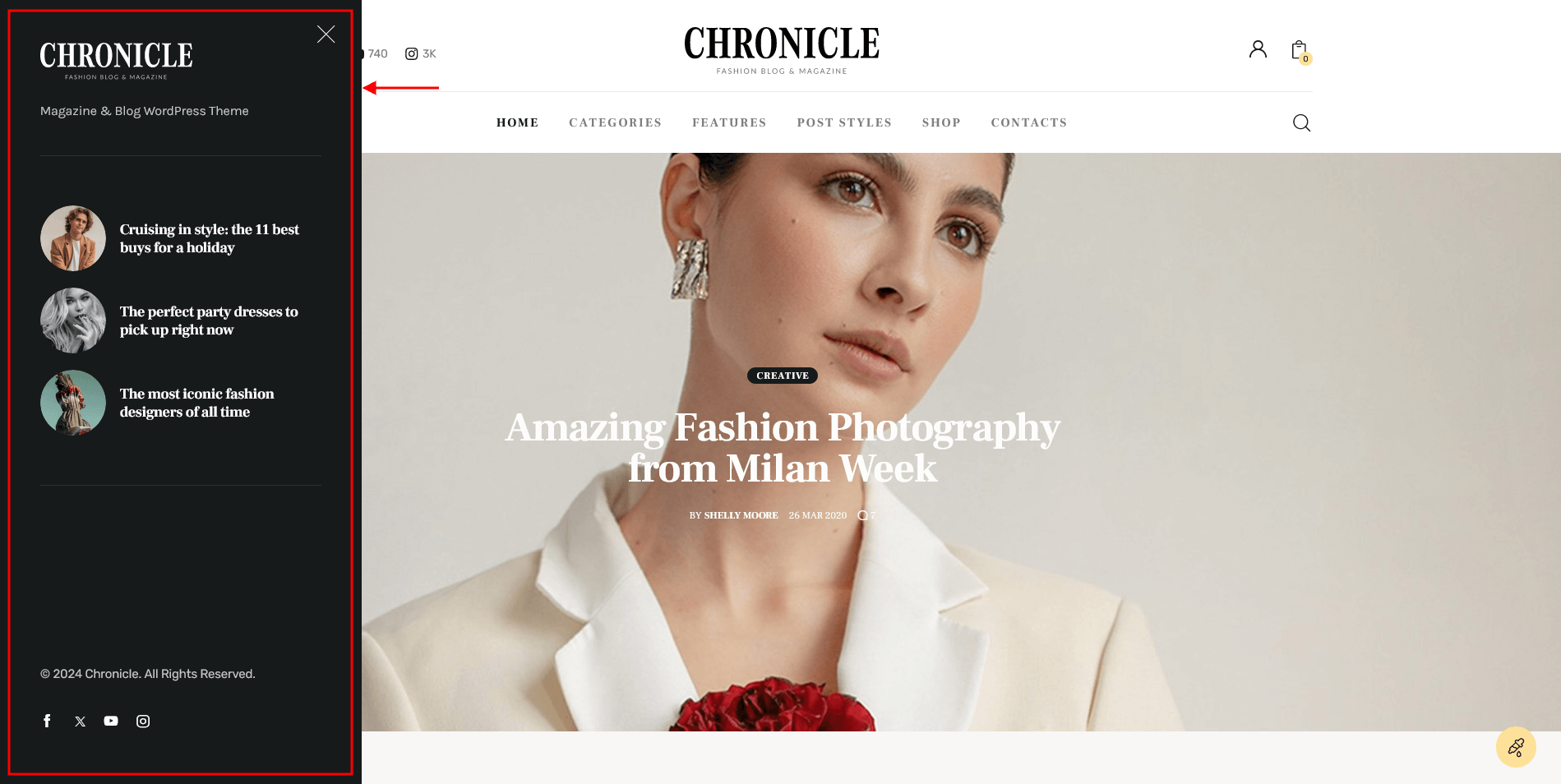
-
A mobile menu with social icons and a search field, like in pre-built headers for mobile devices.
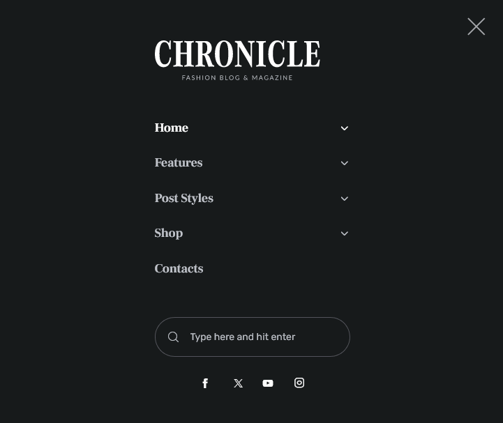 To customize the links (URLs) to your social profiles, proceed to the Theme Panel (WP Dashboard) > ThemeREX Addons > Socials tab.
The search field and social icons are enabled in Appearance (WP Dashboard) > Customize > General > Navigation section.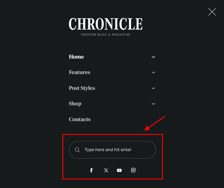
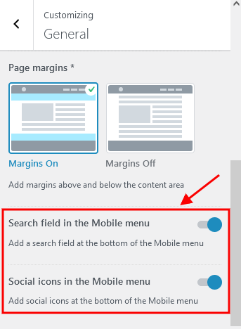
We have used the Powerkit plugin to place the social icons into the header area. In order to manage the social icons and connect to your social profiles, navigate to Settings (WP Dashboard) > Social Links.
[powerkit_social_links labels="false" titles="false" counts="true" template="default" scheme="default"]
If you want to add social icons not supported by Powerkit plugin, replace the Powerkit shortcode with Elementor "Custom Socials & Share" or "Socials & Share" widgets and expand the list of available icons by adding new ones from the fontello website.
The background color/image for the header sections can be set or managed in Edit Section/Column > Style > Background/Background Overlay in the Elementor editor.
Otherwise, the background color for the sections can be inherited from the color scheme, specified in Edit Section > Advanced > Advanced > Theme-specific params. The color scheme is set in the Appearance > Customize > Colors section (with Advanced mode).
-
Header – Main
Sticky Menu
-
Header – Single Post
Sticky Menu
Additional CSS class .layouts_title_1regulates the max width of the post title (for the Elementor "Layouts: Title" widget).
Footer Layouts
The footer menu can be customized in Appearance > Menus > Edit Menus or Appearance > Customize > Menus.
In case no logo is selected in the Elementor "Layouts: Logo" widget, the initial logo from the Appearance > Customize > Logo & Site Identity will be used.
To make the current year change automatically in the copyright area, just paste {Y} or {{Y}} instead of the year.
The social icons inherit the links (URLs) to your social profiles specified in the Theme Panel (WP Dashboard) > ThemeREX Addons > Socials tab.
The subscription form can be managed in MC4WP (WP Dashboard) > Form. The forms are used in different styles. The element ID (like: element_id="style-2") outputs the form in one of available styles, ranging from 1 to 6.
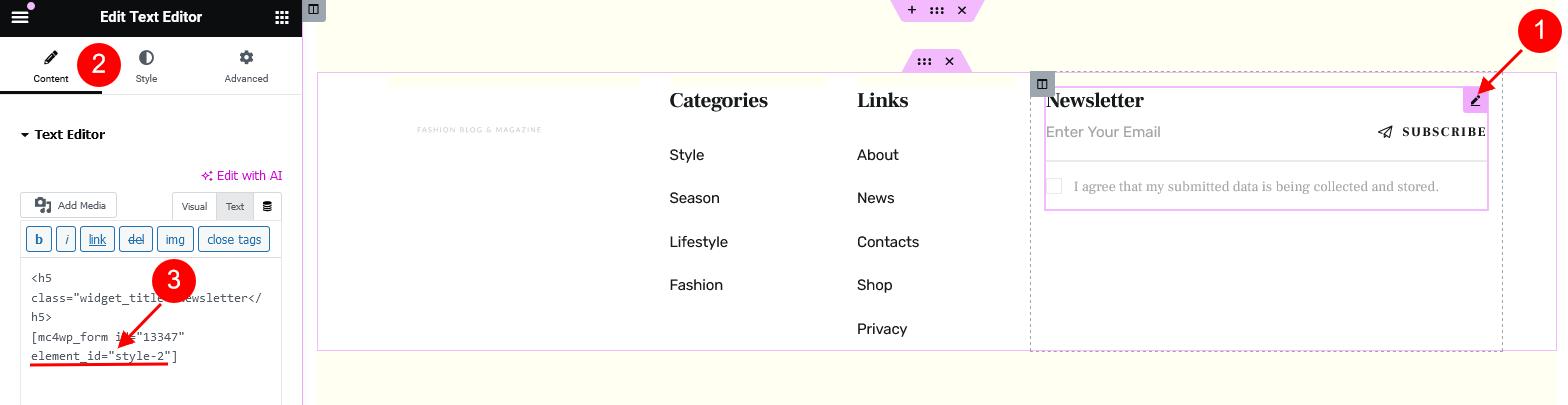
[mc4wp_form id="13347" element_id="style-2"]
The background color/image for the footer areas can be set or customized in the Edit Section/Column > Style > Background/Background Overlay tabs in the Elementor widgets panel.
Otherwise, the background color for the sections can be inherited from the color scheme, specified in Edit Section > Advanced > Advanced > Theme-specific params. The color scheme is set in the Appearance > Customize > Colors section (with Advanced mode).
-
Footer – Main
-
Footer – Shop
The "Related Products" section is visible on single products only!
You can customize the single products in the Products (WP Dashboard) > All Products section.
Additional CSS class.chronicle_custom_shop_footerdisplays the "Related Products" section on single products with custom title and hides this section on all other pages.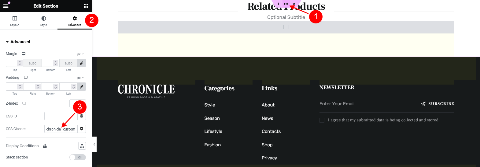
-
Footer – Single Blog
The Elementor Blogger widget outputs single posts from WP Dashboard > Posts > All Posts.
Additional CSS class.alter_bgmakes the background color for the top footer section inherit the value from "Alter > Background color" option in Appearance > Customize > Colors.
Submenu Layouts
You can apply the submenu layout in the Appearance > Menus > Layout of submenu (optional) field.
"Layout of submenu" field appears only when at least one submenu layout is created.
Please view this article for more information about submenu layouts.
The background color for layouts of submenu group is inherited from "Dark color scheme", set in the Appearance > Customize > Colors (with Advanced mode) section. You can also set up individual color settings for the rows/elements in Edit Section/Column > Style > Background in the Elementor panel if you are not planning to use color scheme switcher.
The Blogger widget outputs single posts (Dashboard > Posts > All Posts).
-
Submenu Categories (boxed)
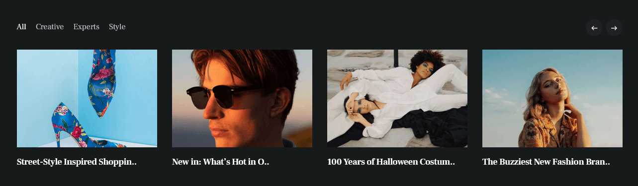
-
Submenu Design (boxed)
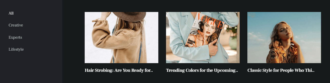 Additional CSS class
 .submenu_with_blogger_left_filtersadds grey background gradient behind the filters tabs.
Custom Layouts
In this chapter, we will describe the custom layouts combined into groups by their formation.
Please view the description of the Layouts Widget for more information about the popup notifications and panels.
The background color/image for the page sections can be set or customized in the Edit Section/Column > Style > Background tab in the Elementor widgets panel.
Panels
The background color for the panels is inherited from the "Layouts" widget's color scheme, specified in a particular header layout. Use the Elementor navigator to open the settings, if needed.
Dark background color for the panels is inherited from dark color scheme, "Main" > "Background color" option in Appearance > Customize > Colors (with Advanced mode).
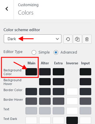
The example below is displayed in a panel.
Panel #1

In case no logo is selected in the "Layouts: Logo" widget, the initial logo from the Appearance > Customize > Logo & Site Identity will be used.
The Elementor Blogger widget outputs single posts from WP Dashboard > Posts > All Posts.
You can manage the links (URLs) to your social profiles in the Theme Panel (WP Dashboard) > ThemeREX Addons > Socials tab.
Elementor Widgets
Elementor Widgets in WordPress let you add different kinds of functionality to your website without writing a single line of code.
Our theme comes with some custom Elementor widgets allowing you to add the information in a simple way.
Custom Elementor widgets (with icon functionality) support icons from the standard Fontello icons set. You can expand the list of available icons by adding new ones from the Fontello website. To add new icons proceed to wp-content/themes/chronicle/skins/default/css/font-icons/config.json. Watch this video guide for more information.
Please note that the location of the config.json file and website page builder with the available set of widgets/shortcodes in your theme may vary from the video provided!
We have arranged all custom Elementor widgets in the following groups of elements in the Elementor Editor:
ThemeREX Addons Elements group
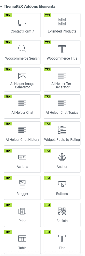
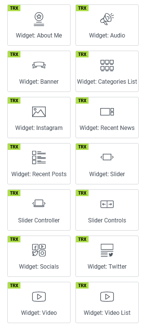
We have enhanced our themes with macros features for the "Title" and "Heading" Elementor widgets, as well as for some widgets with a title element (like Blogger, Services, etc.). The macros allow you to add code to your widgets without the need to write complex code manually. Thus, you can make a part of your title italic or bold, add an icon or an image between words, or simply move some words to a new line (add a line break). Please also view our article for more information.
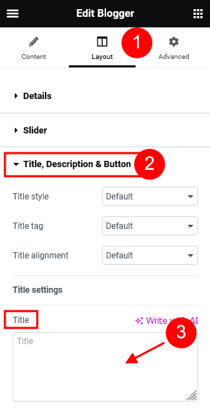
We will [image id=34020 size=0.9em valign=bottom thumb=tiny css="border-radius:25%; margin: 0.1em;"] help you to ideate, design, and implement [image id=34357 size=0.9em valign=bottom thumb=tiny css="border-radius:25%; margin: 0.1em;"] your ideas|| we are creative [icon name=clock size=1em margin=0.1em] studio||
{{some italic text}}||
((some bold text))
You can find the IDs for the images in your WordPress Media Library.
The names for the icons are standard Fontello icons’ names from the Fontello icons set that comes with the theme. You can expand the list of available icons by adding new ones from the Fontello website. To add new icons, proceed to wp-content/themes/chronicle/skins/default/css/font-icons/config.json. Watch this video guide for more information.
Please note that the location of the config.json file and website page builder with the available set of widgets/shortcodes in your theme may vary from the video provided!
Attention! Below are examples of Elementor widgets taken from various themes, not necessarily the one you are using. Therefore, the screenshots showing the front-end view of these widgets are for reference only. The actual element styles may differ from those in your theme.
The number of widgets may vary depending on the plugins installed in your skin if the theme supports several skins.
ThemeREX Addons Elements group
AI Helper Audio Generator
The "AI Helper Audio Generator" widget outputs a form for generating text from audio (speech-to-text), converting text to audio, translating audio-based text, or modifying voices in audio files (for ModelsLab only). This widget requires the AI Helper add-on to be active, along with an OpenAI and/or ModelsLab token set in Theme Panel (WP Dashboard) > ThemeREX Addons > AI Helper section. It’s a PAID service!
The "Model" drop-down option on the front end indicates what services are connected to generate audio. If the list is empty, you need to specify OpenAI and/or ModelsLab tokens in the Theme Panel (WP Dashboard) > ThemeREX Addons > AI Helper section under the "Open AI API" and "ModelsLab API" tabs.

To manage available Open AI models or add new ones, navigate to the general "ThemeREX Addons > AI Helper > Open AI API" settings. The ModelsLab model (model slug) should be entered on the front end into the corresponding field of the form.

To specify the limitations for your visitors, proceed to the global "ThemeREX Addons > AI Helper > SC Audio Generator" settings: the number of generated audio per 1 hour and the number of allowed requests from 1 visitor during 1 hour. You can set limits for regular users (free audio generation) and for registered users with paid subscriptions separately ("Premium Mode"). The premium mode should be enabled in the widget’s settings of audio generation form if you are using the limitations for registered users.
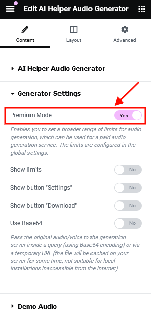
Once these limits are exceeded, the audio from the "Demo Audio" section of this widget will be used (from your /wp-content/uploads/ folder).
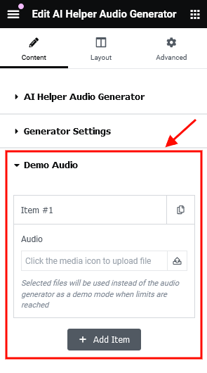
Example:
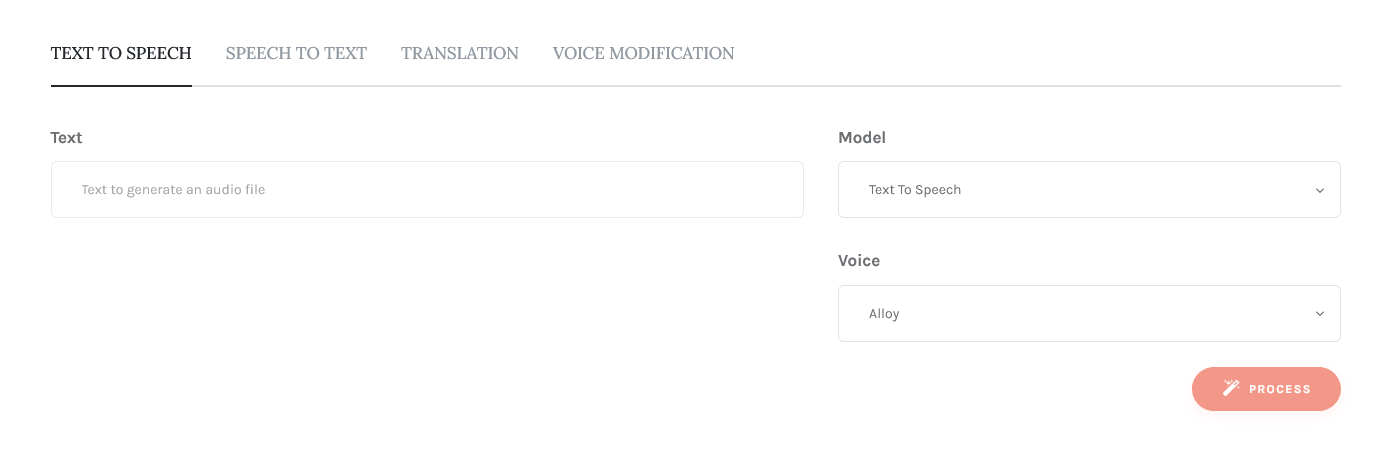
AI Helper Chat
This widget inserts ChatGPT into your web page, allowing your visitor to communicate with OpenAI via live chat (ask questions and get answers on any topics) directly from your website. The AI Helper add-on is required. The chat works if a real Open AI, Open AI Assistants, Flowise AI, X AI (Grok), or Google AI (Gemini) token is set in Theme Panel (WP Dashboard) > ThemeREX Addons > AI Helper section. It’s a PAID service!
All elements of the chat are customizable through the widget’s settings.
Enhance the chat by adding a list of suggested topics or questions that your visitors can use in their requests and/or chat history. Please view the description of the AI Helper Chat Topics" and AI Helper Chat History" widgets for more information.
In the global "ThemeREX Addons > AI Helper > SC AI Chat" settings you can also specify the limitations for your visitors: the number of requests per 1 hour for all visitors, the number of allowed requests from 1 visitor in 1 hour, and max. tokens per 1 request. These limits are available for regular users (free chatting) and for registered users with paid subscriptions ("Premium Mode"). Please do not forget to enable premium mode in the widget’s settings for registered users.
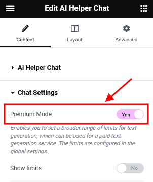
The "Model" option displays available models that are enabled in the global "ThemeREX Addons > AI Helper" settings under the "Open AI API", "Flowise AI API", and "Google AI (Gemini) API" tabs.
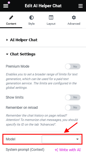
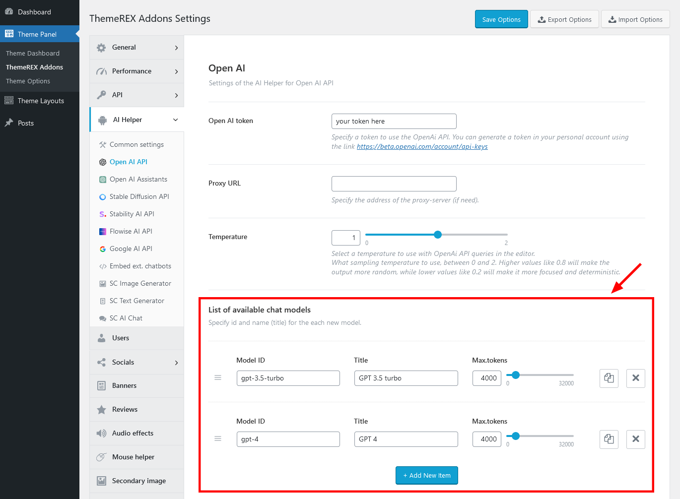
Our AI chats support processing various file types based on the model used. This feature is currently available for OpenAI and Google AI (Gemini). To enable file attachments in chat, go to Edit AI Helper Chat > Content > Chat Settings and activate the "Allow Attachments" option. This option appears if the model is specified. Please view our video tutorial on how to add an AI Chat to WordPress Site with OpenAI Multimodality Functionality.
Example:
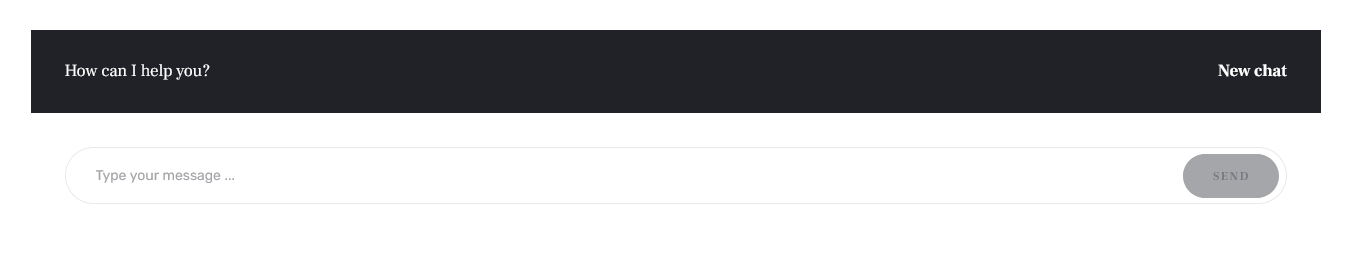
AI Helper Chat History
You can extend the functionality of the Elementor "AI Helper Chat" widget by inserting a complete chat history of a current user. The information displayed by this widget is only accessible to the logged-in users! When you click on a topic, the list of the messages will be replaced with a list of messages from the selected chat.
Please do not forget to specify the ID of the chat ("AI Helper Chat" widget) you want to output the chat history from.
Example:
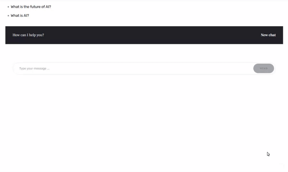
AI Helper Chat Topics
This widget extends the functionality of the Elementor "AI Helper Chat" widget by letting you create a list of suggested topics or questions for a chat beforehand. The visitors of your website can just choose a question, click on it, and proceed with communicating via live chat with AI. If no topics are specified in the widget’s settings, the latest chat requests will be displayed.
Before you start, please enter the ID of the "AI Helper Chat" widget for which you want the topics to be used as prompts (Edit AI Helper Chat > Advanced > Layout > CSS ID). Then copy this ID into the "AI Helper Chat Topics" widget’s settings into the Content > Chat ID field.
Example:
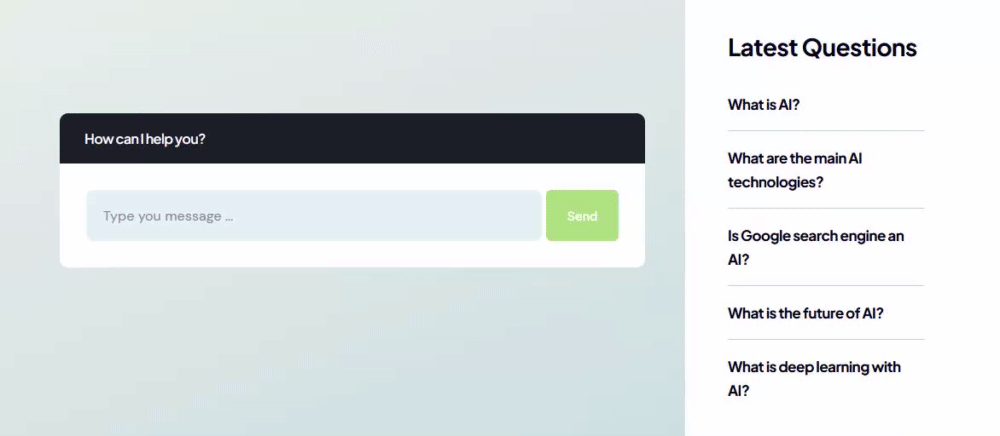
AI Helper Image Generator
The "AI Helper Image Generator" widget displays an image generator form on your web page. This widget requires the AI Helper add-on to be active. The form works if a real Open AI, ModelsLab, X AI (Grok), and/or Stability AI token is set in Theme Panel (WP Dashboard) > ThemeREX Addons > AI Helper section. It’s a PAID service!
The "Default model" option outputs a list of available Open AI, ModelsLab, and Stability AI models for generating images. You can activate the models by filling them into the list in the general "ThemeREX Addons > AI Helper" settings under the "Open AI API", "ModelsLab API", or "Stability AI API" tabs.

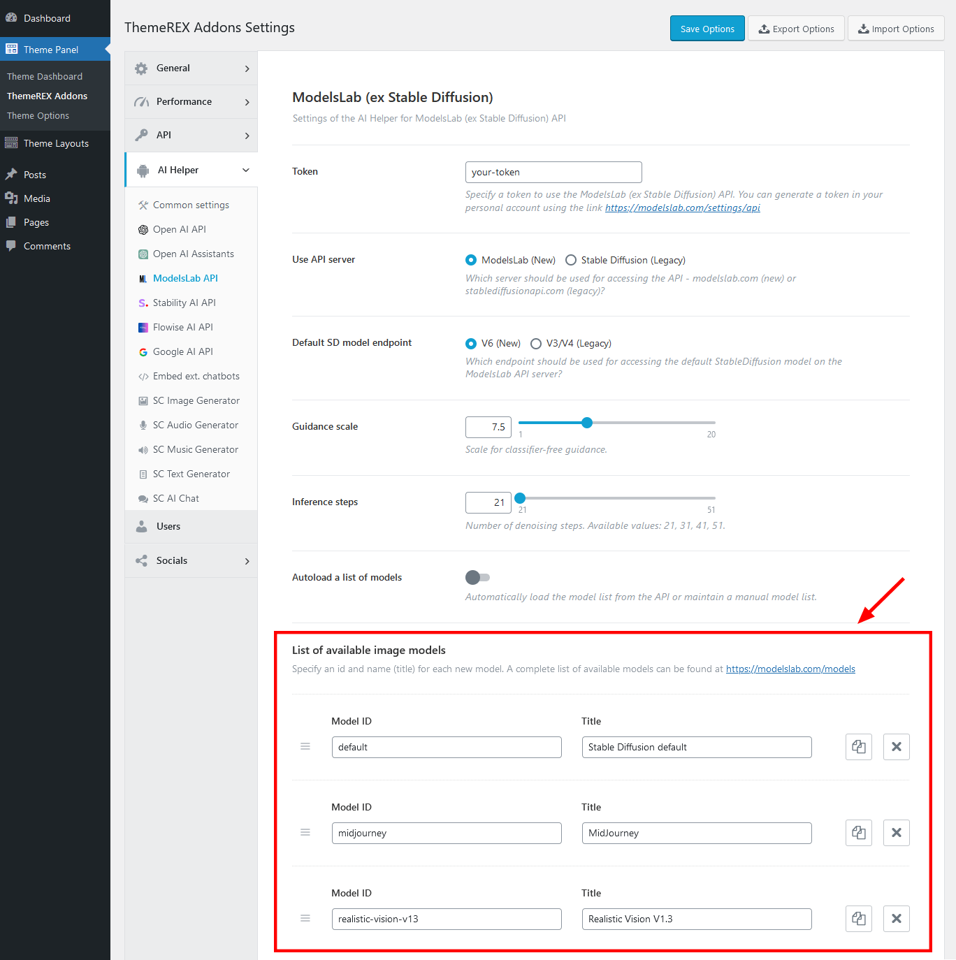
In the global "ThemeREX Addons > AI Helper > SC Image Generator" settings you can also specify the limitations for your visitors: the number of generated images per 1 hour and the number of allowed requests from 1 visitor during 1 hour. You can set limits for regular users (free image generation) and for registered users with paid subscriptions separately ("Premium Mode"). Please do not forget to enable premium mode in the widget’s settings of image generation forms for registered users.
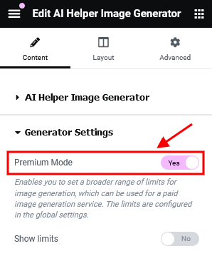
Once these limits are exceeded, the images from the "Demo images" section of this widget will be used (from your /wp-content/uploads/ folder).
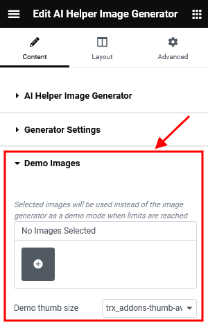
Example:
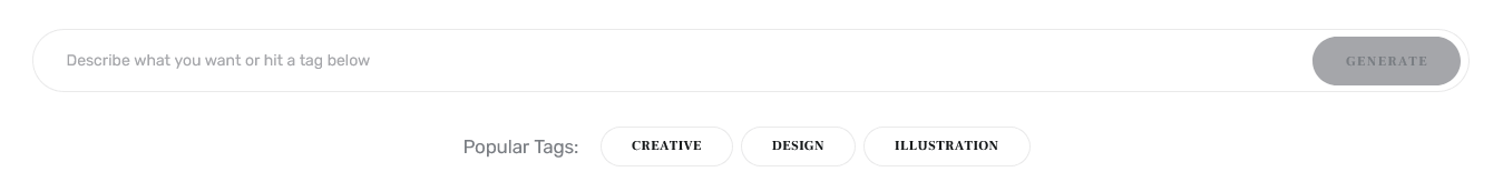
AI Helper Music Generator
This widget shows a form to generate music from text or audio sample. The AI Helper add-on is required. The form works if a real ModelsLab token is set in Theme Panel (WP Dashboard) > ThemeREX Addons > AI Helper > ModelsLab API section. Please follow this link to generate your token, if needed. It’s a PAID service!
The "Default model" option currently serves only as an indicator of whether the ModelsLab token is connected. If this field is empty, you'll need to enter the ModelsLab token in the general settings. Note that the ModelsLab service does not offer model selection options for music generation.
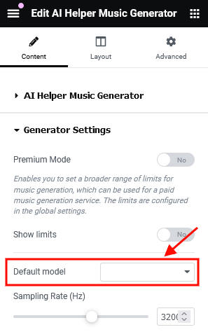
In the global "ThemeREX Addons > AI Helper > SC Music Generator" settings, the limitation settings for your visitors are available: the number of generated music strings per 1 hour and the number of allowed requests from 1 visitor during 1 hour. You can specify limits for regular users (free music generation) and for registered users with paid subscriptions separately ("Premium Mode"). Please do not forget to enable premium mode in the widget’s settings of music generation form for registered users.
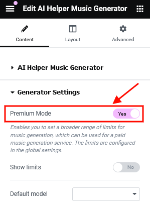
When these limits are reached, music from the widget’s "Demo Music" section will play instead (from your /wp-content/uploads/ folder).
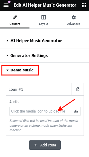
Example:
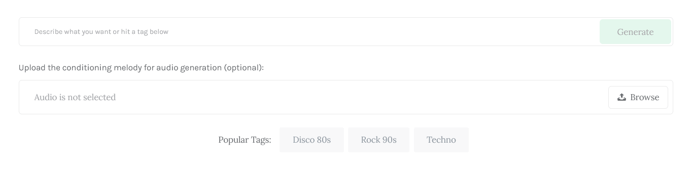
AI Helper Text Generator
This widget inserts a text generator form into your web page. Thus, your visitor can generate text (post, essay, story, poem, etc.), headings, and manipulate the text (make it longer/shorter, summarize, explain, translate, spell check, and much more). The AI Helper add-on is required. The form works if a real Open AI, Open AI Assistants, Flowise AI, X AI (Grok), or Google AI (Gemini) token is set in Theme Panel (WP Dashboard) > ThemeREX Addons > AI Helper section. It’s a PAID service!
In the global "ThemeREX Addons > AI Helper > SC Text Generator" settings you can also specify the limitations for your visitors: the number of requests per 1 hour for all visitors, the number of allowed requests from 1 visitor in 1 hour, and max. tokens per 1 request. You can also set these limits separately for free and paid generation. Please do not forget to enable premium mode in the widget’s settings for registered users.
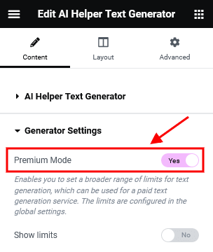
Example:
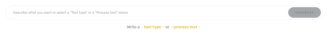
AI Helper Video Generator
The "AI Helper Video Generator" widget inserts a video generator form into a web page, allowing website visitors to generate videos directly from the front end. The AI Helper add-on is required. The form works if a real LumaLabs token is set in Theme Panel (WP Dashboard) > ThemeREX Addons > AI Helper > LumaLabs AI API section. It’s a PAID service! This widget is perfect for interactive content creation, giving users a seamless video generation experience.
Two modes of the form are available: Simple and Premium. The Simple form provides basic functionality for free users, while the Premium version includes extended options with broader limits.
In the global "ThemeREX Addons > AI Helper > SC Video Generator" settings you can set the limitations for your visitors: the number of requests per 1 hour for all visitors, the number of allowed requests from 1 visitor in 1 hour, and max. tokens per 1 request. You can also set these limits separately for free and paid generation. Please do not forget to enable premium mode in the widget’s settings for registered users.
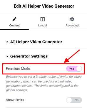
Once these limits are exceeded, the video from the "Demo Video" section of this widget will be used (from your /wp-content/uploads/ folder).
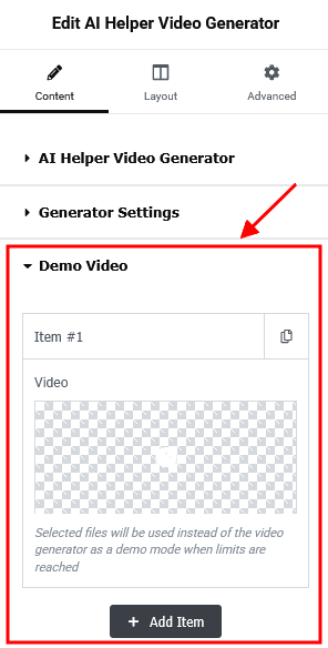
Example:
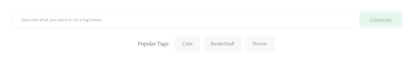
Actions
This Elementor widget inserts a "Call to action" or columns layout.
Example:
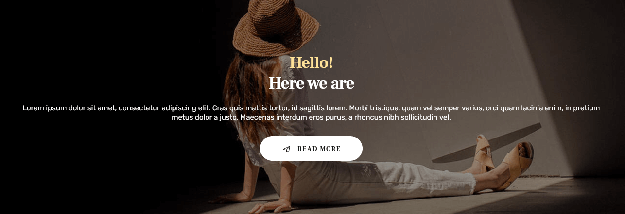
Anchor
The Elementor "Anchor" widget inserts an anchor element that lets you link to specific parts of your page (or to other pages).
If you want to add smooth navigation between your anchors, check the Scroll to Anchor box in Theme Panel > ThemeREX Addons > Shortcodes > Anchor section.
Blogger
This widget displays posts or pages from a specified group. Just specify the post type to show the posts from in the Edit Blogger > Content > Post type field in the Elementor panel. By default, the widget outputs single posts. Please click here to view our video tutorial.
You can create additional layouts to output the posts in the WP Dashboard > Theme Layouts using the Blog layout’s type (Item Options section). Please see Creating Layouts section of this documentation file for more information.
Example:
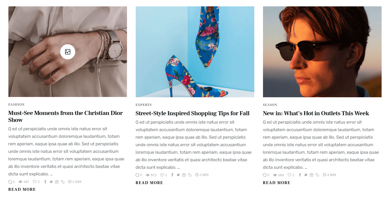
You can edit the post excerpt text by opening the corresponding blog post and adjusting the text in the Excerpt field.
Enable the Excerpt field in the Preferences > General panel in the top right corner of the post.
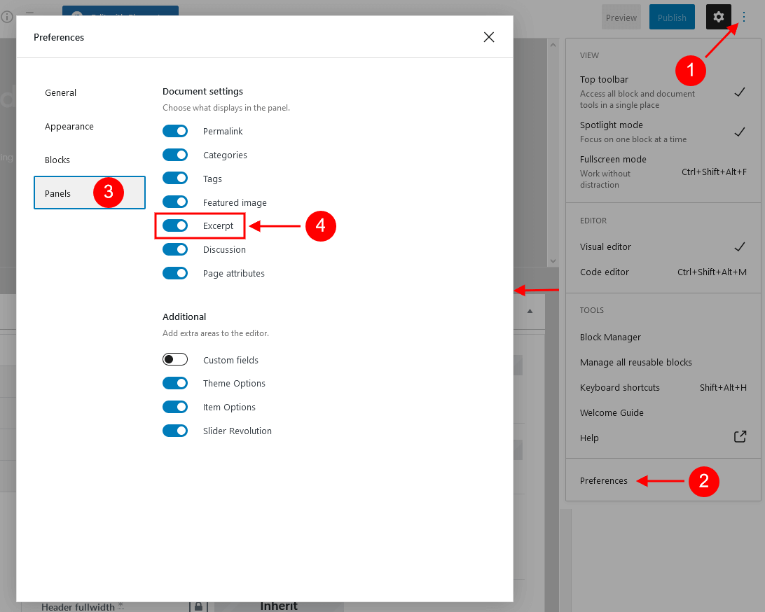
The length (in words) of the post excerpt text is inherited from the global setting in Appearance > Customize > Blog > Posts Page > Posts Page Settings.
IMPORTANT! The layout of the block depends on the combination of 2 main options: "Blogger layout" and "Template". Please feel free to play around with these options.
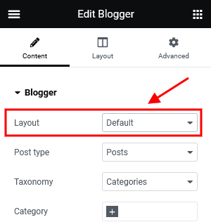
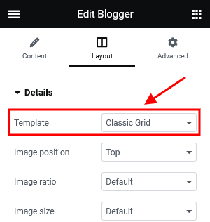
Buttons
This Elementor widget displays buttons.
Examples:
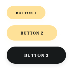
Price
This Elementor widget inserts a price table divided by blocks.
Example:
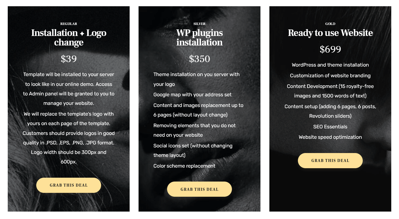
Reviews
This Elementor widget inserts a review section with some information filled in by the author of the website.
How to display a review section on a page/post:
- Enable the review section for posts/pages/post types globally in the Theme Panel (WP Dashboard) > ThemeREX Addons > Reviews tab.
- Open a single post/page/post type and proceed to the Item Options > Review section. Check the "Enable review" option.
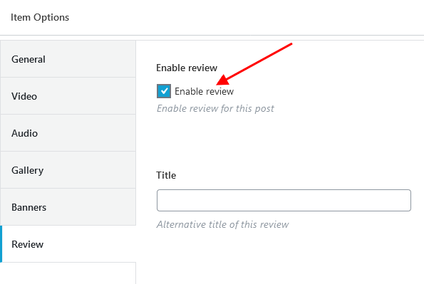
- Fill in the needed information and save your changes.
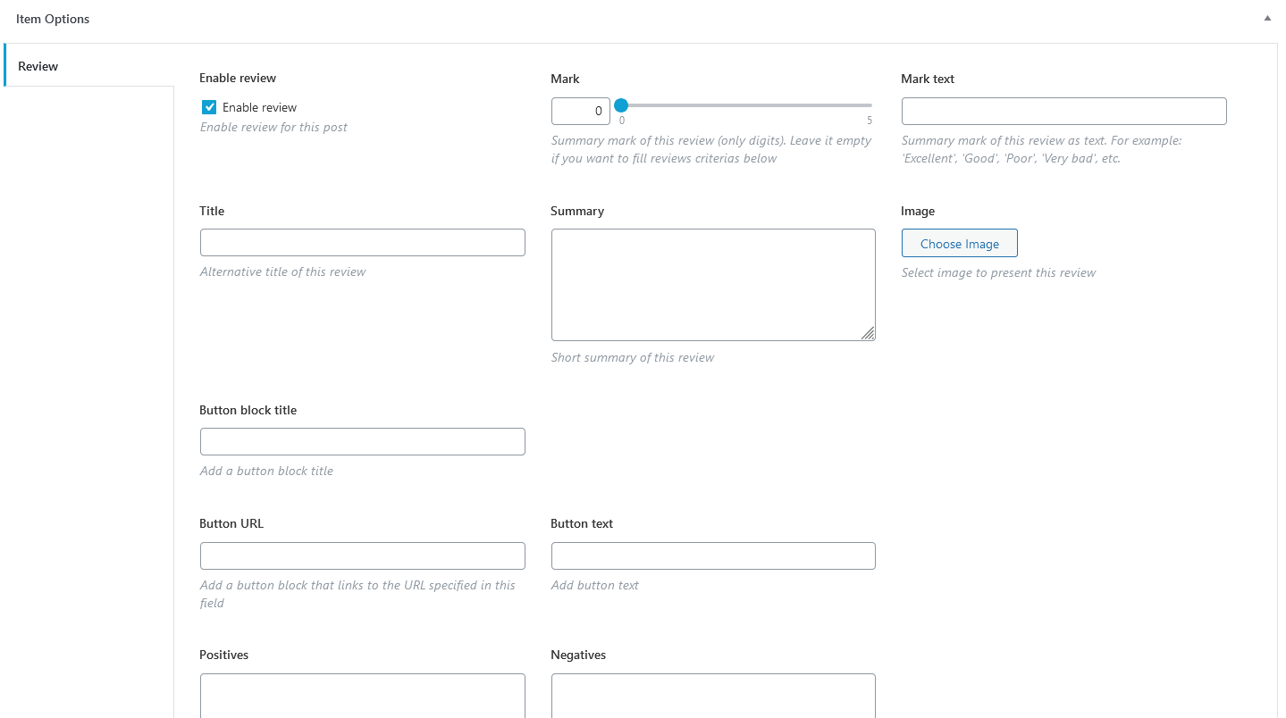
- Open this page through the Elementor page builder and place the "Reviews" widget into the page canvas. Don't forget to save your changes.
Examples from our themes:
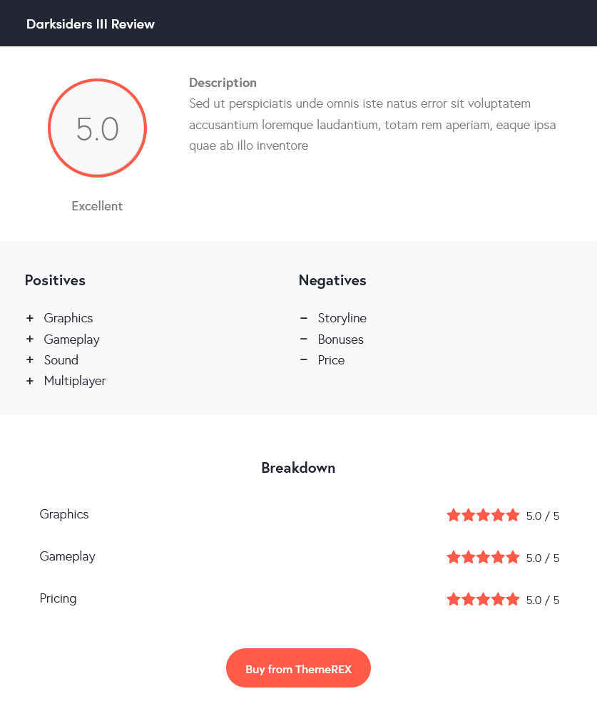
Slider
This Elementor widget lets you insert the following type of sliders, namely:
- Swiper Slider (Posts Slider);
- ElastiStack (Posts Slider);
Select which type of slider to show in the Slider Engine option under the content tab.
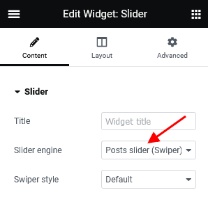
Example (Swiper Slider):
The Swiper Slider lets you display your posts, pages, or custom post types in a form of a slider. Enhance the slider by adding preview image thumbnails using Slider Controller, and navigation arrows using the Slider Controls or via the Slider widgets’ settings under Layout > Controls tab.
Example (Swiper Slider with Slider Controller and Slider Controls):
Example (ElastiStack Slider):
ElastiStack is a type of slider that allows you to navigate through a stack of slides by dragging away the first item.
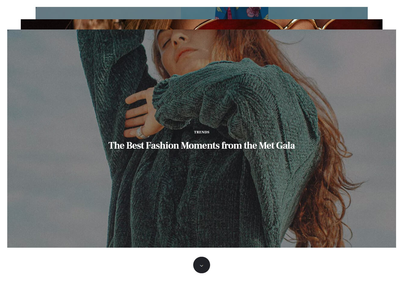
Slider Controller
Slider Controller displays image thumbnails and navigation arrows for the Swiper Slider engine in the Slider widget.
Example:

Make sure to enter the ID of the Slider widget you want to control. Enter the ID first into the Slider widget settings (under the Advanced > CSS ID), and then copy it into the Slider Controller settings into the Content > Slave Slider ID field.
Slider Controls
Slider Controls adds navigation pointers for the Swiper Slider engine in the Slider widget. By default, the widget displays previous/next icons. Anyway, you can hide them and use slides thumbnails, titles, bullets, slide numbers, or progress bar as slider controls.
Example:
Make sure to enter the ID of the Slider widget you want to control. Enter the ID first into the Slider widget settings (under the Advanced > CSS ID), and then copy it into the Slider Controls settings into the Content > Slave Slider ID field.
Custom Socials & Share
This Elementor widget displays social icons. You can specify the necessary links (URLs) to your social profiles in the widget’s settings under the content tab as well as expand the list of available icons by adding new ones from the Fontello website. To add new icons proceed to wp-content/themes/chronicle/skins/default/css/font-icons/config.json. Watch this video guide for more information.
PLEASE NOTE! The location of the config.json file and website page builder with the available set of widgets/shortcodes in your theme may vary from the video provided!
If empty, the social icons will inherit the links (URLs) to your social profiles specified in the Theme Panel > ThemeREX Addons > Socials tab.
Example:

Table
This Elementor widget inserts a regular table, created using any table generator, like https://www.impressivewebs.com/html-table-code-generator/.
Example:
Title
This Elementor widget inserts a regular title with a subtitle, some description, and a button.
Example:
About Me
This widget displays an "About Me" block with some personal information of the website’s owner or any other person. If you leave the options empty, they will inherit data from the following options on the admin’s profile page: "Profile Picture" (for photo), "Username" (for name), and "Biographical Info" (for description). You can hide any option by inserting the # sign in the corresponding field in the widget’s settings.
The widget is designed to be used in a sidebar.
Example:
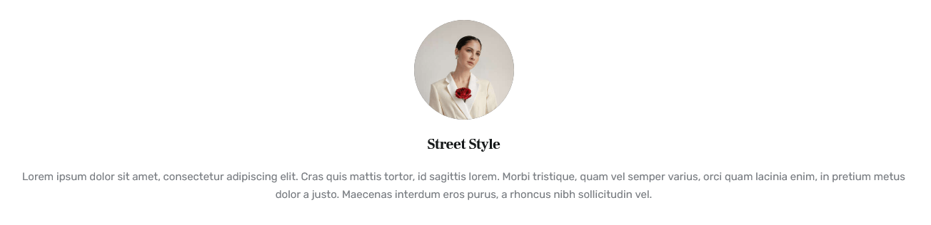
Audio Player
This Elementor widget inserts an Audio Player block. You can use a locally uploaded audio file (from your Media library) or an external one (through embedded HTML code). The system ignores the "Audio caption" and "Author name" options if the embedded code is used.
Example:
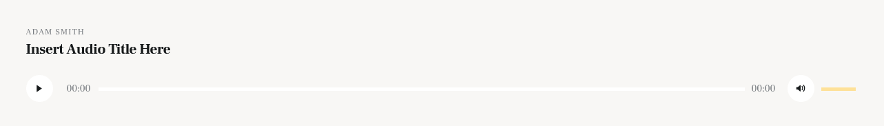
Banner
This Elementor widget displays a regular banner image linked or not as well as any object inserted using HTML code (banner, iFrame for video, audio, etc.).
Example:
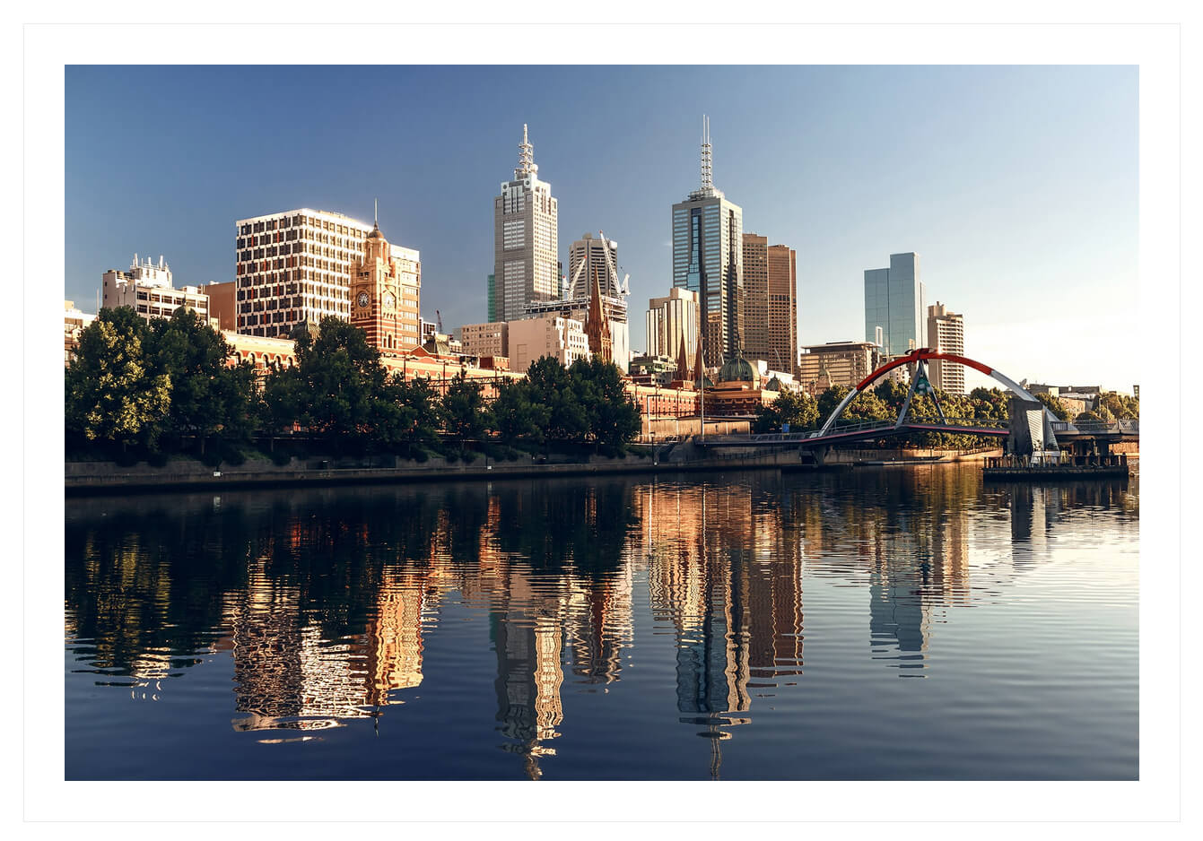
Categories List
This Elementor widget displays a list of post or product categories/tags/formats, layouts, or CPT groups (if CPT are available in the theme). By default, it inserts post categories. You can choose the post type to show the categories/tags/groups from in the Edit Categories List > Content > Post type field.
Example:
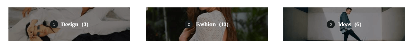
In case you want to display thumbs with the titles, you should check the "Large Image" or "Small Image" attribute options and enable these attributes for the needed category/group of posts/post types in Theme Panel (WP Dashboard) > ThemeREX Addons > Extended Taxonomy tab. Then navigate to a particular category/group of posts/post types in the WP Dashboard and upload the images (if this option is available for a definite group of posts).
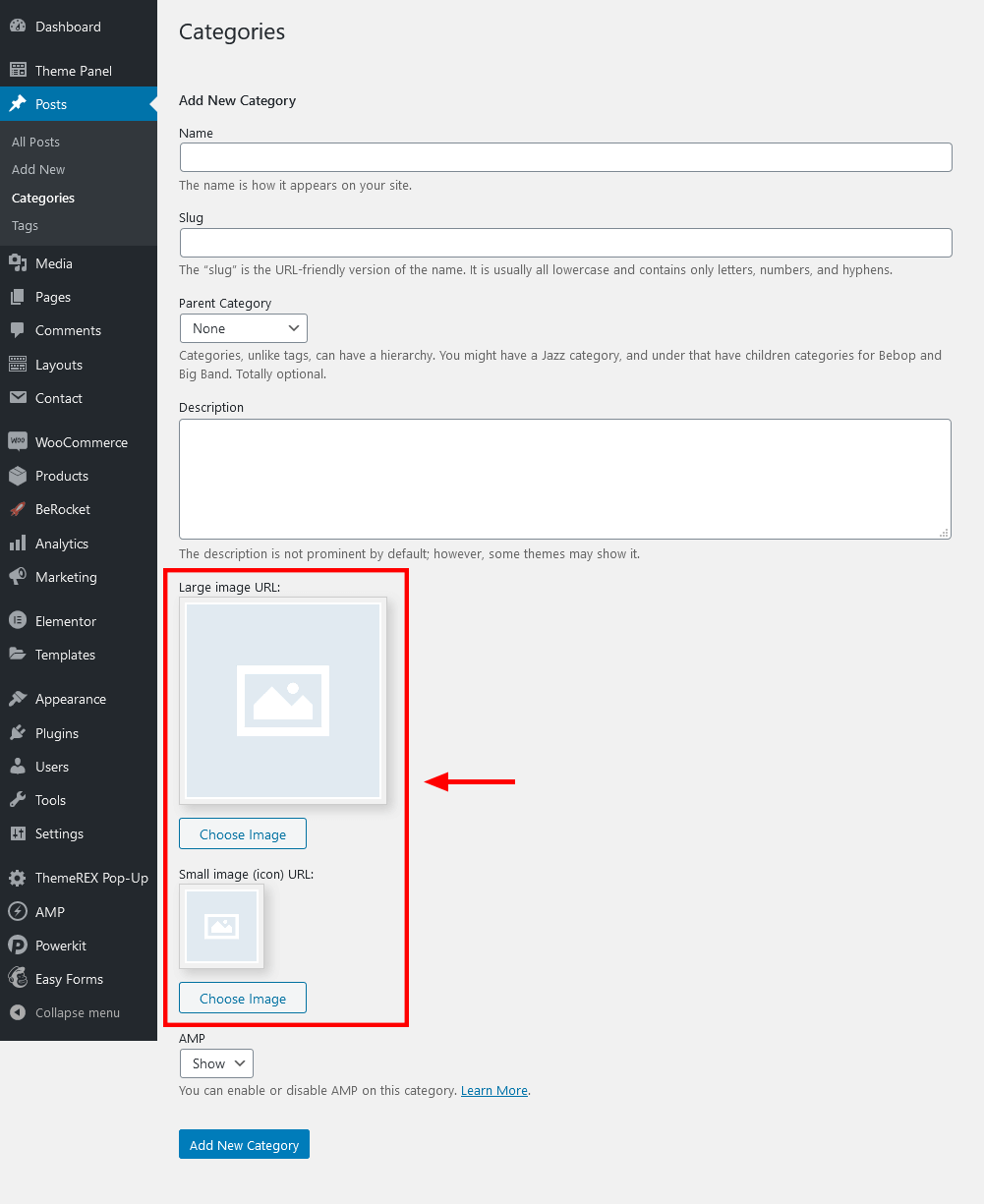
This Elementor widget displays the latest photos from your Instagram account or demo photos in a form of a feed on your WordPress website. You can connect to your Instagram account in the Theme Panel (WP Dashboard) > ThemeREX Addons > API section (you need a valid Instagram Access Token).
Demo mode means that the images will be taken from your demo folder (/wp-content/uploads/).
Example:
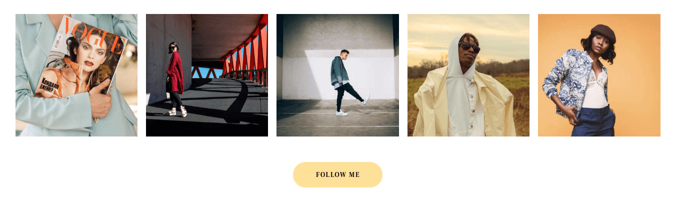
Posts by Rating
This Elementor widget displays rated pages, blog posts, posts provided by external plugins, Custom Post Types (if available in a theme). In case no pages or posts are rated, the widget will stay invisible. This widget is designed to be used in a sidebar.
How to allow rating on a post/page:
- Navigate to Theme Panel (WP Dashboard) > ThemeREX Addons > Reviews tab and enable the reviews section for a definite post type (for pages, posts, etc.);
-
Enable reviews on a single post/page. Please open a post/page and check the "Enable review" option in the Item Options > Review section.
-
If you want to display rating above the comment form, please navigate to a particular post/page in WP Dashboard and allow comments section, like on the screenshot below:
- Now your website visitors can rate this particular page/post on the front-end (above the comment form).
Example:
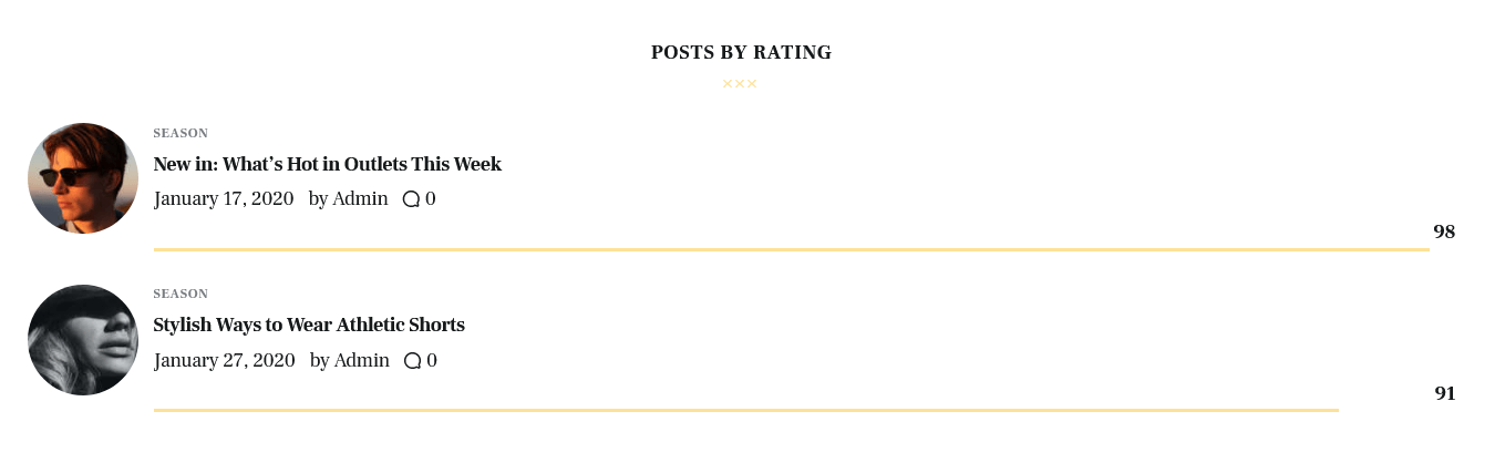
Recent News
This Elementor widget displays the most recent news.
Example:
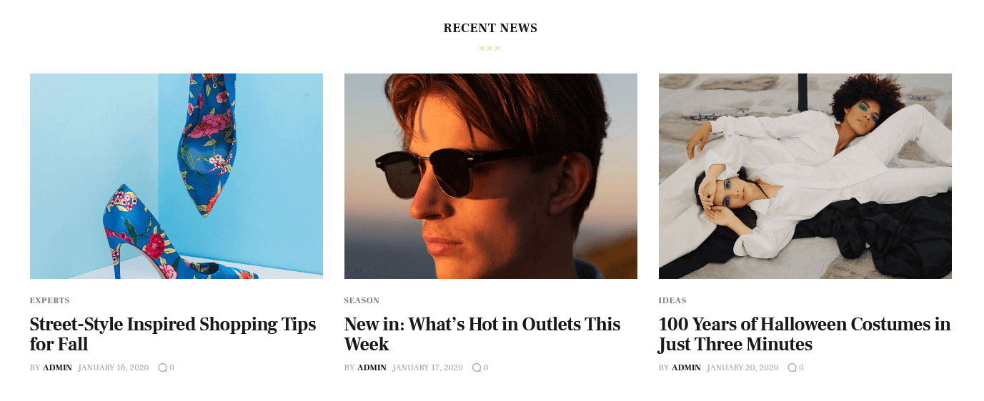
Recent Posts
This Elementor widget displays the most recent posts. You can set additional options in the "Details" section in the element’s settings window. This widget is designed to be used in a sidebar.
Example:
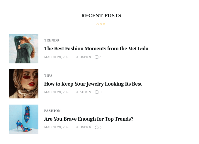
Socials & Share
This Elementor widget displays social icons of the social networks you are subscribed to. Please specify the necessary links (URLs) to your social profiles in the Theme Panel > ThemeREX Addons > Socials tab. Works in a sidebar (as a widget) as well.
Example:
Twitter Feed
This Elementor widget displays posts from your twitter account. Please use your own Twitter API keys to make the widget display your twitter feed properly. The theme supports Twitter API v.2.
Video Player
This Elementor widget displays a video file. The widget supports direct links from YouTube, Vimeo, or locally downloaded video files. You can also insert a video through HTML code from any video hosting platform.
Example:
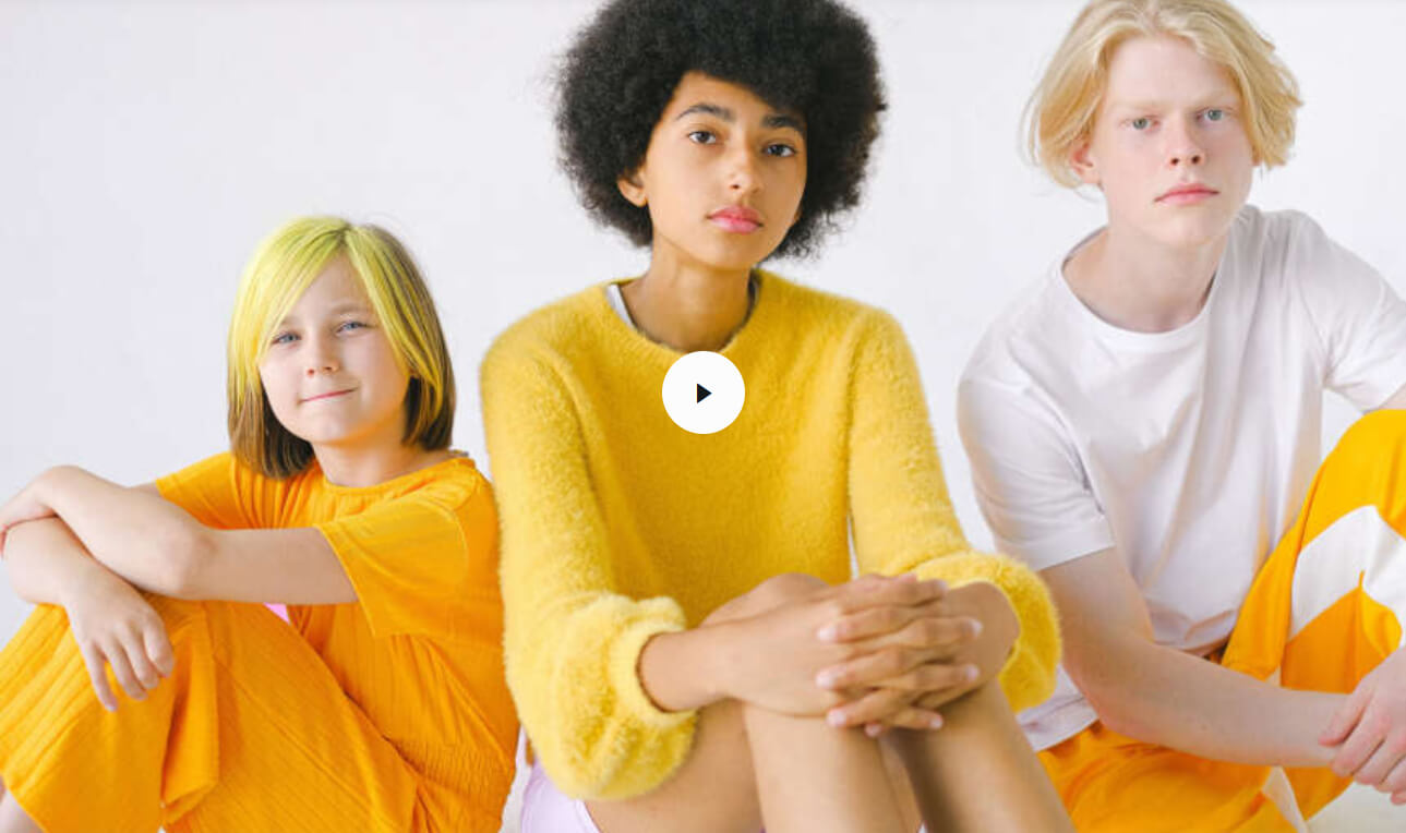
Video List
This Elementor widget shows a list of videos:
- taken from posts of "Video" post format type.
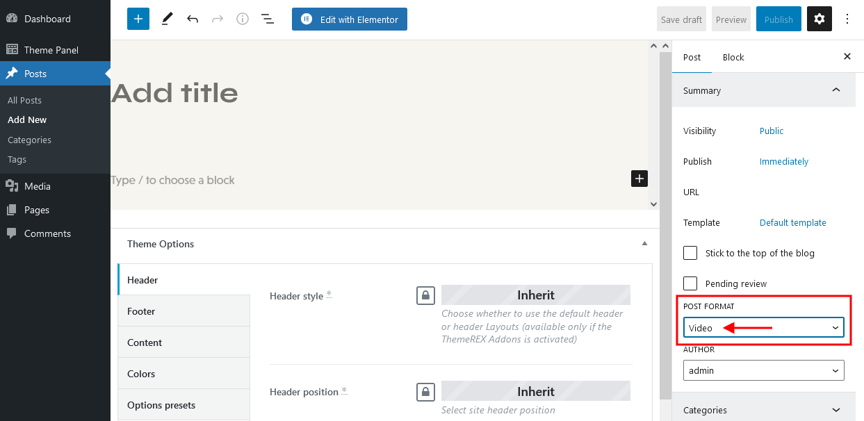 A URL or embedded code for the video should be specified in the single post’s settings, Item Options > Video > Video List section.
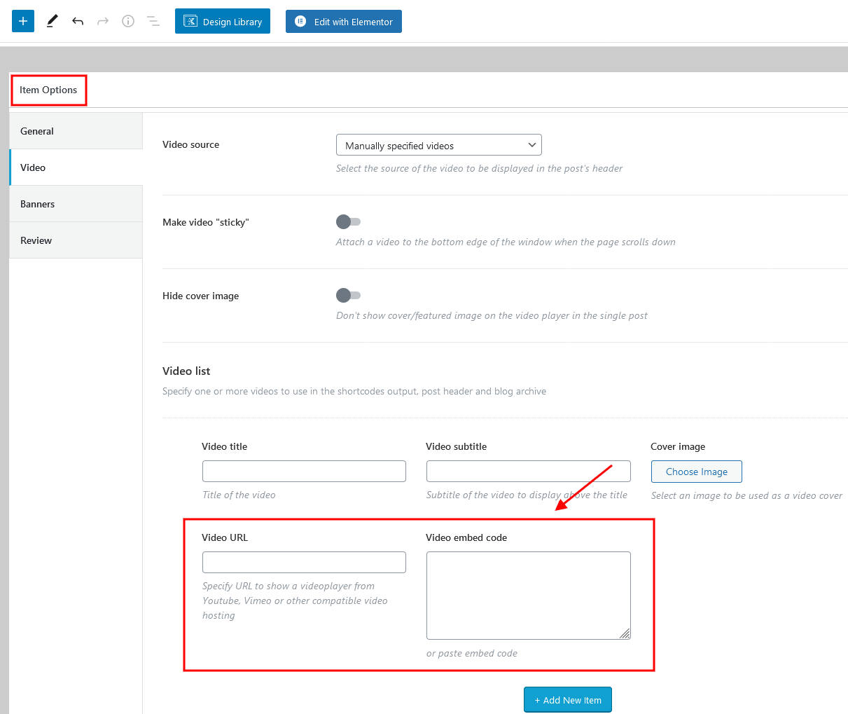
- custom video list, created through the widget’s settings (Edit Video List > Content > Video List). Add as many items as you want. Clone items by clicking a clone button to the right of the item’s number, or rearrange them by dragging and dropping.
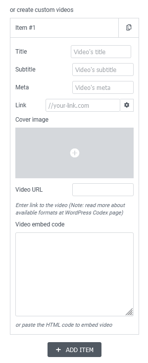
Example:
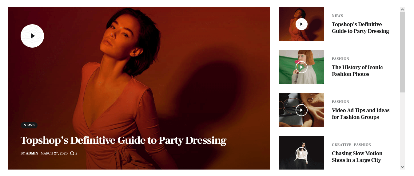
Contact Form 7
This Elementor widget displays pre-built contact forms. The Contact Form 7 plugin must be installed and active for this functionality. The forms can be managed in the Contact (WP Dashboard) > Contact Forms section.
Example:
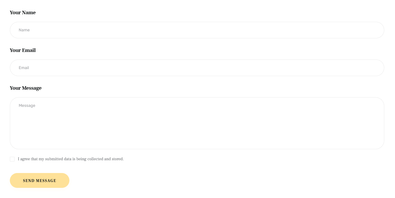
Extended Products
This Elementor widget outputs products. You can customize the single products in the Products (WP Dashboard) > All Products section. Ensure the WooCommerce plugin is installed and active to access this widget.
Example:
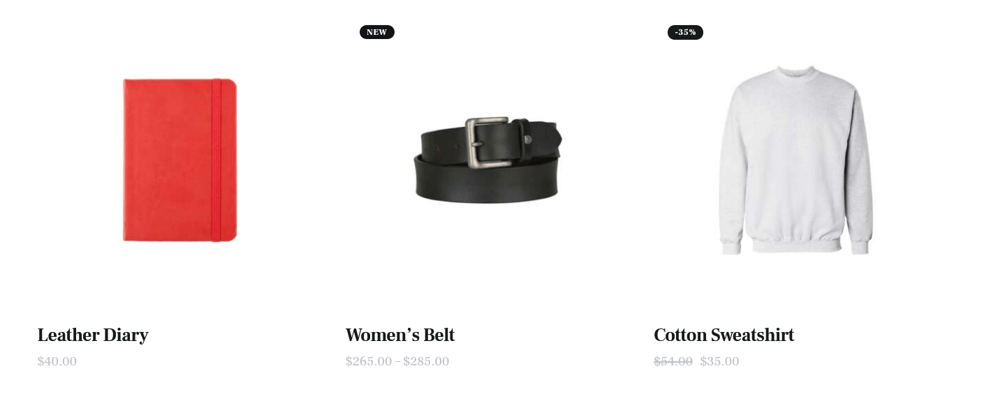
WooCommerce Search
This Elementor widget inserts an advanced search form for products (requires the WooCommerce plugin). Please note that the widget in "Inline" style works on all pages. The rest available styles work on the shop list page only!
Example:
You can easily add new field filters in WP Dashboard > Products > Attributes
WooCommerce Title
This Elementor widget displays a page title, breadcrumbs, and a description of a product category on shop-related pages. You can use this widget for creating separate custom header layouts for shop-related pages ONLY! The description inherits content from the back-end settings of a definite product category. The description becomes visible on product category pages ONLY!
This widget requires the WooCommerce plugin to be active.
Example:
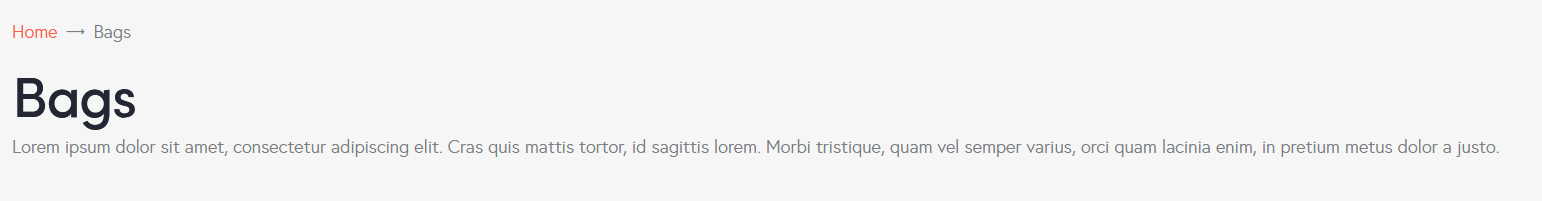
ThemeREX Addons Layouts group
Layouts
Inserts content in different ways, depending on the type of layout:
- Default - displays one of the custom layouts available in WP Dashboard > Theme Layouts post type. Please click here to view the list of available custom layouts.
- Popup - creates popup notifications that appear whenever a user clicks on a link or a button.
- Panel - creates a panel with some content/menu that appears whenever a user clicks on a link or a button.
Select which type of layout to use in the layouts widget’s content settings.
The algorithm for building a popup notification or panel:
- Create a custom layout with the required content that will be displayed in the popup window or panel. If you want to use simple text/image or shortcode (like grid gallery, MailChimp form, etc.), just omit this step.
- Add a new Elementor Page Builder section to the page. In the left panel with Elementor elements open the "ThemeREX Addons Layouts" group, and drag and drop the Layouts widget from the panel into your section. Select the desired widget’s type (popup/panel) and custom Layout from the dropdown list (Layout field) or enter simple text/shortcode/image from the Media Library in the Content field (if the "Layout" option is set to "Use content").
You may navigate to Edit Layouts > Advanced tab to enclose the elements with paddings or set the background image/color. - In the widget’s settings under the Content tab, Popup (panel) ID field, assign the ID to your popup/panel, e.g.
example_popup.
- Use the popup/panel ID, preceded by a pound sign (
#), as an address for the link or button that should trigger the popup/panel.
The background color for the panels is inherited from the "Layouts" widget’s color scheme, specified in a particular header layout. Use the Elementor navigator to open the settings, if needed.
Example (Default layout):
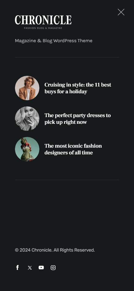
Example (Popup layout):
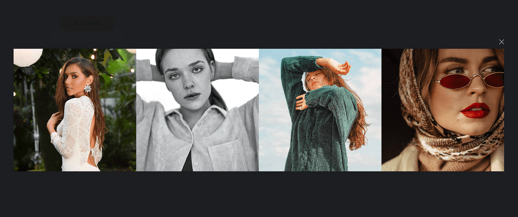
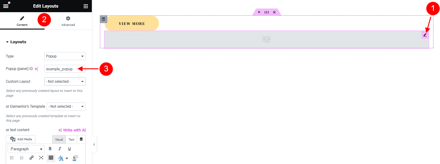
Example (Panel layout):
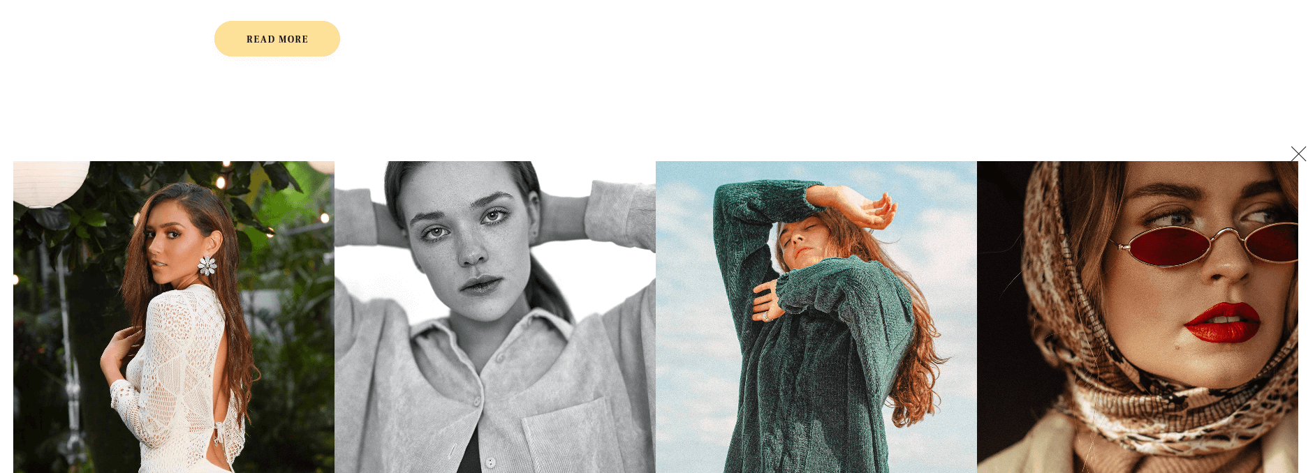
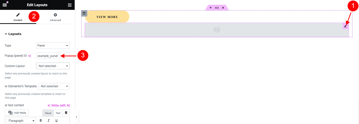
The rest widgets from this group are described in the Layouts Widgets section of this documentation file.
ThemeREX Addons
As a free addition to this theme, we have included a unique ThemeREX Addons plugin. Once activated, it allows expanding the options of the theme noticeably. These add-ons allow you to use custom widgets sets and custom Elementor widgets, show custom post types, set links to your social profiles as well as some advanced theme-specific settings.
After the plugin’s installation, the "ThemeREX Addons" menu item should appear in the "Theme Panel" tab in the WordPress dashboard menu panel.
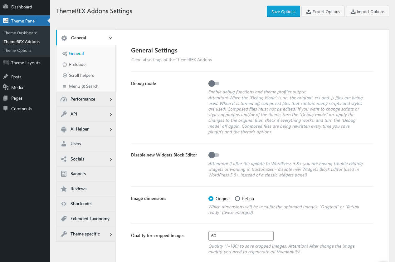
Below is a brief description of all the available settings.
PLEASE NOTE! Please treat the screenshots in this chapter as pure examples. The theme settings (enabled/disabled options) may vary from the ones in your theme.
General
Settings of this tab define the general behavior of your theme.
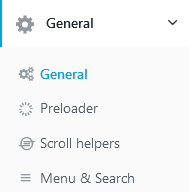
General Settings
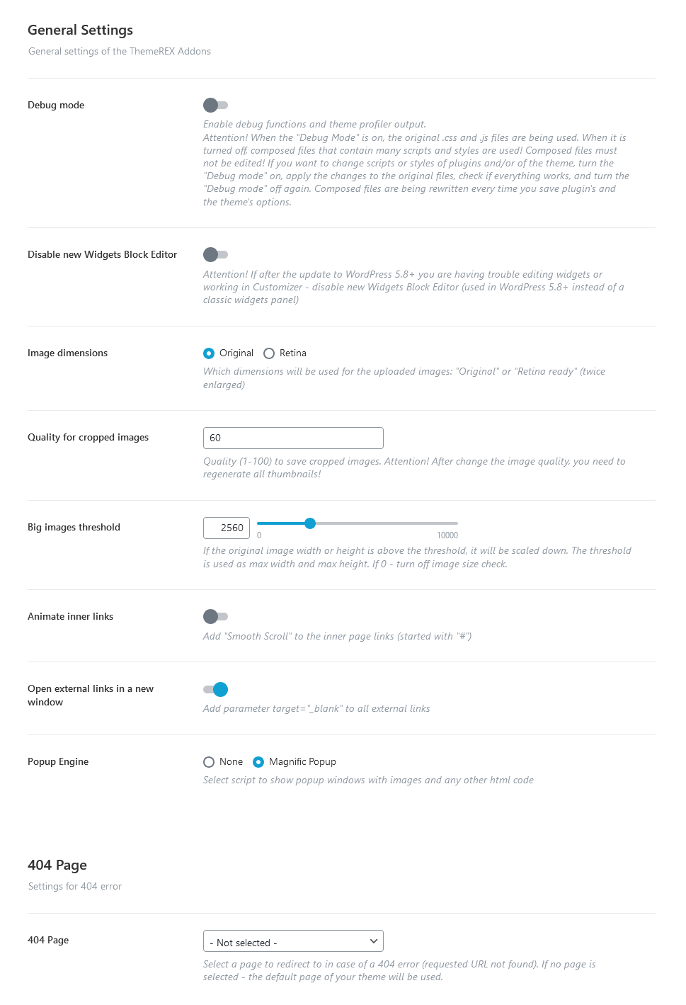
-
Debug Mode - Enable debug functions and theme profiler output.
IMPORTANT! There is a separate file for each script snippet.jsand style-related.cssdata. For better theme performance the system automatically re-compiles/re-merges these files into a single.js/.cssrelated one after every "Save Options" button click in Customizer (Appearance > Customize) and ThemeREX Addons settings (Theme Panel > ThemeREX Addons).
In case the "Debug Mode" is on, the theme does not run the re-compile/re-merge mode, so every file loads separately. That is why we do recommend turning this mode on only if you need to edit/customize the source script and style-related files. Please do not edit the following (re-merged) files:trx_addons.css,trx_addons.js,__colors.css,__style.css,__scripts.js. - Disable new Widgets Block Editor - Disable new Widgets Block Editor, if after the update to WordPress 5.8+, you are having trouble with editing widgets or working in Customizer. New Widgets Block Editor is used in WordPress 5.8+ instead of the classic widgets panel.
-
Allow Presets in Elementor Editor - Add a "Preset" section under the "Advanced" tab for each Elementor widget, allowing you to save all styling settings as a preset and easily apply them to other instances of the same widget.
Presets save styles from the "Style" and "Advanced" tabs, as well as from other tabs defined by the theme (options with parameters:'selectors','prefix_class', or'for_preset' => true). There are three available options: "Save as Preset", "Update/Rename Preset", and "Delete Current Preset".
If you mark a preset as the default when saving it, the system will highlight it in the list (make it bold) and automatically apply it whenever the element is added to the page.
By default, the theme does not include any widget presets. However, you can add presets inJSONformat to the theme (applicable to all theme skins) by placing them in the following file:/plugins/trx_addons/presets/trx_addons-presets.json.
If the theme includes a set of pre-built presets, they will be available immediately after the full demo content import. However, you can easily regenerate them at any time by navigating to Theme Panel > ThemeREX Addons > Theme Specific > Theme Elements > Create Presets.
Images
-
Image dimensions - Choose which dimensions will be used for the uploaded images: "Original" or "Retina ready" (twice enlarged).
If the "Retina" option is enabled, twice enlarged images will be loaded on devices with retina displays and regular images will be used for non-retina screens. The system automatically creates retina versions for all sets of thumbnails. This will significantly enlarge your disc space. It doesn't work for previously uploaded images. In this case, you can install and launch any plugin, like regenerate thumbnails, after switching this option. -
Quality for cropped images - Specify a range of quality (1-100) to save cropped images.
PLEASE NOTE If you change the image quality, do not forget to regenerate the thumbnails again.
- Big images threshold - If the original image width or height is above the threshold, it will be scaled down. The threshold is used as max width and max height. If 0 - turn off image size check.
- Popup Engine - Choose one of two scripts to display your popup images.
Links
- Animate inner links - This setting adds a "smooth scroll" effect to the inner page links.
- Open plugin’s external links in a new window - Automatically add the attribute
target="_blank"to all links pointing to external sites during server-side page generation (applies only to links generated by the plugin). - Open all external links in a new window - If checked, this setting adds parameter
target="_blank"to all external links.
404 Page
- 404 Page - Choose a page to take content from for redirect if the requested URL is not found (404 error). If no page is selected, the default 404 page that comes with the theme will be used.
Preloader Settings
-
Show page preloader - Select or upload a page preloader image for your site.
- Page preloader color - Choose the for the page preloader. If empty - the default color is used.
- Page preloader bg color - Specify the background color for the page preloader. If empty, do not use any background color.
- Page preloader image - Select or upload the page preloader image. If empty - no preloader is used. This option is available for the "Custom" preloader style only.
Scroll Helpers Settings
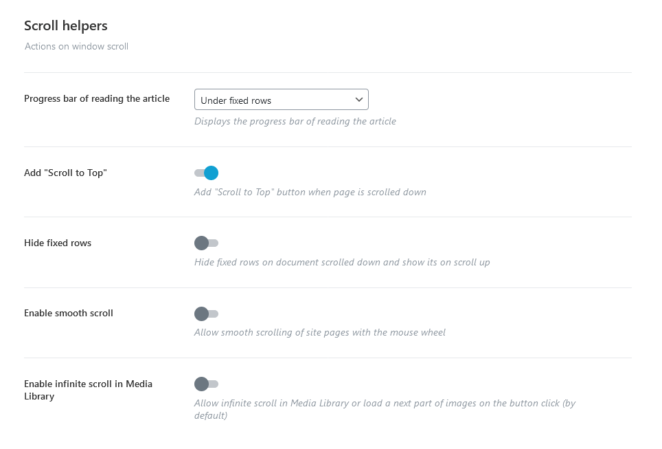
- Progress bar of reading the article - Enable/disable the progress bar of reading the article.
- Add "Scroll to Top" - Add the "Scroll to Top" button when the page is scrolled.
- Hide fixed rows - Hide fixed rows when the page is scrolled down and show them on scroll up.
- Enable smooth scroll - Allow smooth scrolling of site pages with the mouse wheel.
- Enable infinite scroll in Media Library - Allow infinite scroll in Media Library or load the next part of images on the button click (by default).
Menu & Search Settings
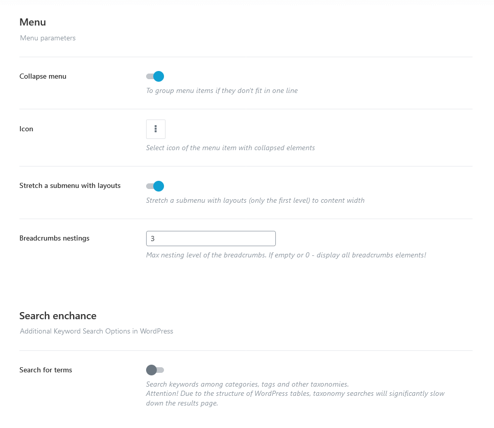
Menu
- Collapse menu - Whether you need to group menu items or not, if they don't fit in one line.
- Icon - Select the icon of the menu item with collapsed elements.
- Stretch a submenu with layouts - Stretch a submenu with layouts (only the first level) to the content width.
- Breadcrumbs nestings - Specify the necessary nesting level for breadcrumbs.
Search Enhance
- Search for terms - if enabled, makes standard WordPress search, Elementor "Search Form" widget (for pages) (ThemeREX Addons Layouts group) and "ThemeREX Products Filter" widget (for sidebars) support search keywords among all registered taxonomies (categories, tags, product attributes, etc.). The taxonomy searches will significantly slow down the results page.
Performance
Settings of this tab allow you to improve page loading speed.
Optimization Settings
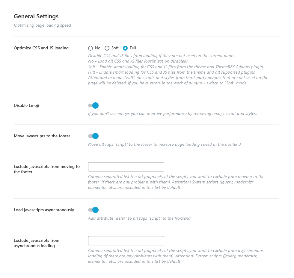
-
Optimize CSS and JS loading - Disable CSS and JS files from loading if they are not used on the current page.
- No - Load all CSS and JS files (optimization disabled);
- Soft - Load CSS and JS files from the theme and ThemeREX Addons plugin on the pages where they are used. The loading of styles and scripts of external plugins is regulated by the rules of those plugins.
- Full - Load CSS and JS files on the pages where they are used (for theme styles, ThemeREX Addons plugin, and all supported plugins).
- Disable Emoji - Remove Emojis scripts and styles if you don't use them.
- Move javascripts to the footer - This setting moves all tags "script" to the footer to increase page loading speed.
- Exclude javascripts from moving to the footer - Specify the URL fragments of the scripts you want to exclude from moving to the footer (if there are any problems with them). The system scripts (jquery, modernizr, Elementor, etc.) are included in this list by default.
- Load javascripts asynchronously - This setting adds the attribute "defer" to all tags "script" in the front end.
- Exclude javascripts from asynchronous loading - Specify the URL fragments of the scripts you want to exclude from asynchronous loading (if there are any problems with them). The system scripts (jquery, modernizr, Elementor, etc.) are included in this list by default.
Lazy Loading Settings
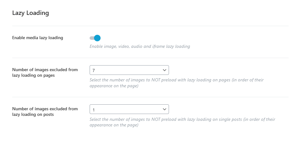
-
Enable media lazy loading - Enable image, video, audio and iframe lazy loading. This function allows a browser to defer loading offscreen images and iframes until users scroll down to them.
- Number of images excluded from lazy loading on pages - Specify the number of images NOT to preload with lazy loading on pages.
- Number of images excluded from lazy loading on posts - Select the number of images NOT to preload with lazy loading on single posts.
Cache Manager Settings
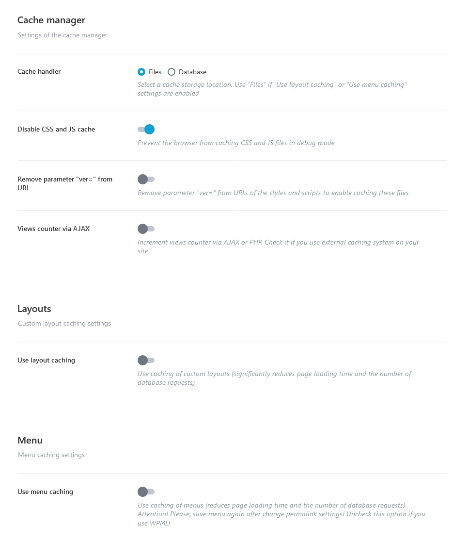
Cache Manager
-
Cache handler - Select a cache storage location.
-
Files - data is stored as separate files in the
/uploads/trx_addons/cachefolder. - Database - data is stored in the WordPress cache in your database.
-
Files - data is stored as separate files in the
- Disable CSS and JS cache - Prevent the browser from caching CSS and JS files in debug mode.
- Remove parameter "ver=" from URL - This setting removes parameter "ver=" from URLs of the styles and scripts to enable caching these files.
- Views counter via AJAX - This setting allows managing the views counter. We recommend leaving it intact.
Layouts
-
Use layout caching - Use caching of custom layouts (significantly reduces page loading time and the number of database requests, but increases the size of the database). If enabled, we recommend using "Files" as a cache storage location.
- Select the types of layouts to caching - Use caching only for the specified types of layouts.
- Cache only on the popular pages - Cache the layouts only for the most visited pages.
Menu
- Use menu caching - The menu caching option is responsible for increasing the overall theme’s performance.
API
This section contains settings for correct loading maps (Google maps and OpenStreet maps) as well as connecting to your profiles on Facebook and Instagram.
Facebook Settings
Here, you can specify Facebook App ID.
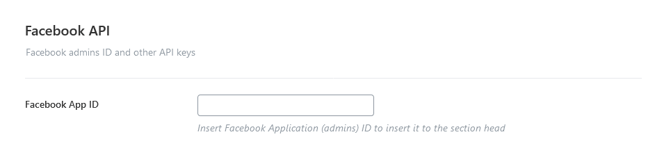
Instagram Settings
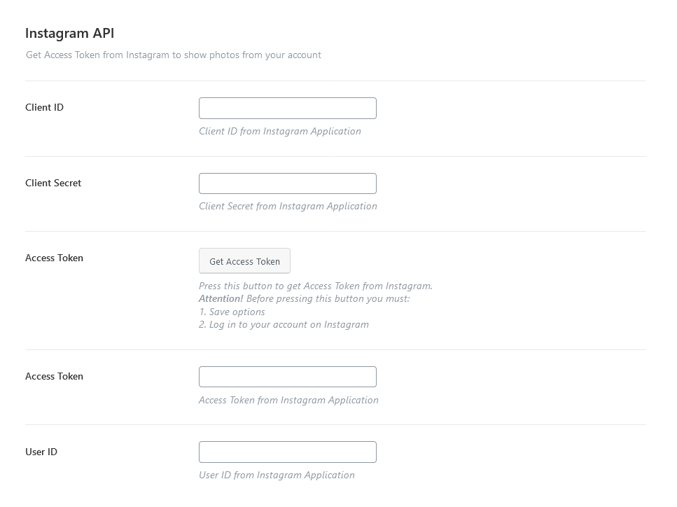
These settings allow you to connect to your Instagram account. Use the "ThemeREX Instagram Feed" widget (Appearance > Widgets) or Elementor "Instagram" widget (ThemeREX Addons Elements group) to output the Instagram photos.
How to get Access Token from Instagram:
- Log into your Instagram account with photos you want to display on your website.
- Visit the Facebook Developer Page, and click My Apps to create and set up a Facebook application. Please click here to view an official tutorial.
- Fill in the form. For the "valid redirect URLs" option use the following link
https://your_website_name/wp-json/trx_addons/v1/widget_instagram/get_access/. - Get your "Client ID" and "Client Secret".
- Navigate to Theme Panel (WP Dashboard) > ThemeREX Addons > API section and paste "Client ID" and "Client Secret" into the corresponding fields. Click on the "Get Access Token" button.
- Approve that you want to grant the application access to your Instagram account.
AI Helper (available if AI Helper Add-on is active)
These are the basic settings for AI Helper. Here, you can insert your own Open AI, ModelsLab AI, Stability AI, Flowise AI, Google AI (Gemini), X AI (Grok), and LumaLabs AI (Dream Machine) tokens, choose the models for generating images/chats/audio/video here as well as specify the limitations for your customers to generate images/text/audio/music/video from your website or for chat requests (if you have inserted the corresponding widgets/blocks into your web page). It’s a PAID service!
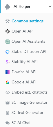
Links for generating tokens:
- Open AI - https://platform.openai.com/settings/organization/api-keys;
- ModelsLab - https://modelslab.com/dashboard/api-keys;
- Stability AI - https://platform.stability.ai/account/keys;
- Google AI (Gemini) - https://makersuite.google.com/app/apikey;
- X AI (Grok) - https://console.x.ai;
- LumaLabs AI (Dream Machine) - https://lumalabs.ai/dream-machine/api/keys;
- Extend support period for 6 months - https://themerex.net/downloads/technical-support/;
Common Settings
Here you can enable/disable AI Assistant in your Dashboard, extend support for using AI Assistant, and choose default text model for text generations.
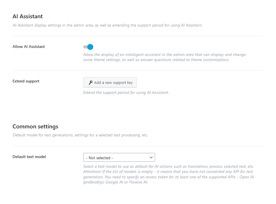
AI Assistant
-
Allow AI Assistant - Enable an intelligent assistant in the admin area (in the right bottom corner) that can display and change some global theme settings (website title, tagline, logo; colors of a defined color scheme; mouse helper settings, etc.), as well as answer questions related to the theme customization.
The assistant functions when you have paid support, which initially lasts for 6 months from the theme purchase. To continue using AI Assistant, you will need to extend the support period through a paid service.
- Extend support - Add a new support key to extend the support period for using AI Assistant.
Common settings
-
Default text model - Select a text model to use as a default one for AI actions such as translation, process selected text, etc. If the list of models is empty - it means that you have not connected any API for text generation. You need to specify an access token for at least one of the supported APIs - Open AI (preferably), Google AI, or Flowise AI in the corresponding section of the AI Helper settings (Theme Panel > ThemeREX Addons > AI Helper). There, you can also extend the list of models if needed (for Open AI - under the "Chat Models" accordion section).
- System Prompt - System instructions for the AI Helper in the post editor guide the AI in selecting the appropriate communication style.
- Process selected text - If enabled, it adds functionality to process (explain, summarize, translate) selected text for specified post types and/or URLs.
- Post types - Select the post types. The available post types vary based on the plugins installed.
- URL include - The "Process selected text" functionality will be enabled for pages that match URL parts listed here (comma-separated or each on a separate line).
- URL exclude - The "Process selected text" feature will be disabled for pages with URLs that match any of the listed parts (either comma-separated or on separate lines).
AI Content Generator Settings
This block of settings becomes visible after you enter your valid AI token in Theme Panel > ThemeREX Addons > AI Helper > Open AI API.
If you want to use AI-generated content on your website, provide details about your company (such as name, industry, contact information, description, mission, history, etc). This information helps the AI generate content tailored to your business and accurately populate widget fields in the page editor (Elementor sections/containers).
The "Company Name" and "Industry" fields are required for demo content and blog post generating. The remaining information can be generated by the AI. Simply click the "Generate Demo Content" button in the upper-right corner to proceed and save your changes.
IMPORTANT! Press the "Generate Demo Content" button only if all fields are empty, except for the "Company Name" and "Industry" entries. The AI will overwrite any previously entered information.
The "Demo blog generation" contains the following settings. Please take note of the limitations.
- Posts to generate - Define how many posts you want the system to generate. You can enter any whole number between
1and100. - Case of post titles - Controls the capitalization format applied to generated post titles:
- Sentence - The title will begin with a capital letter, while the rest of the sentence remains in lowercase (e.g., This is a post title).
- Title - Capitalizes the main words in the title following the standard title case rules (e.g., This Is a Post Title).
- Categories/Tags/Comments per post - Specify the number of categories, tags, and comments to assign per post. You can enter any value from
0to10. A value of0means that no categories, tags, or comments will be added to the post. - Comment in each # post - This option defines how frequently comments will be added across the generated posts. Enter a number from
1to10. The number represents the interval: for example, setting it to3means every third post will receive a comment. A value of1applies comments to all posts.
Content main settings
- "Company name"/"Industry" - Share information about your company. These fields are recommended for filling.
- "Address"/"Phone"/"E-mail" - Company contact information
- Description - A concise description of your company (up to 250 words), highlighting its mission, values, and key areas of operation.
- Mission - The company’s mission with a brief statement (up to 50 words) that captures its core purpose and guiding philosophy.
- History - A short history of the company (up to 200 words), including its founding year, major milestones, and notable achievements.
- Values - Lists a key value or principle of the company. Each entry should begin on a new line, be concise, meaningful, and represent the company’s culture and priorities.
- List of company services - Displays a service name, datailed service’s description (up to 150 words), and key features or advantage of the service (up to 20 words; each item starting from a new line). Add as many service items as needed. Clone items by clicking a clone button in the top right corner, or rearrange them using the drag button in the top left corner (an icon with 3 horizontal lines).
- Team members - Outputs employee mame, position, and a brief biography (up to 100 words). Add as many team member entries as needed. Use the clone button in the top-right corner to duplicate items or the drag button in the top-left corner (icon with three horizontal lines) to rearrange them.
How to generate content based on company information
After entering or generating your company information, open a page in the Elementor page builder and insert any Elementor widget, leaving it empty. Access the context menu for the section or container with the widget, then click "Generate Texts with AI" to create content.
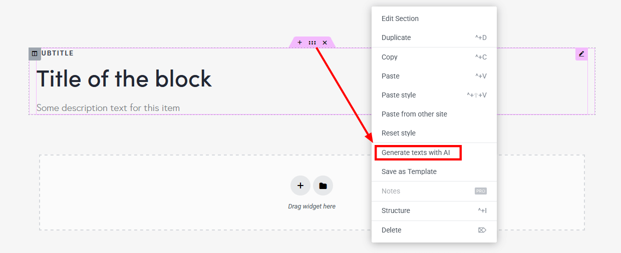
In the newly opened popup specify the type of content and click on the "Generate" button. When generating, company data will be used as a context for generation.
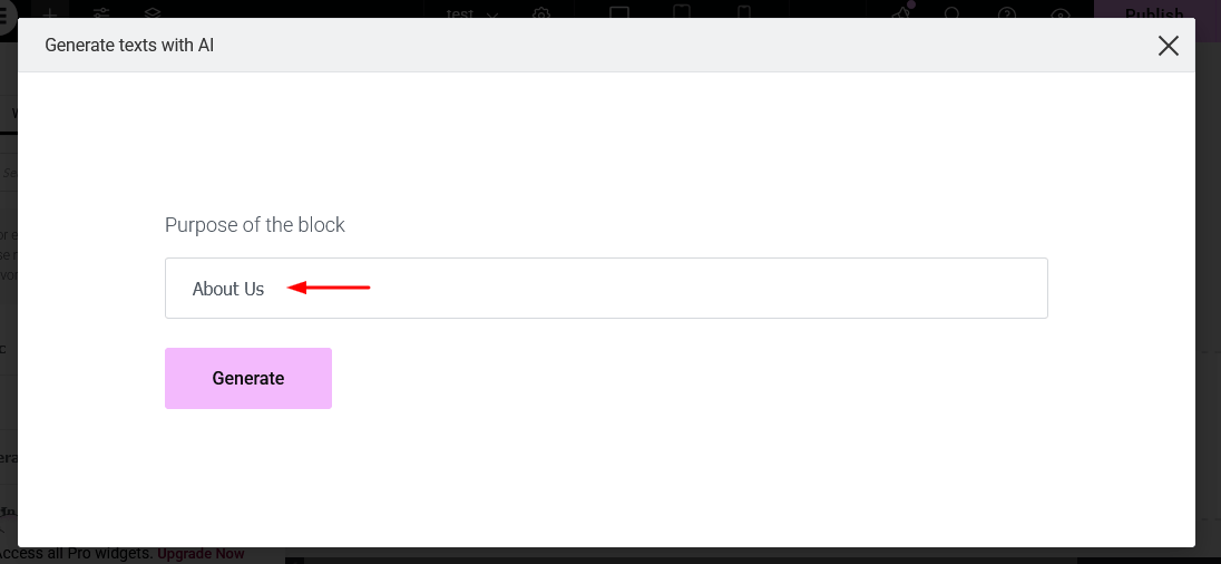
IMPORTANT! Ensure the Elementor section or container is not empty when generating content based on company data!
Open AI API Settings
Below you can find settings of the AI Helper for Open AI API.
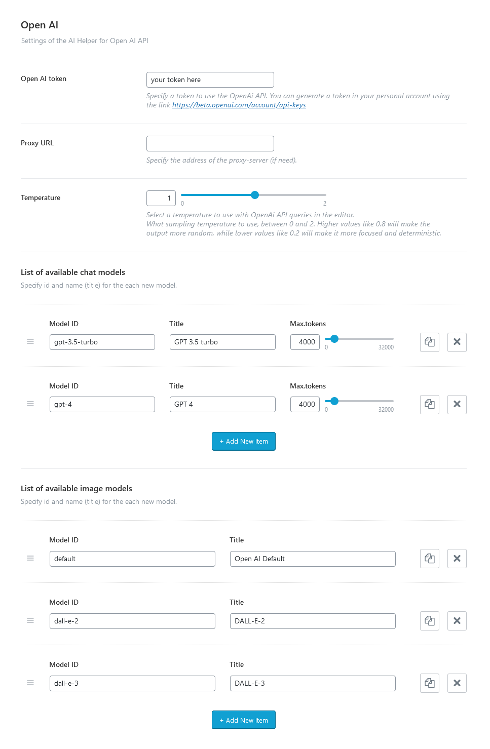
-
Open AI token - Specify a real token to use the OpenAI API functionality. Please follow this link to generate your token from your account, if required.
The rest settings appear if the AI token is entered.
- Proxy URL - Type in an address of the proxy-server (if applicable).
-
Proxy Auth - Specify the login and password to access the proxy-server (if necessary). Use the format:
login:password. - Default chat endpoint - Choose the endpoint to use for accessing the chat completions on the OpenAI API server: responses (New) or chat/completions (Legacy).
-
Temperature - Select a temperature to use with OpenAI API queries. It describes the level of randomness.
O- less random,2- creative, but more random. - List of available chat/image/text to speech/transcription/translation models - Add the required models for chats and generating images/audio/text. Specify IDs and names (titles) for each new model.
Open AI Assistants Settings
A list of assistants created in the GPT Plus user account, available for text generation (via the "AI Helper Text Generator" block/Elementor widget in the front end and Gutenberg text generator) and for chats (using the "AI Helper Chat" block/Elementor widget in the front end or AI Assistant in the admin area).
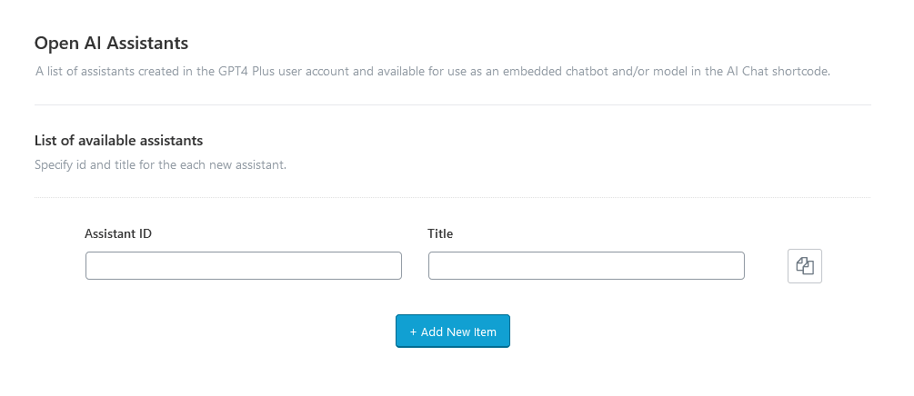
- Assistants API version - Choose the version of Assistants API. Please note some newer models, such as the GPT-4o, only support API v2.
- Parse annotations - If enabled, substitutes citations of the information source in the Assistant’s responses with numbered references (like [1], [2], etc.), and includes a corresponding list of footnotes below the main response.
- List of available assistants - Specify an id and name (title) for each new assistant. Use as many items as you need.
To create AI Assistants you need a real Open AI token and a valid subscription to GPT Plus.
In your GPT Plus personal account, you can create, edit, or delete assistants. For each assistant, you can upload documents (knowledge base), set text instructions, and specify whether the assistant should interpret program code.
The assistant ID value can be found in your GPT Plus personal account, the assistant’s name is arbitrary.
Please check our video tutorial.
ModelsLab (formerly Stable Diffusion) API Settings
If the Open AI models are not enough for you, you can use ModelsLab service for generating images/audio/music. Just enter your own ModelsLab token and set the available parameters. By default, we have activated 10+ image models, though you can easily add new ones. The number of activated models is unlimited. The models for audio/music generation should be specified in the "AI Helper Audio Generator" or "AI Helper Music Generator" block/Elementor widgets if the corresponding option is available.
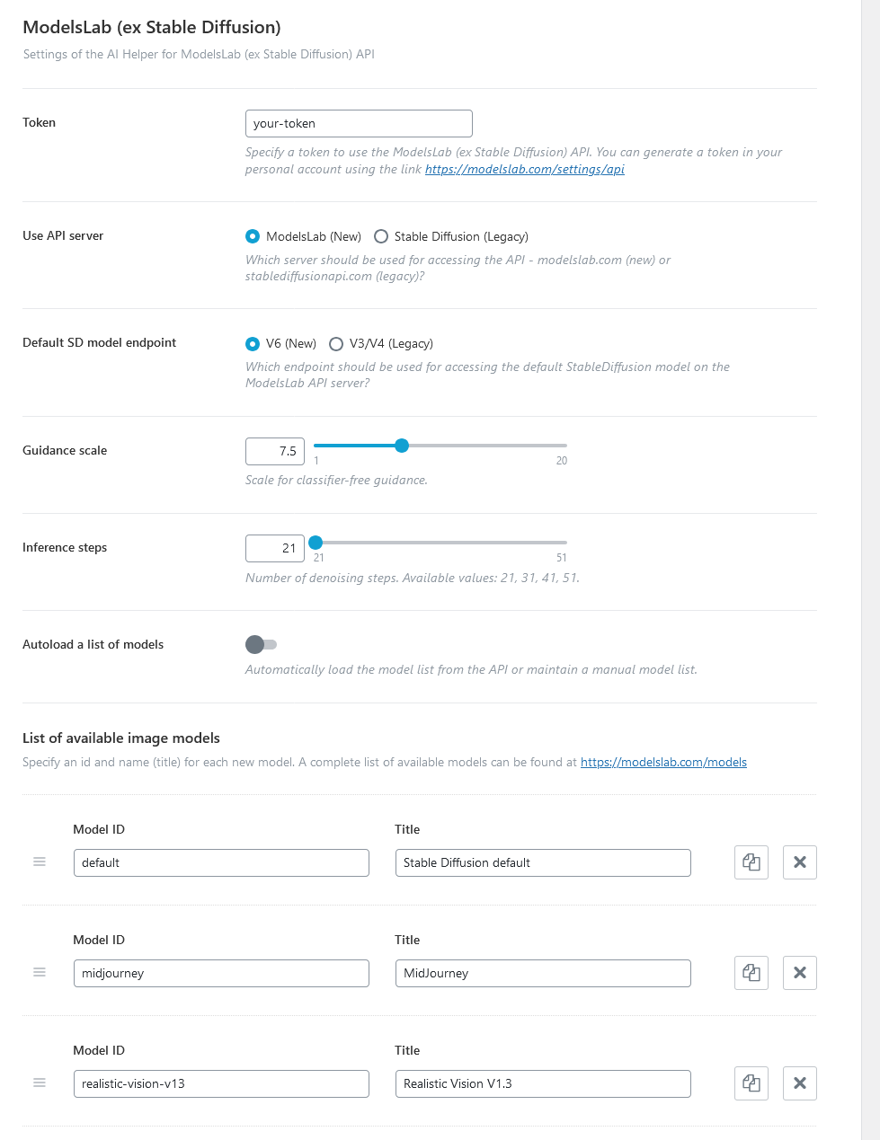
-
ModelsLab token - Specify a real token to use the ModelsLab API. You can generate a token in your account using the link.
The rest settings appear if the ModelsLab token is entered.
- Use API server - Choose the server to access the API - modelslab.com (new) or stablediffusionapi.com (legacy).
- Default SD model endpoint - Select an enpoint for accessing the default StableDiffusion model on the ModelsLab API server.
- Guidance scale - This is a scale for classifier-free guidance.
- Interference steps - Specify the number of denoising steps. Available values: 21, 31, 41, 51.
- Autoload a list of models - Choose between the automatically loading model list from the API or maintaining a manual model list.
-
List of available models - Add the required models for generating images ONLY! Specify IDs and names (titles) for each new model. A complete list of available models (with their IDs and titles) can be found at https://modelslab.com/models.
This list with image models will appear in the "AI Helper Image Generator" Gutenberg block or Elementor widget ("ThemeREX Addons Elements" group) and in the WordPress Media Library Selector popup.
Feel free to check out our video tutorial concerning the Stable Diffusion API integration:
Stability AI API Settings
Our theme also supports Stability AI API for generating and processing images.
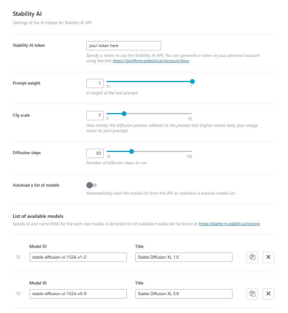
-
Stability AI token - Specify your token to use the Stability AI API. You can generate a token in your account using the link.
The rest settings appear if the Stability AI token is specified.
- Default API - Choose the correct endpoint to use for connecting to the default Stability AI API server.
-
Prompt weight - A weight (significance) of the text prompt. Use values from
0.0to1.0. - Cfg scale - Specifies how closely the generator should adhere to user prompts when generating or processing an image. The value ranges from 0 (minimal consideration of prompts) to 35 (strict adherence to prompt instructions).
- Diffusion steps - Specify the number of diffusion steps to run.
- Autoload a list of models - If enabled, the system automatically loads the model list from the API. If disabled, the system maintains a manual model list.
- List of available image models - Add the required models for generating images. Specify an ID and title (arbitrarily) for each new model. A complete list of available models (with their IDs and titles) can be found at https://platform.stability.ai/pricing.
Flowise AI Settings
Flowise AI is a versatile platform that simplifies chatbot creation for users without coding experience. Chatbot configuration is managed within the Personal Account on the server where Flowise AI is deployed.
To use chatbots created with Flowise AI as models for AI chat and text generation, ensure the following settings:
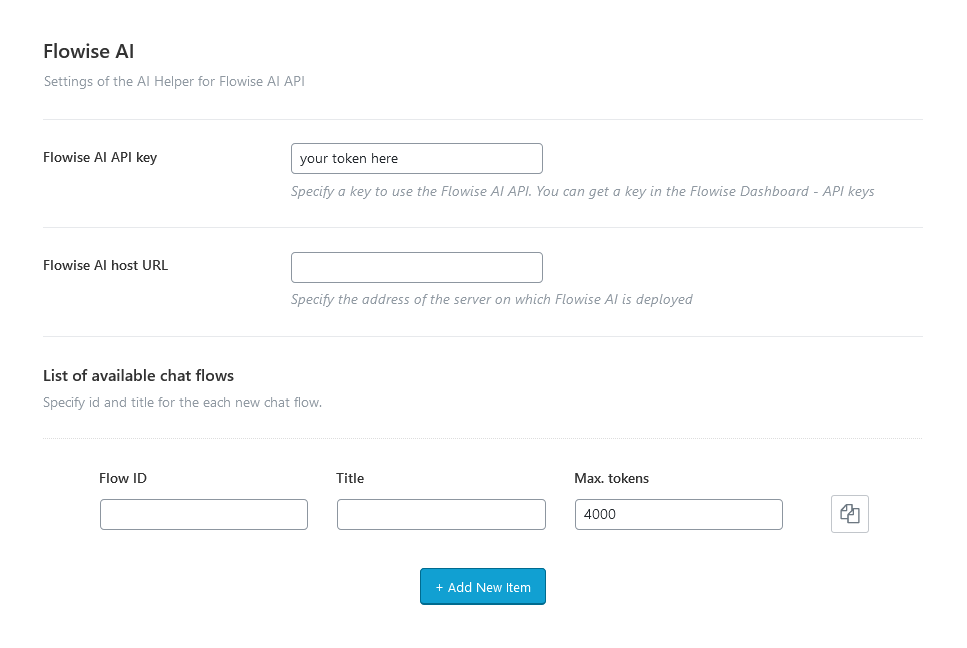
-
API key - Specify your token to use the Flowise AI API. You can get a key in the Flowise Dashboard - API keys on your server with deployed Flowise AI.
The rest settings appear if the Flowise AI token is specified.
- Flowise AI host URL - Type in the address of the server on which Flowise AI is deployed.
- List of available chat flows - Set an ID (from your Flowise Dashboard) and a title (arbitrary) for each new chat flow. You can use these chatbots as models for the Elementor "AI Helper Chat"/"AI Helper Text Generator" widgets or corresponding Gutenberg blocks.
Google AI (Gemini) Settings
Available AI Helper settings for optimal AI chat performance and proper text generation with the Google AI (Gemini):
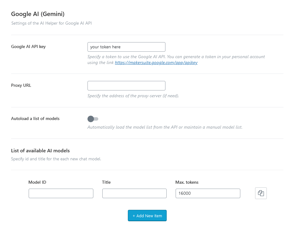
-
API key - Specify your token to use the Google AI API. You can generate a token in your account using the link.
The rest settings appear if the Google AI token is specified.
- Proxy URL - Specify the address of the proxy-server (if necessary).
-
Proxy Auth - Insert the login and password to access the proxy-server (if required). Use the format:
login:password. - Autoload a list of models - Choose between automatically loading the model list from the API or maintaining a manual model list.
- List of available chat models - Specify an ID and a title for each new chat model.
Take a look at our video tutorial for step-by-step guidance on integrating Google’s Gemini AI API with your WordPress site.
X AI (Grok) Settings
This panel allows you to configure the integration with the X AI (Grok) API for using AI features within your website.
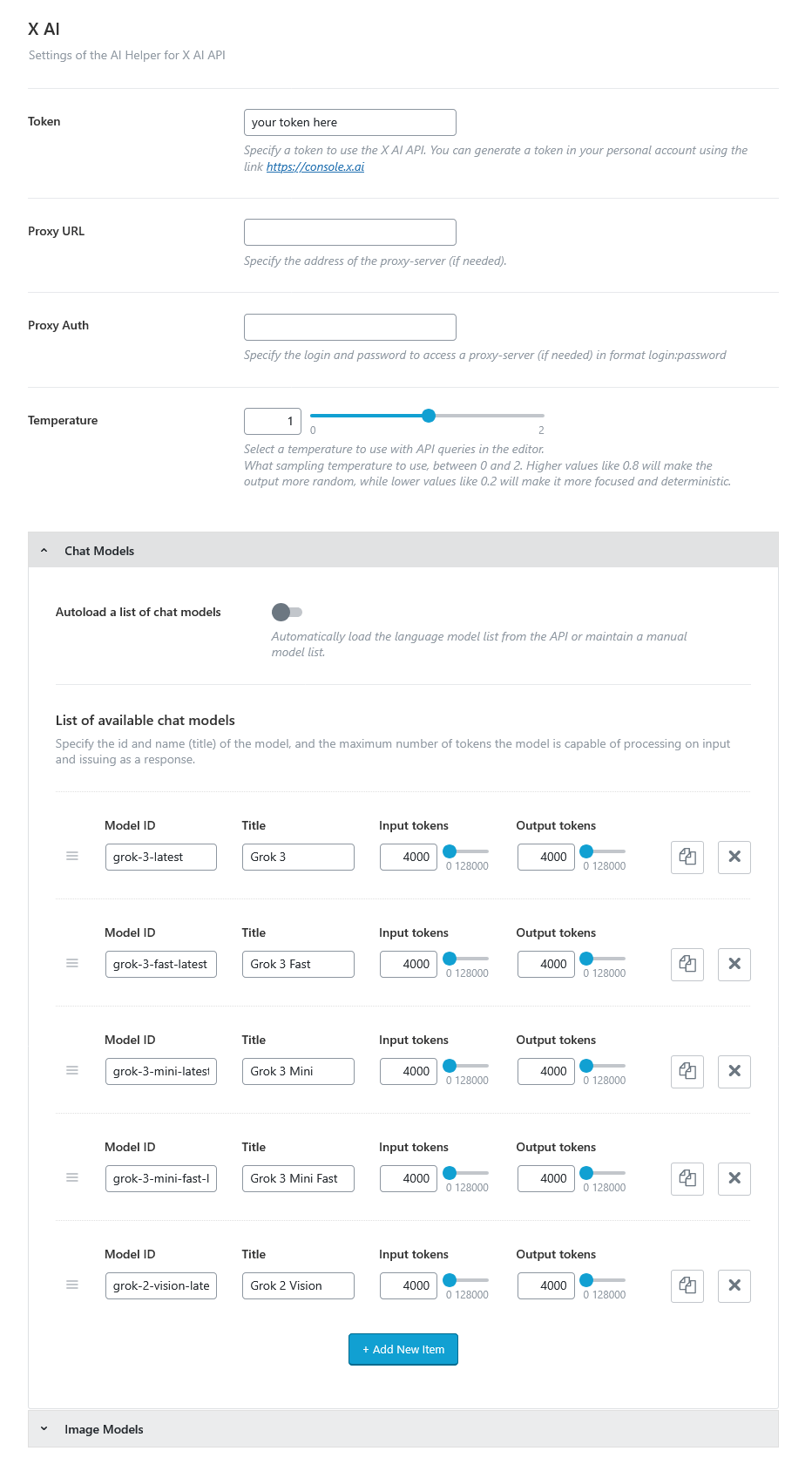
-
Token - Enter your personal API token to authenticate with the X AI API. You can generate a token from your X AI account at: https://console.x.ai.
The rest settings appear if the X AI token is specified.
- Proxy URL - Provide the address of a proxy server to route API requests if needed. Leave blank if you are not using a proxy.
-
Proxy Auth - If the proxy server requires authentication, input your login and password in the format:
login:password. -
Temperature - Controls the randomness of AI responses. Choose an appropriate value from
0to2based on the desired level of creativity or precision.
- Lower values (e.g.,
0.2): More focused, predictable, and deterministic outputs. - Higher values (e.g.,
0.8or above): More creative, diverse, and random outputs.
- Lower values (e.g.,
- List of available chat/image models - Add the required models for chats and generating images. Specify IDs and names (titles) for each new model. Here you can enable autoloading a list of models from your API as well.
LumaLabs AI API (Dream Machine) Settings
Below you can find available settings for text to video generating functionality. Use the Elementor "AI Helper Video Generator" widget to display a video generating form on your website.
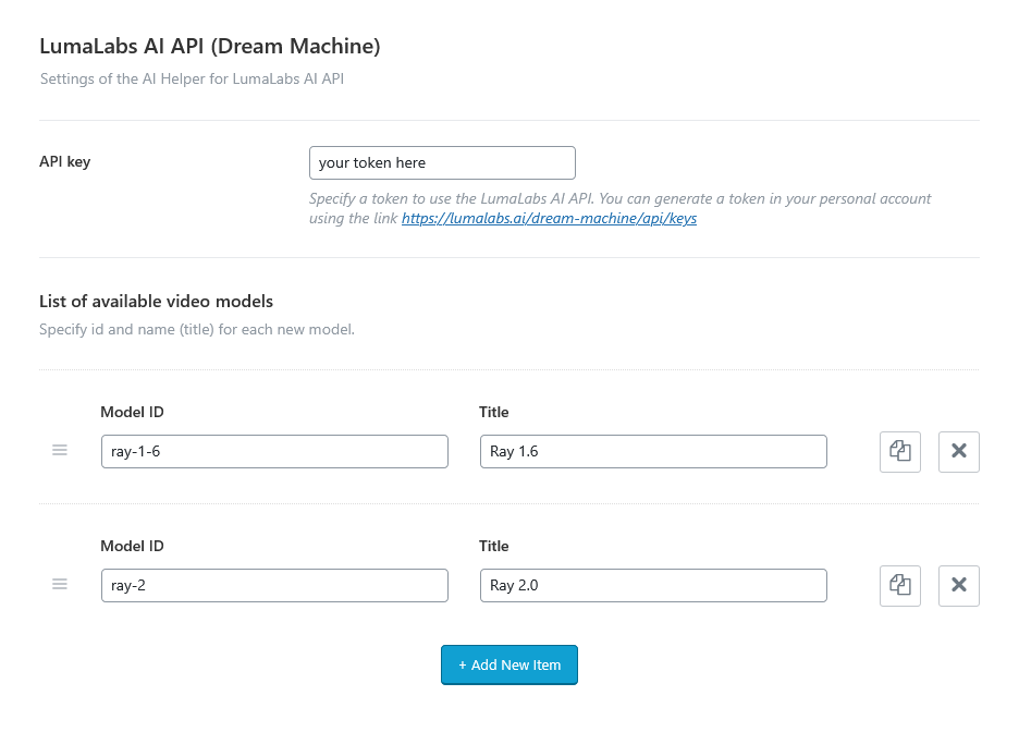
-
API key - Insert your token to use the LumaLabs AI API. To generate a token, open your account using the link.
Once the token is specified, the following settings appear:
- List of available video models - Specify an ID and a title for each new model. You can clone items by clicking a clone button in the top right corner, or rearrange them using the drag button (icon with 3 horizontal lines) in the top left corner.
Check out our video tutorial for a guide on integrating the AI Video Generator (LumaLabs API) into your WordPress site.
Embed External Chatbots Settings
Define a scope and HTML code for each new embedding. In the "URL Contain" field, list address segments (separated by commas or placed on separate lines). If any segment matches the current page URL, the block will be displayed. In the "HTML Code" field, paste the code snippet provided when creating/exporting the chatbot in your Flowise AI, VoiceFlow, or similar personal account.
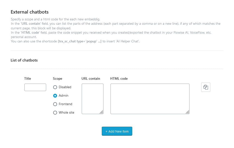
Clone items by clicking a clone button in the top right corner, or rearrange them using the drag button (icon with 3 horizontal lines) in the top left corner.
Shortcode "Image Generator" Settings
The "AI Helper" add-on allows you to display image generator form on your web page, using the "AI Helper Image Generator" Gutenberg block or Elementor widget ("ThemeREX Addons Elements" group).
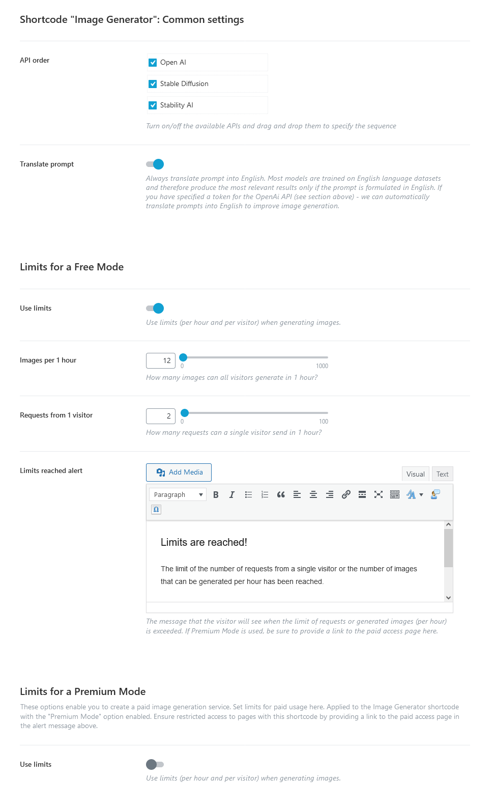
Common settings
- API order - As our theme supports different AI services, you can turn on/off the available APIs and drag and drop them to specify the sequence.
- Translate prompt - Always translate the prompt into English. Most models are trained on English language datasets and therefore produce the most relevant results only if the prompt is formulated in English. If you have specified a token for the OpenAI API (see section above) - we can automatically translate prompts into English to improve image generation.
Limits for a Free Mode
-
Use limits - If enabled, use limits (per hour and visitor) when generating images for free. These limits are for regular users who are not logged in or registered.
- Images per 1 hour - The number of images all visitors can generate in 1 hour.
- Requests from 1 visitor - The number of allowed requests from 1 visitor during 1 hour.
- Limits reached alert - Adjust a message that the visitor will see when the limit of requests or generated items is exceeded. If Premium Mode is used, be sure to provide a link to the paid access page here.
Limits for a Premium Mode
This section is for those who want to create a paid image generation service. Here, you can set the limits for paid usage. The options below can be applied to the "AI Helper Image Generator" Gutenberg block or Elementor widget ("ThemeREX Addons Elements" group) with the "Premium Mode" option enabled.
Ensure restricted access to pages with these widgets by providing a link to the paid access page in the alert message from the "Limits for a Free Mode" section.
-
Use limits - If enabled, use limits for visitors when generating images. These limits are for paid image generation.
- General limits - When an access sharing plugin is not used. In this case, you can restrict the page with an image generation form by a password. No registration for users is required.
- Images per 1 hour - The number of images all visitors can generate in 1 hour.
- Requests from 1 visitor - The number of allowed requests from 1 visitor during 1 hour.
- Limits for logged-in users - If a page with a premium image generation form is restricted by an external plugin ("Default" limit) or an external plugin separates access levels, like "Paid Memberships Pro" (not provided with the theme).
-
User levels with limits - The number of images a user can generate during a definite period (hour, day, week, month, or year) depending on the subscription level.
Default level - A limit for regular registered users, if the page with a premium generation form is restricted by an external plugin (not provided with the theme). This limit will be applied to every logged-in user separately.
Other levels - For more flexible settings, use special plugins to divide access levels, like "Paid Memberships Pro" (not provided with the theme).
-
User levels with limits - The number of images a user can generate during a definite period (hour, day, week, month, or year) depending on the subscription level.
- For all limits
- Limits reached alert - Adjust a message that the visitor will see when the limit of requests or generated items is exceeded.
- General limits - When an access sharing plugin is not used. In this case, you can restrict the page with an image generation form by a password. No registration for users is required.
Shortcode "Audio Generator" Settings
The "AI Helper" add-on allows you to display audio generator forms on your web page, using the "AI Helper Audio Generator" Gutenberg block or Elementor widget ("ThemeREX Addons Elements" group).
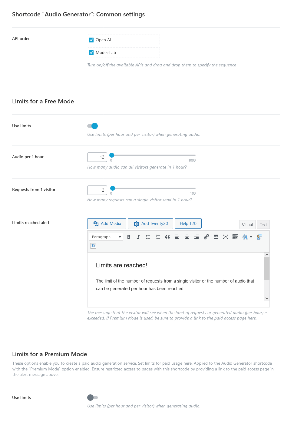
Common settings
- API order - As our theme supports different AI services, you can turn on/off the available APIs and drag and drop them to specify the sequence.
Limits for a Free Mode
-
Use limits - If enabled, use limits (per hour and visitor) when generating audio for free. These limits are for regular users who are not logged in or registered.
- Audio per 1 hour - The number of audio all visitors can generate in 1 hour.
- Requests from 1 visitor - The number of allowed requests from 1 visitor during 1 hour.
- Limits reached alert - Adjust a message that the visitor will see when the limit of requests or generated items is exceeded. If Premium Mode is used, be sure to provide a link to the paid access page here.
Limits for a Premium Mode
This section is for those who want to create a paid audio generation service. Here, you can set the limits for paid usage. The options below can be applied to the "AI Helper Audio Generator" Gutenberg block or Elementor widget ("ThemeREX Addons Elements" group) with the "Premium Mode" option enabled.
Ensure restricted access to pages with these widgets by providing a link to the paid access page in the alert message from the "Limits for a Free Mode" section.
-
Use limits - If enabled, use limits for visitors when generating audio. These limits are for paid audio generation.
- General limits - When an access sharing plugin is not used. In this case, you can restrict the page with an audio generation form by a password. No registration for users is required.
- Audio per 1 hour - The number of audio all visitors can generate in 1 hour.
- Requests from 1 visitor - The number of allowed requests from 1 visitor during 1 hour.
- Limits for logged-in users - If a page with a premium audio generation form is restricted by an external plugin ("Default" limit) or an external plugin separates access levels, like "Paid Memberships Pro" (not provided with the theme).
-
User levels with limits - The number of audio a user can generate during a definite period (hour, day, week, month, or year) depending on the subscription level.
Default level - A limit for regular registered users, if the page with a premium generation form is restricted by an external plugin (not provided with the theme). This limit will be applied to every logged-in user separately.
Other levels - For more flexible settings, use special plugins to divide access levels, like "Paid Memberships Pro" (not provided with the theme).
-
User levels with limits - The number of audio a user can generate during a definite period (hour, day, week, month, or year) depending on the subscription level.
- For all limits
- Limits reached alert - Adjust a message that the visitor will see when the limit of requests or generated items is exceeded.
- General limits - When an access sharing plugin is not used. In this case, you can restrict the page with an audio generation form by a password. No registration for users is required.
Shortcode "Music Generator" Settings
The "AI Helper" add-on allows you to display music generator forms on your web page, using the "AI Helper Music Generator" Gutenberg block or Elementor widget ("ThemeREX Addons Elements" group).
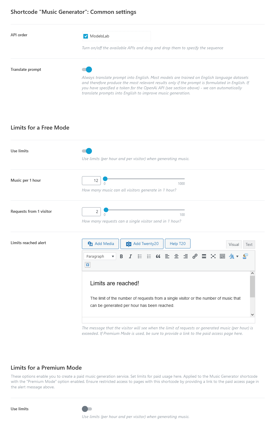
Common settings
- API order - As our theme supports different AI services, you can turn on/off the available APIs and drag and drop them to specify the sequence.
- Translate prompt - Always translate the prompt into English. Most models are trained on English language datasets and therefore produce the most relevant results only if the prompt is formulated in English. If you have specified a token for the OpenAI API (see section above) - we can automatically translate prompts into English to improve music generation.
Limits for a Free Mode
-
Use limits - If enabled, use limits (per hour and visitor) when generating music for free. These limits are for regular users who are not logged in or registered.
- Music per 1 hour - The number of music all visitors can generate in 1 hour.
- Requests from 1 visitor - The number of allowed requests from 1 visitor during 1 hour.
- Limits reached alert - Adjust a message that the visitor will see when the limit of requests or generated items is exceeded. If Premium Mode is used, be sure to provide a link to the paid access page here.
Limits for a Premium Mode
This section is for those who want to create a paid music generation service. Here, you can set the limits for paid usage. The options below can be applied to the "AI Helper Music Generator" Gutenberg block or Elementor widget ("ThemeREX Addons Elements" group) with the "Premium Mode" option enabled.
Ensure restricted access to pages with these widgets by providing a link to the paid access page in the alert message from the "Limits for a Free Mode" section.
-
Use limits - If enabled, use limits for visitors when generating music. These limits are for paid music generation.
- General limits - When an access sharing plugin is not used. In this case, you can restrict the page with an music generation form by a password. No registration for users is required.
- Music per 1 hour - The number of music all visitors can generate in 1 hour.
- Requests from 1 visitor - The number of allowed requests from 1 visitor during 1 hour.
- Limits for logged-in users - If a page with a premium music generation form is restricted by an external plugin ("Default" limit) or an external plugin separates access levels, like "Paid Memberships Pro" (not provided with the theme).
-
User levels with limits - The number of music a user can generate during a definite period (hour, day, week, month, or year) depending on the subscription level.
Default level - A limit for regular registered users, if the page with a premium generation form is restricted by an external plugin (not provided with the theme). This limit will be applied to every logged-in user separately.
Other levels - For more flexible settings, use special plugins to divide access levels, like "Paid Memberships Pro" (not provided with the theme).
-
User levels with limits - The number of music a user can generate during a definite period (hour, day, week, month, or year) depending on the subscription level.
- For all limits
- Limits reached alert - Adjust a message that the visitor will see when the limit of requests or generated items is exceeded.
- General limits - When an access sharing plugin is not used. In this case, you can restrict the page with an music generation form by a password. No registration for users is required.
Shortcode "Text Generator" Settings
You can insert a text generator form right into your web page, using "AI Helper Text Generator" Gutenberg block or Elementor widget ("ThemeREX Addons Elements" group). Thus, your visitor can generate text and headings, manipulate the text directly from your website.
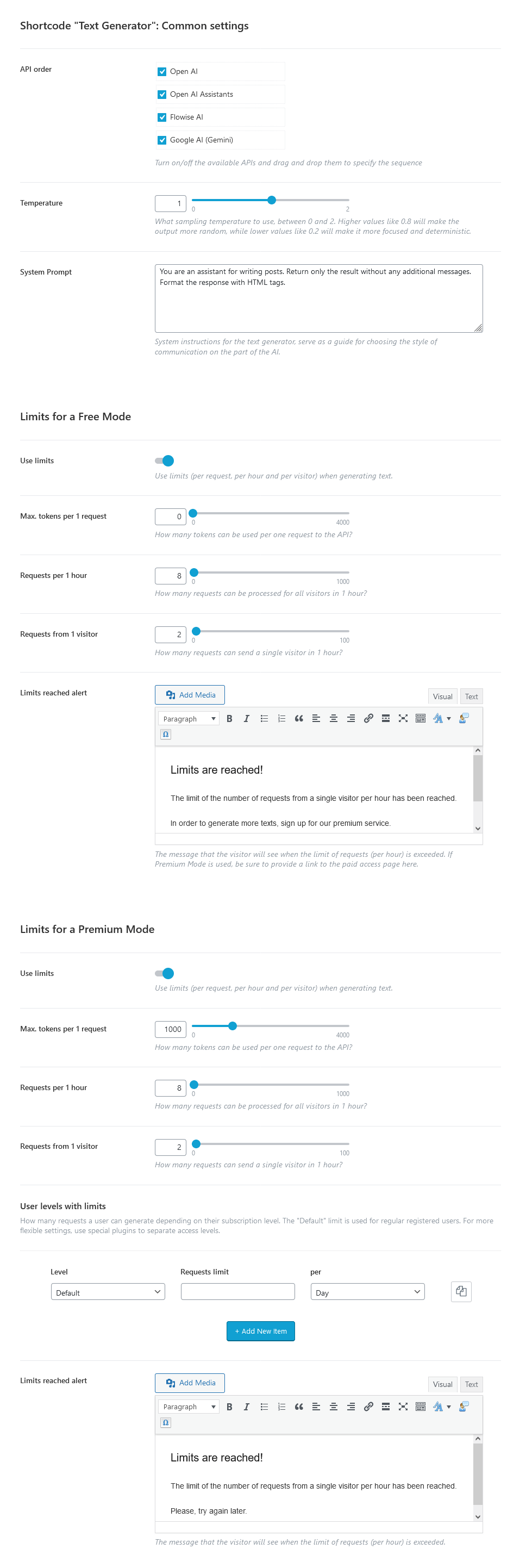
Common settings
- API order - As our theme supports several APIs, you can turn on/off and drag and drop them to specify the sequence.
-
Temperature - Choose a temperature to use with queries. It describes the level of randomness.
O- less random,2- creative, but more random. - System Prompt - Type in the system instructions for the AI Helper in the post editor. Serve as a guide for choosing the style of communication on the part of the AI.
Limits for a Free Mode
- Use limits - If enabled, use limits (per request, per hour, and per visitor) when generating text.
- Max. tokens per 1 request - The number of tokens used per request to the API.
- Requests per 1 hour - The number of requests processed for all visitors during 1 hour.
- Requests from 1 visitor - The number of allowed requests from 1 visitor during 1 hour.
- Limits reached alert - Type in a message that the visitor will see when the limit of requests is exceeded. If Premium Mode is used, be sure to provide a link to the paid access page here.
Limits for a Premium Mode
This section is for those who want to create a paid text generation service. Here you can set the limits for paid usage. The options below can be applied to the "AI Helper Text Generator" Gutenberg block or Elementor widget ("ThemeREX Addons Elements" group) with the "Premium Mode" option enabled.
Ensure restricted access to pages with these widgets by providing a link to the paid access page in the alert message from the "Limits for a Free Mode" section.
-
Use limits - If enabled, use limits for visitors when generating text. These limits are for paid service.
- General limits - When an access sharing plugin is not used. In this case, you can restrict the page with a text generation form with a password. No registration for users is required.
- Max. tokens per 1 request - The number of tokens used per request to the API.
- Requests per 1 hour - The number of requests processed for all visitors during 1 hour.
- Requests from 1 visitor - The number of allowed requests from 1 visitor during 1 hour.
- Limits for logged-in users - If a page with a premium text generation form is restricted by an external plugin ("Default" limit) or an external plugin separates access levels, like "Paid Memberships Pro" (not provided with the theme).
-
User levels with limits - The number of requests a user can generate during a definite period (hour, day, week, month, or year) depending on the subscription level.
Default level - A limit for regular registered users, if the page with a premium text generation form is restricted by an external plugin (not provided with the theme). This limit will be applied to every logged-in user separately.
Other levels - For more flexible settings, use special plugins to divide access levels, like "Paid Memberships Pro" (not provided with the theme).
-
User levels with limits - The number of requests a user can generate during a definite period (hour, day, week, month, or year) depending on the subscription level.
- For all limits
- Limits reached alert - Adjust a message that the visitor will see when the limit of requests is exceeded.
- General limits - When an access sharing plugin is not used. In this case, you can restrict the page with a text generation form with a password. No registration for users is required.
Shortcode "AI Chat" Settings
You can insert AI chat right into your web page, using "AI Helper Chat" Gutenberg block or Elementor widget ("ThemeREX Addons Elements" group). Thus, your visitor can communicate with OpenAI via live chat (ask questions and get answers on any topics) directly from your website.
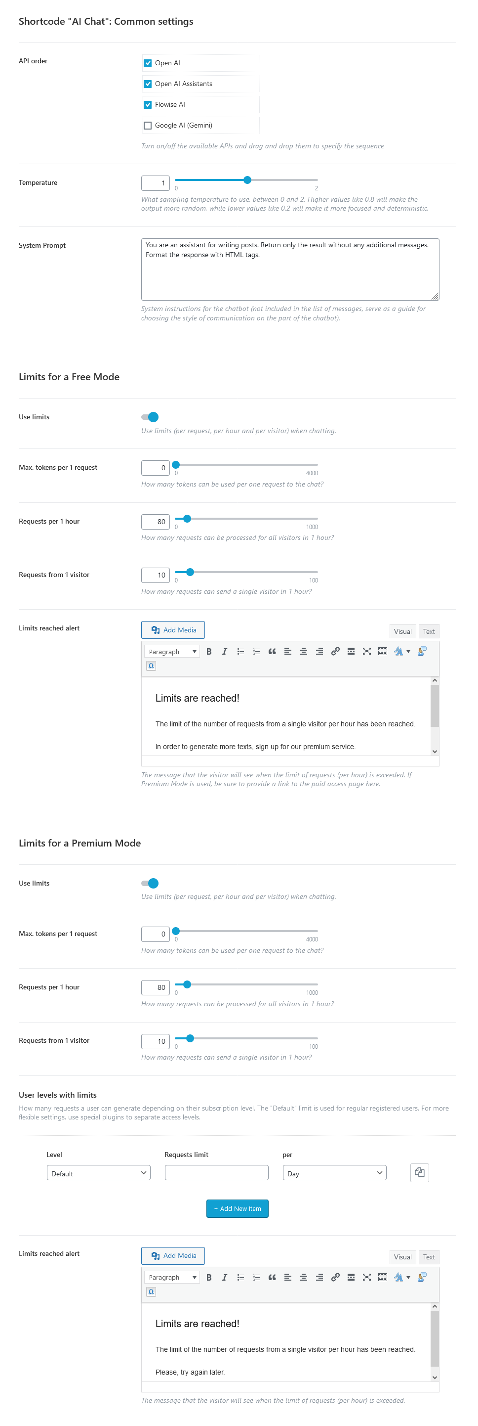
Common settings
- API order - As our theme supports several APIs, you can turn on/off and drag and drop them to specify the sequence.
-
Temperature - Choose a temperature to use with queries. It describes the level of randomness.
O- less random,2- creative, but more random. - System Prompt - Type in the system instructions for the AI Helper in the post editor. Serve as a guide for choosing the style of communication on the part of the AI.
Limits for a Free Mode
- Use limits - If enabled, use limits (per request, per hour, and per visitor) when generating text or chatting.
- Max. tokens per 1 request - The number of tokens used per request to the API.
- Requests per 1 hour - The number of requests processed for all visitors during 1 hour.
- Requests from 1 visitor - The number of allowed requests from 1 visitor during 1 hour.
- Limits reached alert - Type in a message that the visitor will see when the limit of requests is exceeded. If Premium Mode is used, be sure to provide a link to the paid access page here.
Limits for a Premium Mode
This section is for those who want to create a paid chat. Here you can set the limits for paid usage. The options below can be applied to the "AI Helper Chat" Gutenberg block or Elementor widget ("ThemeREX Addons Elements" group) with the "Premium Mode" option enabled.
Ensure restricted access to pages with these widgets by providing a link to the paid access page in the alert message from the "Limits for a Free Mode" section.
-
Use limits - If enabled, use limits for visitors when chatting. These limits are for paid service.
- General limits - When an access sharing plugin is not used. In this case, you can restrict the page with a chat with a password. No registration for users is required.
- Max. tokens per 1 request - The number of tokens used per request to the API.
- Requests per 1 hour - The number of requests processed for all visitors during 1 hour.
- Requests from 1 visitor - The number of allowed requests from 1 visitor during 1 hour.
- Limits for logged-in users - If a page with a premium chat is restricted by an external plugin ("Default" limit) or an external plugin separates access levels, like "Paid Memberships Pro" (not provided with the theme).
-
User levels with limits - The number of requests a user can generate during a definite period (hour, day, week, month, or year) depending on the subscription level.
Default level - A limit for regular registered users, if the page with a premium chat is restricted by an external plugin (not provided with the theme). This limit will be applied to every logged-in user separately.
Other levels - For more flexible settings, use special plugins to divide access levels, like "Paid Memberships Pro" (not provided with the theme).
-
User levels with limits - The number of requests a user can generate during a definite period (hour, day, week, month, or year) depending on the subscription level.
- For all limits
- Limits reached alert - Adjust a message that the visitor will see when the limit of requests is exceeded.
- General limits - When an access sharing plugin is not used. In this case, you can restrict the page with a chat with a password. No registration for users is required.
Shortcode "SC Video Generator" Settings
The "AI Helper" add-on also lets you insert a video generator form into your web page, using the "AI Helper Video Generator" Elementor widget ("ThemeREX Addons Elements" group).

Common settings
- API order - Since our theme supports multiple AI services, you can enable or disable available APIs and arrange their order using drag-and-drop.
- Translate prompt - Always translate the prompt into English. Most models are trained on English language datasets and therefore produce the most relevant results only if the prompt is formulated in English. If you have specified a token for the OpenAI API (see section above) - we can automatically translate prompts into English to improve video generation.
Limits for a Free Mode
-
Use limits - If enabled, use limits (per hour and visitor) when generating video for free. These limits are for regular users who are not logged in or registered.
- Video per 1 hour - The number of videos all visitors can generate in 1 hour.
- Requests from 1 visitor - The number of allowed requests from 1 visitor during 1 hour.
- Limits reached alert - Adjust a message that the visitor will see when the limit of requests or generated items is exceeded. If Premium Mode is used, be sure to provide a link to the paid access page here.
Limits for a Premium Mode
This section is for those who want to create a paid video generation service. Here, you can set the limits for paid usage. The options below can be applied to the "AI Helper Video Generator" Elementor widget ("ThemeREX Addons Elements" group) with the "Premium Mode" option enabled.
Ensure restricted access to pages with these widgets by providing a link to the paid access page in the alert message from the "Limits for a Free Mode" section.
-
Use limits - If enabled, use limits for visitors when generating videos. These limits are for paid video generation.
- General limits - When an access sharing plugin is not used. In this case, you can restrict the page with a video generation form by a password. No registration for users is required.
- Video per 1 hour - The number of videos all visitors can generate in 1 hour.
- Requests from 1 visitor - The number of allowed requests from 1 visitor during 1 hour.
- Limits for logged-in users - If a page with a premium video generation form is restricted by an external plugin ("Default" limit) or an external plugin separates access levels, like "Paid Memberships Pro" (not provided with the theme).
-
User levels with limits - The number of videos a user can generate during a definite period (hour, day, week, month, or year) depending on the subscription level.
Default level - A limit for regular registered users, if the page with a premium generation form is restricted by an external plugin (not provided with the theme). This limit will be applied to every logged-in user separately.
Other levels - For more flexible settings, use special plugins to divide access levels, like "Paid Memberships Pro" (not provided with the theme).
-
User levels with limits - The number of videos a user can generate during a definite period (hour, day, week, month, or year) depending on the subscription level.
- For all limits
- Limits reached alert - Adjust a message that the visitor will see when the limit of requests or generated items is exceeded.
- General limits - When an access sharing plugin is not used. In this case, you can restrict the page with a video generation form by a password. No registration for users is required.
PLEASE NOTE! More information about the "AI Helper" Add-on is available here.
Users
Here you can specify the parameters of the User’s Login and Registration.
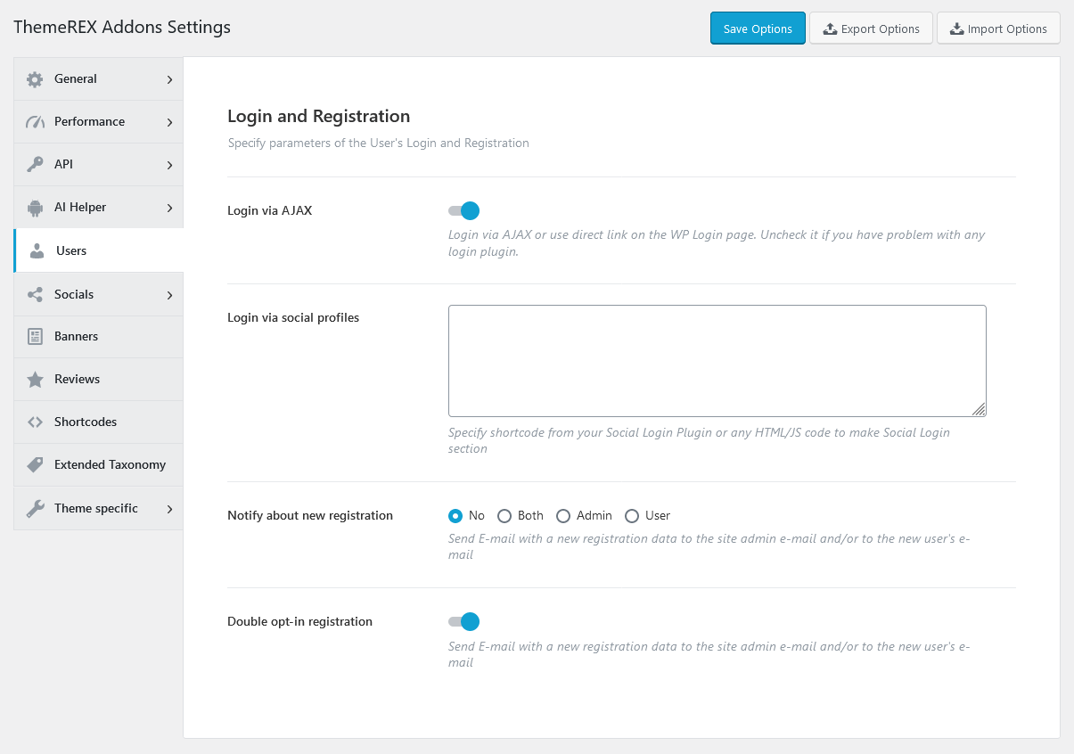
- Login via AJAX - Define whether to use AJAX Login or a direct link on the WP Login Page.
- Login via social profiles - Add the necessary code snippet/shortcode from the Social Login Plugin.
- Notify about new registration - Define the person who receives a registration notification message.
- Double opt-in registration - Send confirmation E-mail with new registration data to the site admin e-mail and/or to a new user’s e-mail. The link to confirm the registration expires within 24 hours. Once the link is followed a new user will be registered.
Socials
Here you can specify all the necessary links (URLs) to your social profiles. Just paste the permanent URL addresses into the needed fields and click "Save."
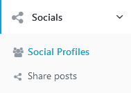
Social Profiles Settings
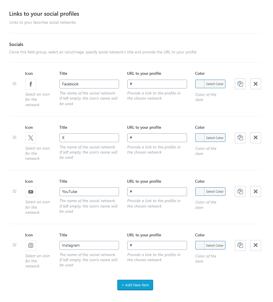
Select an icon/image, specify social network’s title and provide the URL to your profile. Just paste the permanent URL addresses into the needed fields and click "Save."
The icons are used from the standard Fontello icons set. You can expand the list of available icons by adding new ones from the fontello website. To add new icons proceed to wp-content/themes/chronicle/skins/default/css/font-icons/config.json. Watch this video guide for more information.
PLEASE NOTE! The location of the config.json file and website page builder with the available set of widgets/shortcodes in your theme may vary from the video provided!
Share Posts Settings
Specify URLs to share your posts in the social networks. If empty - no share post in this social network is used.
You can use the following macros to include post’s parts into the URL:
{link}- post’s URL;{title}- title of the post;{descr}- excerpt of the post;{image}- post’s featured image URL;{id}- post’s ID;
Add Open Graph tags - Enable/disable Open Graph tags. They are responsible for the information (picture, title, description) that appears on the wall of the user, when he clicks on the "Share" icon inn your blog. They are used by many popular social networks such as Facebook.
Banners
These settings allow you to enable banners on single posts and specify parameters for banners.
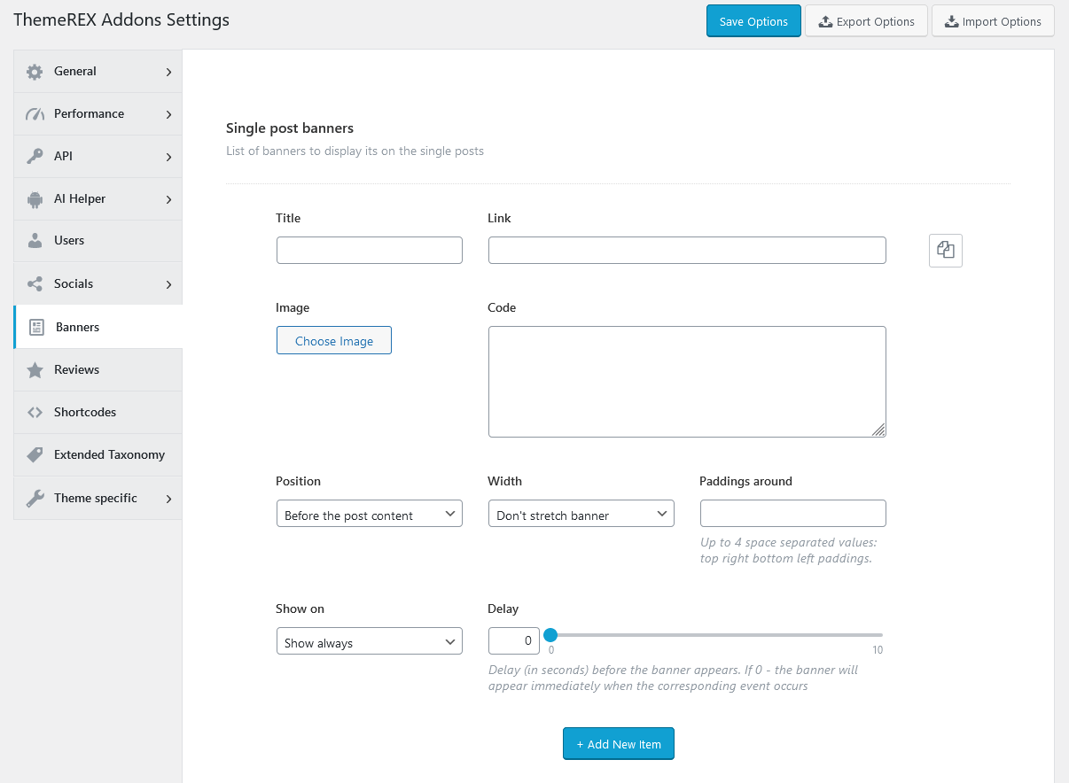
PLEASE NOTE! The "Banner code" option allows using HTML code only!
Reviews
Here you can enable the reviews section for posts/pages/post types and specify rating settings.
The quantity of accessible post types varies depending on the installed plugins.
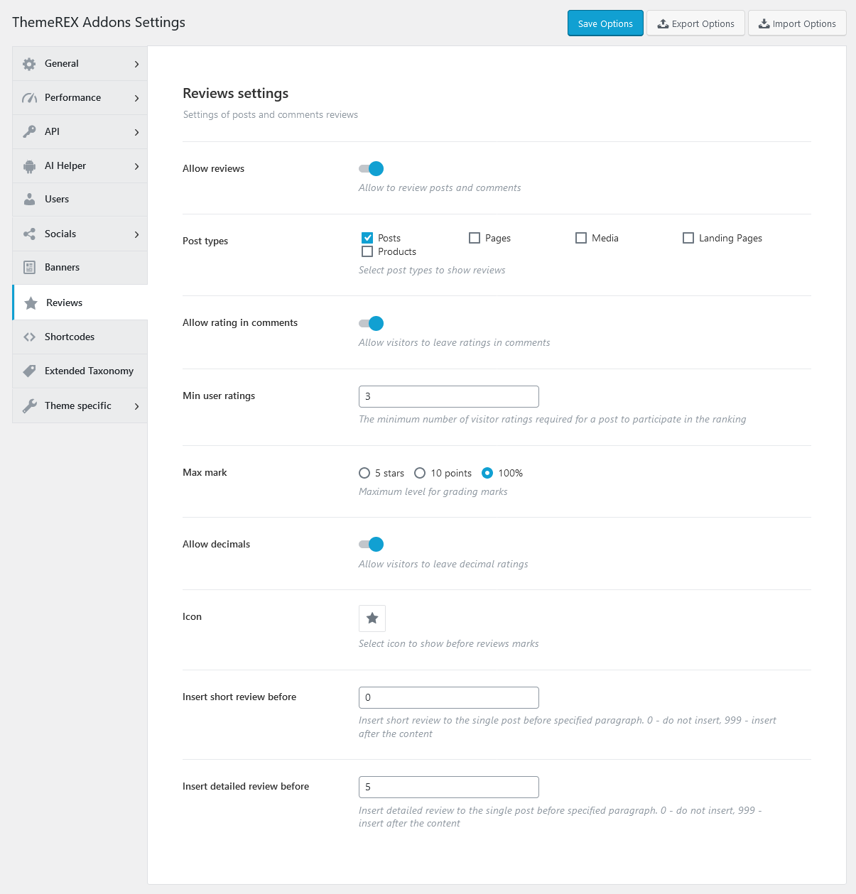
Once you have enabled the reviews section globally, you should enable reviews on a single post/page/post type. Please open a post/page/post type and check the "Enable review" option in the Item Options > Review section.
If you want to display a rating above the comment form, please navigate to a particular post/page/post type in the WP Dashboard and allow comments section, like in the screenshot below:
You can also use the Elementor Posts by Rating widget (ThemeREX Addons Elements group) to output rated posts/pages.
Shortcodes
Here you can define whether you want to use the Anchor widget or not, specify hover effects for form fields, choose the type of posts selector for some widgets, like Blogger, and also allow to use custom layouts and saved templates inside tabs (for Elementor ONLY!).
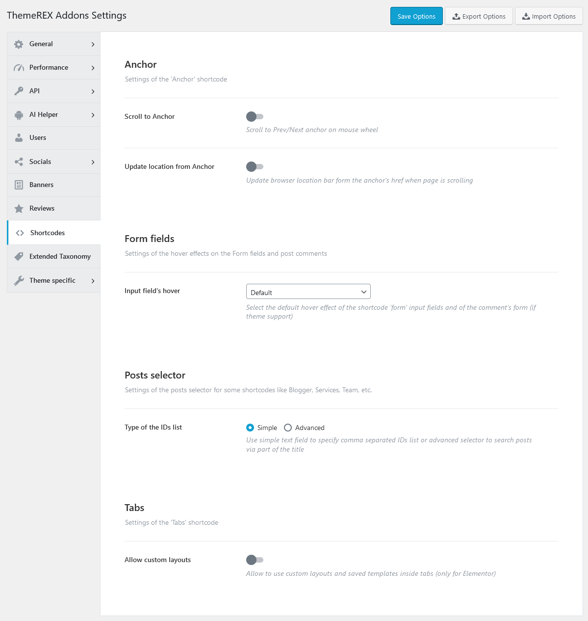
Example of advanced posts selector:
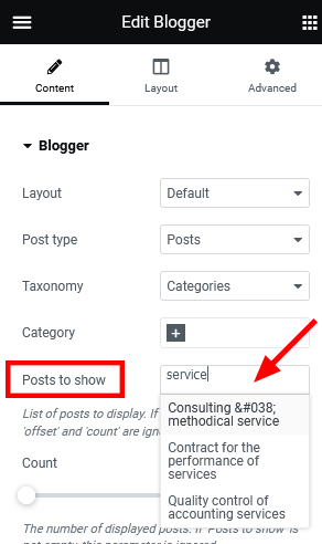
The "Allow custom layouts" option adds the "Content type" dropdown to the Elementor "Tabs" widget, allowing you to use custom layouts and saved templates inside tabs. We recommend leaving this option disabled if you are not planning to insert layouts/templates inside tabs.
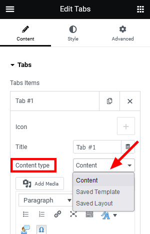
Extended Taxonomy
Here you can enable some extended taxonomy attributes for a particular group/category of posts/post types. You can output the large/small image using the Categories List widget (ThemeREX Addons Elements group).
The taxonomy list may vary depending on the plugins installed.
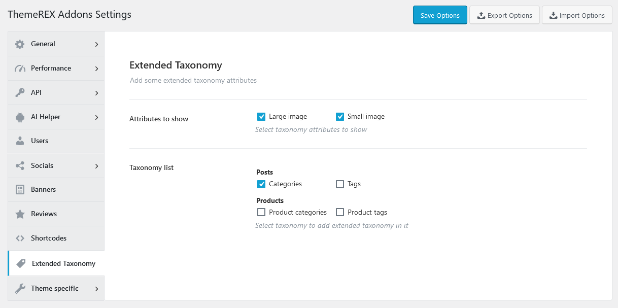
Navigate to a particular category/group of posts/post types in the WP Dashboard and set the required attributes.
Theme Specific
The settings of this section override the default theme’s grid classes, page wrap classes, and recreate layouts and presets of Elementor widgets. We recommend leaving these settings intact.
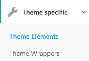
Theme Elements Settings
The theme may include a set of pre-built layouts and presets of Elementor widgets. You can use the options below to restore any deleted layouts or presets. If a layout or preset with the same name already exists, it will be skipped during the restoration process.
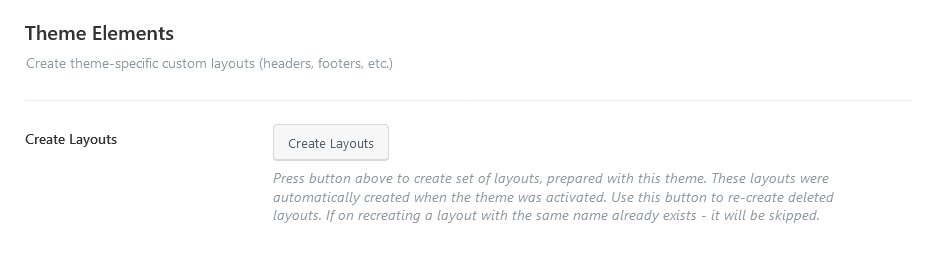
- Create Layouts - Recreate the set of predefined layouts. It might become useful in case there are no layouts available after theme installation.
- Create Presets - Restore the set of pre-built presets of Elementor widgets.
Theme Wrappers Settings
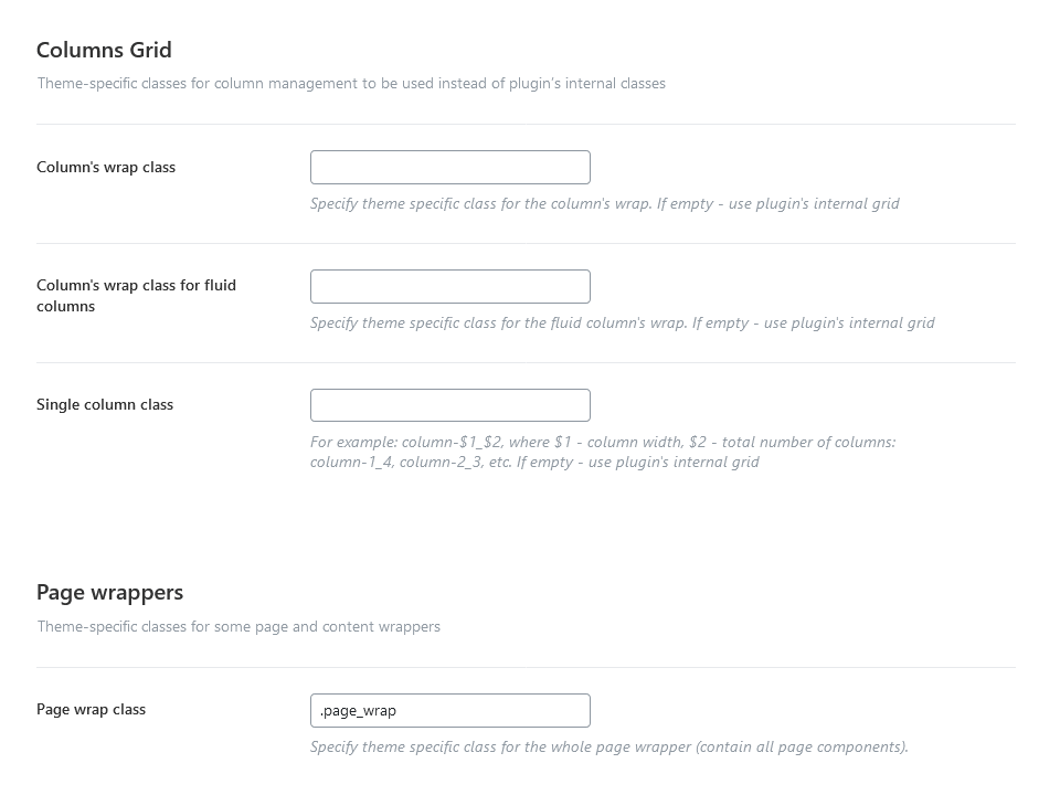
Columns Grid
- Column’s wrap class - Specify theme specific class for the column’s wrap. If empty - use plugin’s internal grid.
- Column’s wrap class for fluid columns - Insert theme specific class for the fluid column’s wrap. If empty - use plugin’s internal grid.
- Single column class - For example:
column-$1_$2, where $1 - column width, $2 - total number of columns:column-1_4,column-2_3, etc. If empty - use plugin’s internal grid.
Page wrappers
- Page wrap class - Specify a theme-specific selector for the entire page wrapper (contains all of the page components).
- Header wrap class - Define a selector unique to your theme that targets the page header wrapper (which includes the logo, navigation menu, and other header elements).
- Footer wrap class - Insert a theme-specific selector that targets the page footer container, which includes elements like contact details and secondary navigation.
- Sidebar wrap class - Provide a unique selector for the sidebar container that holds widgets and related content.
Advanced Theme Add-ons
Advanced theme add-ons enhance the functionality of a WordPress theme. They come prepacked with the theme and require the ThemeREX Addons plugin to be active.
Once you have activated your theme (entered your purchase code), please navigate to the Theme Panel (WP Dashboard) > Theme Dashboard > Addons tab and make sure that all advanced add-ons, provided with the theme, are active. If an add-on is not downloaded by default and you want to use its functionality, please download this add-on yourself. Now you can proceed with demo data installation and further theme customization. Here you can activate/deactivate, download or update add-ons if needed.
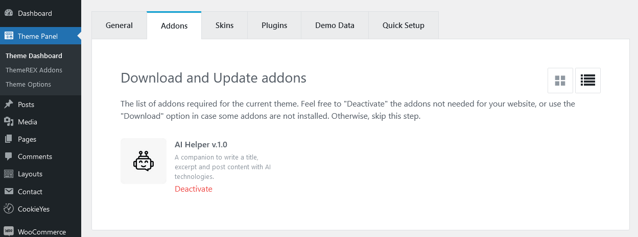
PLEASE NOTE! The following advanced theme add-ons come with the theme.
AI Helper Add-on
We have integrated Open AI content generation functionality into our themes. It means that you can use ChatGPT right through your WordPress dashboard and save your time while creating content for pages, posts, and Custom Post Types (Services, Team, Portfolio, and Testimonials), if any available in your theme, and generate images right through the WordPress Media Library Selector popup. Moreover, you can let your visitors generate images/text/audio/music/video or communicate with OpenAI via live chat (ask questions and get answers on any topics) directly from your website (if you have inserted the corresponding widgets/blocks into your web page). This add-on is still in development. New features will come soon.
Before you start, please navigate to Theme Panel (WP Dashboard) > ThemeREX Addons and find the "AI Helper" section. Here, you can insert your own Open AI, ModelsLab (formerly Stable Diffusion), Stability AI, Flowise AI, Google AI (Gemini), X AI (Grok), and/or LumaLabs AI (Dream Machine) tokens, choose the models for generating images/chats/audio/video here as well as specify the limitations for your customers to generate images/text/audio/music/video from your website or for chat requests and much more. It’s a PAID service! Please click here to find the description of the global AI Helper settings.
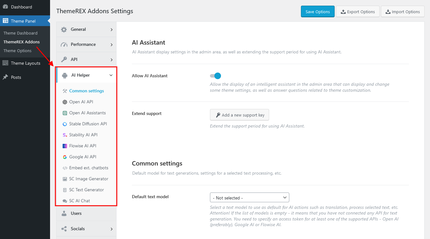
Links for generating tokens:
- Open AI - https://platform.openai.com/settings/organization/api-keys;
- ModelsLab - https://modelslab.com/dashboard/api-keys;
- Stability AI - https://platform.stability.ai/account/keys;
- Google AI (Gemini) - https://makersuite.google.com/app/apikey;
- X AI (Grok) - https://console.x.ai;
- LumaLabs AI (Dream Machine) - https://lumalabs.ai/dream-machine/api/keys;
- Extend support period for 6 months - https://themerex.net/downloads/technical-support/;
Currently, Open AI Helper can:
-
Use AI Assistant in the admin area (in the right bottom corner) to display and change some global theme settings (website title, tagline, logo; colors of a defined color scheme; mouse helper settings, etc.), as well as answer questions related to the theme customization.
The assistant functions when you have paid support, which initially lasts for 6 months from the theme purchase. To continue using AI Assistant, you will need to extend the support period through a paid service and enter your new support key in "ThemeREX Addons > AI Helper > Common Settings".
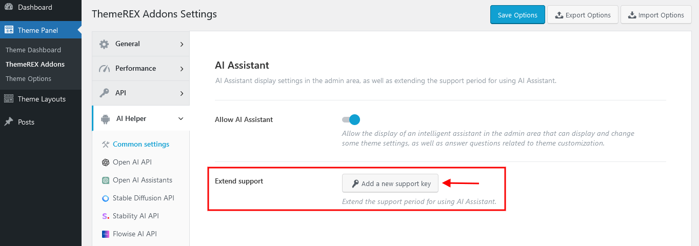
-
Create content for a post, page, or available CPT post through Gutenberg page builder. It can generate post content, titles, and excerpts, as well as help you correct text fragments: make them longer, or shorter, summarize, translate, explain, and much more.
If you want to make the process of assembling content more efficient, open your post, page, or available CPT post and find the "TRX Addons AI Helper" tab in the right panel. Enjoy using Open AI technologies.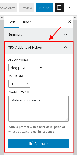 Please view our video tutorial for more information about generating/customizing content with AI Helper.
-
Generate company info
In the general Theme Panel > ThemeREX Addons > AI Helper > Open AI API settings specify a valid Open AI token. Now, proceed to Theme Panel > ThemeREX Addons > AI Helper > AI Content Generator, fill in the "Company Name" and "Industry" fields, and click on the "Generate Demo Content" button in the upper-right corner. Save your changes.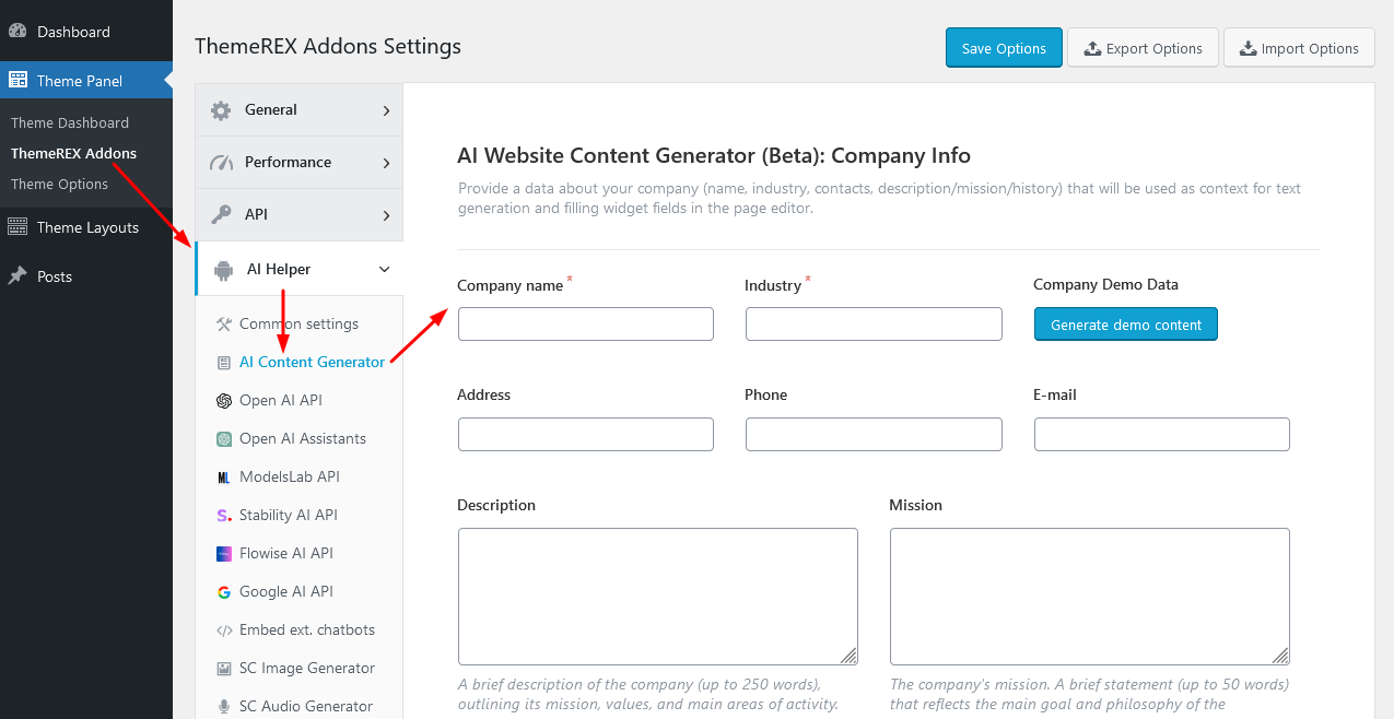
-
Generate content for Elementor widgets based on company info
Specify a valid Open AI token in the general Theme Panel > ThemeREX Addons > AI Helper > Open AI API settings. Proceed to Theme Panel > ThemeREX Addons > AI Helper > AI Content Generator and enter or generate your company information. Save your changes.
Once this is done, open a page in the Elementor page builder and insert any Elementor widget, leaving it empty. Access the context menu for the section or container with the widget, then click "Generate Texts with AI" to create content.
In the newly opened popup specify the type of content and click on the "Generate" button. When generating, company data will be used as a context for generation.
IMPORTANT! Ensure the Elementor section or container is not empty when generating content based on company data!
-
Generate posts
In the general Theme Panel > ThemeREX Addons > AI Helper > Open AI API settings specify a valid Open AI token. Now, proceed to Theme Panel > ThemeREX Addons > AI Helper > AI Content Generator, fill in the "Company Name" and "Industry" fields, and click on the "Blog Generator" button in the upper-right corner.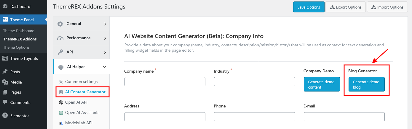 The "Demo blog generation" contains the following settings. Please take note of the limitations.
- Posts to generate - Define how many posts you want the system to generate. You can enter any whole number between
1and100. - Case of post titles - Controls the capitalization format applied to generated post titles:
- Sentence - The title will begin with a capital letter, while the rest of the sentence remains in lowercase (e.g., This is a post title).
- Title - Capitalizes the main words in the title following the standard title case rules (e.g., This Is a Post Title).
- Categories/Tags/Comments per post - Specify the number of categories, tags, and comments to assign per post. You can enter any value from
0to10. A value of0means that no categories, tags, or comments will be added to the post. - Comment in each # post - This option defines how frequently comments will be added across the generated posts. Enter a number from
1to10. The number represents the interval: for example, setting it to3means every third post will receive a comment. A value of1applies comments to all posts.
- Posts to generate - Define how many posts you want the system to generate. You can enter any whole number between
-
Generate images right in the WordPress Media Library Selector popup and create variations of generated images with the ability to upload them to your WordPress Media Library.
This functionality is implemented into Gutenberg and Elementor page builders. Just click on the "choose/upload image" button anywhere on the page’s back end where you want to insert an image and in the newly opened WordPress Media Library Selector popup switch to the "AI Image Generator" tab. Now, specify the search parameters and generate the images. The "AI Image Generator" tab appears only if the Open AI, ModelsLab (formerly Stable Diffusion), X AI (Grok), and/or Stability AI token is entered in the general "ThemeREX Addons > AI Helper" settings!
You can activate the models by filling them into the list in the general "ThemeREX Addons > AI Helper" settings under the "Open AI API", "ModelsLab API", X AI API, or "Stability AI API" tabs.
Generated images can have a size of256x256,512x512,1024x1024,1792x1024(Open AI DALL-E-3 only), or1024x1792(Open AI DALL-E-3 only) pixels. Smaller images can be generated faster.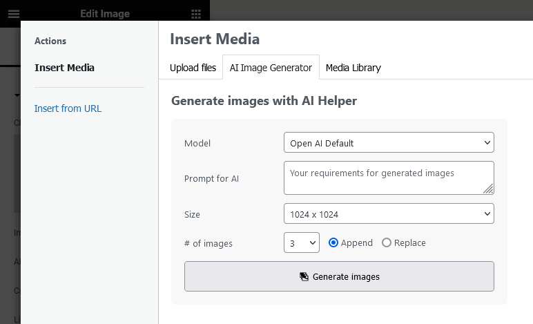
-
Process the selected images - add to the library, create variations and/or enlarge by 2, 3, 4 times.
Open the WordPress Media Library Selector popup and select an image under the "Media Library" tab. In the newly opened right panel press the "Variations or Upscale" link.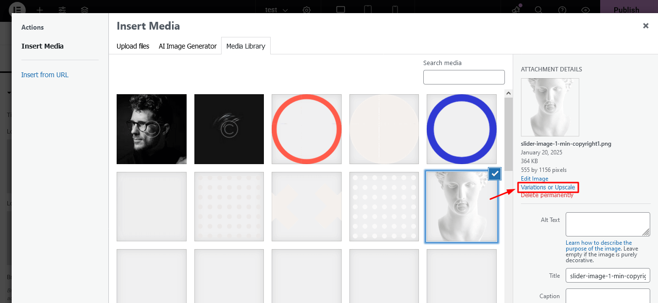 A "Process the selected image" form will appear.
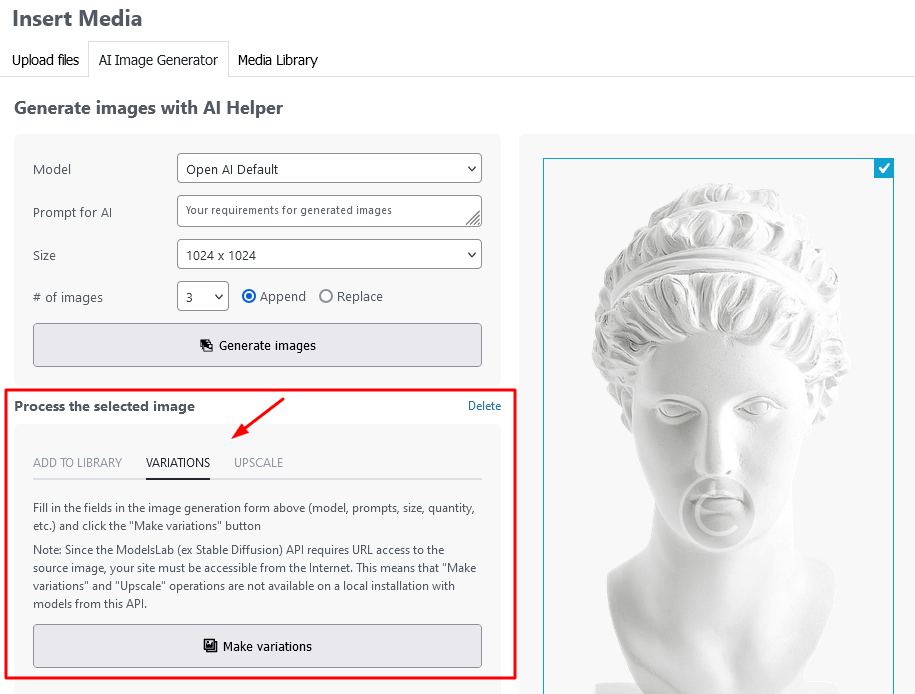 The following options are available:
- Add to Library - upload the selected image to the media library;
- Variations - generate a new image based on the selected one, using the generation parameters specified in the "Generate Images with AI Helper" form above;
- Upscale - enlarge the selected image 2, 3 or 4 times without losing its quality; -
Display an AI image generation form on your web page.
To insert an image generator to your page, open a page/post using Gutenberg or Elementor page builder, and find the "AI Helper Image Generator" block or widget under the "ThemeREX Addons Elements" group. Adjust the block or widget to your needs and save your changes.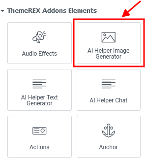 You will get the following form on your front end.
In the global "ThemeREX Addons > AI Helper > SC Image Generator" settings you can also specify the limitations for your visitors: the number of generated images per 1 hour and the number of allowed requests from 1 visitor during 1 hour. You can set limits for regular users (free image generation) and for registered users with paid subscriptions separately ("Premium Mode"). Please do not forget to enable premium mode in the widget’s settings.
You will get the following form on your front end.
In the global "ThemeREX Addons > AI Helper > SC Image Generator" settings you can also specify the limitations for your visitors: the number of generated images per 1 hour and the number of allowed requests from 1 visitor during 1 hour. You can set limits for regular users (free image generation) and for registered users with paid subscriptions separately ("Premium Mode"). Please do not forget to enable premium mode in the widget’s settings.
-
Insert an AI text generation form into your web page.
If you want your visitors to have the possibility to generate text (post, essay, story, poem, etc.) and headings, manipulate the text (make it longer/shorter, summarize, explain, translate, spell check, and much more) through your web page, open a page/post using Gutenberg or Elementor page builder and find "AI Helper Text Generator" block or widget under "ThemeREX Addons Elements" group. Place this block or widget on your page, set it up to your needs, and save your changes.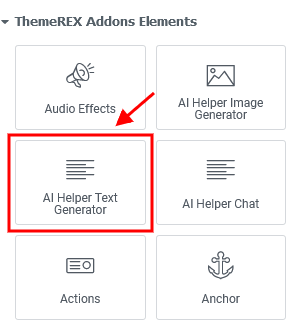 You can get something like this:
In the global "ThemeREX Addons > AI Helper > SC Text Generator" settings you can also specify the limitations for your visitors: the number of requests per 1 hour for all visitors, the number of allowed requests from 1 visitor in 1 hour, and max. tokens per 1 request. You can also set these limits separately for free and paid generation.
You can get something like this:
In the global "ThemeREX Addons > AI Helper > SC Text Generator" settings you can also specify the limitations for your visitors: the number of requests per 1 hour for all visitors, the number of allowed requests from 1 visitor in 1 hour, and max. tokens per 1 request. You can also set these limits separately for free and paid generation.
-
Add an AI-powered live chat to your website.
Insert "AI Helper Chat" Gutenberg block or Elementor widget ("ThemeREX Addons Elements" group) to your web page and let your visitors interact with OpenAI.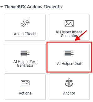 Chat example:
In the global "ThemeREX Addons > AI Helper > SC AI Chat" settings you can also specify the limitations for your visitors: the number of requests per 1 hour for all visitors, the number of allowed requests from 1 visitor in 1 hour, and max. tokens per 1 request. These limits are available for regular users (free chatting) and for registered users with paid subscriptions ("Premium Mode"). Please do not forget to enable premium mode in the widget’s settings.
Chat example:
In the global "ThemeREX Addons > AI Helper > SC AI Chat" settings you can also specify the limitations for your visitors: the number of requests per 1 hour for all visitors, the number of allowed requests from 1 visitor in 1 hour, and max. tokens per 1 request. These limits are available for regular users (free chatting) and for registered users with paid subscriptions ("Premium Mode"). Please do not forget to enable premium mode in the widget’s settings.
Our AI chats support processing various file types based on the model used. This feature is currently available for OpenAI and Google AI (Gemini). To enable file attachments in chat, go to Edit AI Helper Chat > Content > Chat Settings and activate the "Allow Attachments" option. This option appears if the model is specified. Please view our video tutorial below:
-
Output an AI audio generation form on your web pages.
The "AI Helper Audio Generator" Gutenberg block or Elementor widget ("ThemeREX Addons Elements" group) allows you to insert a form for generating text from audio (speech-to-text), converting text to audio, translating audio-based text, or modifying voices in audio files (for ModelsLab only) into your web pages.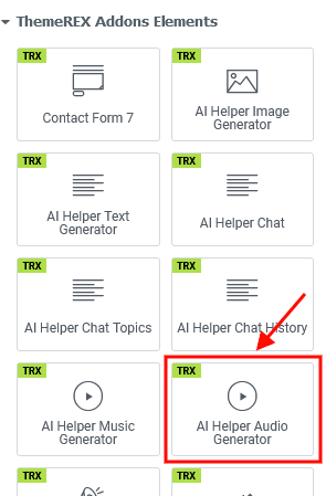 The following form will appear on your front end:
In the global "ThemeREX Addons > AI Helper > SC Audio Generator" settings the limitations for the visitors are available: the number of requests per 1 hour for all visitors, the number of allowed requests from 1 visitor in 1 hour, and max. tokens per 1 request. These limits are available for regular users (free mode) and for registered users with paid subscriptions ("Premium Mode"). You can enable premium mode in the widget’s settings.
The following form will appear on your front end:
In the global "ThemeREX Addons > AI Helper > SC Audio Generator" settings the limitations for the visitors are available: the number of requests per 1 hour for all visitors, the number of allowed requests from 1 visitor in 1 hour, and max. tokens per 1 request. These limits are available for regular users (free mode) and for registered users with paid subscriptions ("Premium Mode"). You can enable premium mode in the widget’s settings.
-
Insert an AI music generation form into your pages.
Take "AI Helper Music Generator" Gutenberg block or Elementor widget ("ThemeREX Addons Elements" group) to display the music generation form on your website. The music can be generated from text or an audio sample.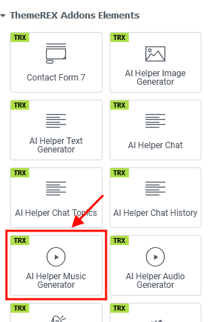 Music generation form sample:
Open the global "ThemeREX Addons > AI Helper > SC Music Generator" settings to specify the limitations for your visitors: the number of requests per 1 hour for all visitors, the number of allowed requests from 1 visitor in 1 hour, and max. tokens per 1 request. These limits are available for regular users (free mode) and for registered users with paid subscriptions ("Premium Mode"). You can enable premium mode in the widget’s settings.
Music generation form sample:
Open the global "ThemeREX Addons > AI Helper > SC Music Generator" settings to specify the limitations for your visitors: the number of requests per 1 hour for all visitors, the number of allowed requests from 1 visitor in 1 hour, and max. tokens per 1 request. These limits are available for regular users (free mode) and for registered users with paid subscriptions ("Premium Mode"). You can enable premium mode in the widget’s settings.
-
Output an AI video generation form on your web pages.
The "AI Helper Video Generator" Elementor widget ("ThemeREX Addons Elements" group) lets you display a form for generating video from text into your web pages.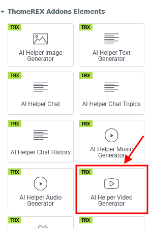 The following form will appear on your front end:
In the global "ThemeREX Addons > AI Helper > SC Video Generator" settings the limitations for the visitors are available: the number of requests per 1 hour for all visitors, the number of allowed requests from 1 visitor in 1 hour, and max. tokens per 1 request. These limits are available for regular users (free mode) and for registered users with paid subscriptions ("Premium Mode"). You can enable premium mode in the widget’s settings.
The following form will appear on your front end:
In the global "ThemeREX Addons > AI Helper > SC Video Generator" settings the limitations for the visitors are available: the number of requests per 1 hour for all visitors, the number of allowed requests from 1 visitor in 1 hour, and max. tokens per 1 request. These limits are available for regular users (free mode) and for registered users with paid subscriptions ("Premium Mode"). You can enable premium mode in the widget’s settings.
Check out our video tutorial for a guide on integrating the AI Video Generator (LumaLabs API) into your WordPress site.
Background Text Add-on
This add-on is embedded into the theme and can not be deactivated. The add-on enhances the Elementor functionality by adding "Background Text" parameters to Elementor sections/containers (rows) helping you create background text lines and animate them when they enter the visible area of the window. You can also make this text "scroll", like in a news ticker. In this case, after the entrance animation, the background text starts scrolling continuously.
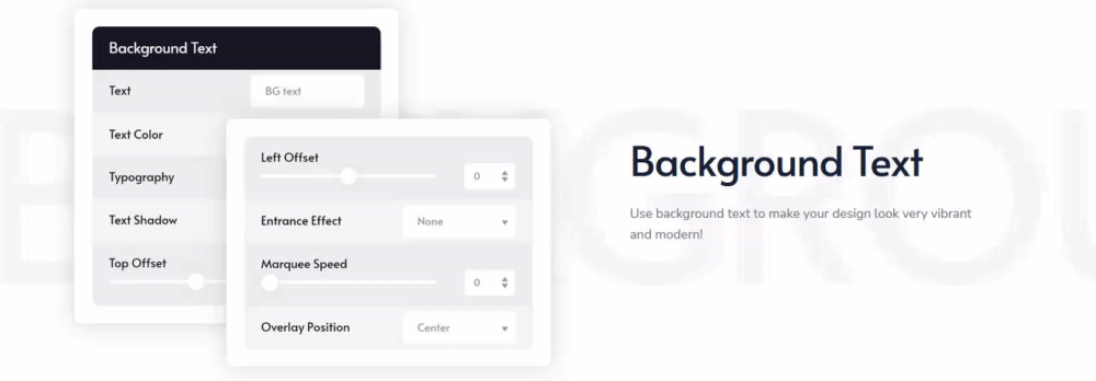
To decorate your theme, open your page through the Elementor page builder, find the page row (Elementor section or container) to which the "background text" functionality you would like to apply, and proceed to Edit Section/Container > Style > Background Text in the Elementor widgets panel. Here you can specify the text, text color, font family, font size, text shadow, and other parameters for your background line.
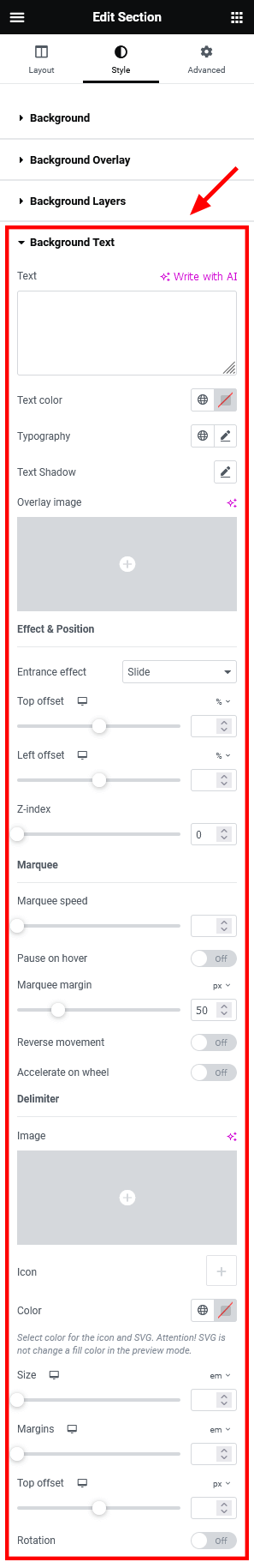
Below, you can find some clarifications of the basic options:
-
Text - Type in some text.
You can use the following macros to insert additional elements into your text:
- [divider] - adds a divider specified under "Divider";
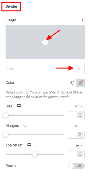
- [icon name=icon-name] - inserts an icon with specified class name.
In case the sections are used for page layout, the icons are from the Fontello icons set that comes with the theme. You can expand the list of available icons by adding new ones from the fontello website.
For containers - the Elementor icon library (free Font Awesome 5 icons) will be used instead. If you have a Font Awesome Pro license, you will have a larger set of icon families to choose from, including Regular Pro, Solid Pro, Brands Pro, Light Pro, and Duotone Pro. Please click here for more information on how to use the Font Awesome Pro Icons. - [image id=image-id] - adds an image with specified ID. You can find the ID for the image in your WordPress Media Library.
size=NNpx|em|rem|%
thumb=thumb-name (only for image)
padding="top right bottom left"
margin="top right bottom left"
top | right | bottom | left=NNpx|em|rem|%
style="any CSS rules"
- [divider] - adds a divider specified under "Divider";
-
Background Type - Set a background color or gradient.
- Text as Clipping Mask - if enabled allows you to output the image or color gradient as text color;
Gradient: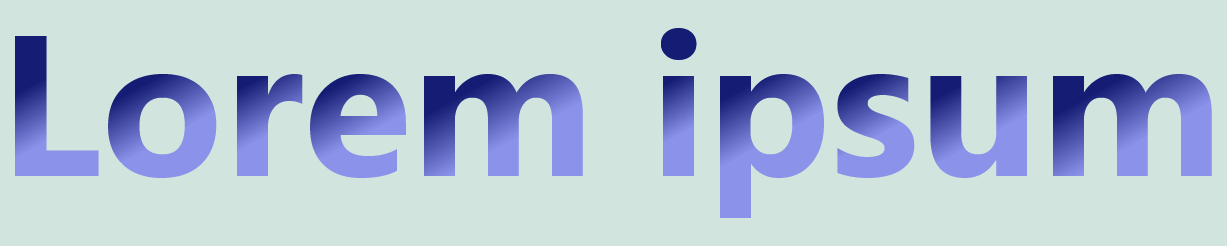 Image:
- Text as Clipping Mask - if enabled allows you to output the image or color gradient as text color;
-
Entrance effect - Choose appearance effect.
- Slide - symbols appear one by one from left to right;
- Rotate - symbols rotate one by one from top to bottom;

- Top offset and Left offset - Shift the text. The shift point is the top left corner of a section.
- Z-index - Raise the ticker above the content of the section, thus making it overlap content. Elements with a higher index will be placed on top of elements with a lower index.
-
Marquee speed - Set the scrolling speed. If the option is set to
0, it means without scrolling. -
Pause on hover - Stop the scrolling line, when you hover over it (if "Z-index" of the background text (not the whole section) is larger than
0).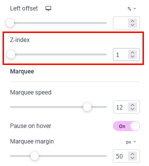
- Marquee margin - Set distance between line duplicates. The line is repeated for looped motion.
- Reverse movement - Make the text scroll in the opposite direction: for regular text - from right to left, for RTL text - from left to right.
-
Overlay image and Overlay position - Place an image (
.PNG) over a background text line to add a "texture" effect to it.
Plugins
This section contains a brief description, as well as references, to some plugins available with this theme.
Accelerated Mobile Pages
We have added the AMP for WP – Accelerated Mobile Pages plugin to the theme to let you add complete AMP (Google Accelerated Mobile Pages) support to your site. AMP makes your website faster for Mobile visitors.
In order to setup the plugin, please proceed to AMP (WP Dashboard).
Check the links below for more information about this plugin:
Advanced Popups
This plugin allows you to insert newsletter popups, a cookie notice, or a notification onto your website. Please click here for more information about this plugin.
The demo popup can be customized in the WP Dashboard > Settings > Popups tab:
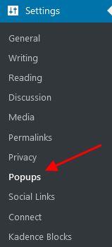
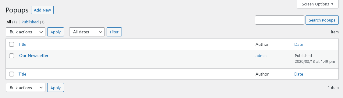
Example:
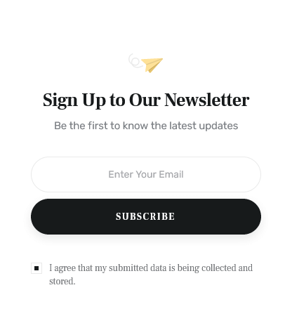
This popup notification is used on single posts in the "Post's additional content" section.
By default, the popups can be assigned to specific pages. To modify this, go to WP Dashboard > Settings > Popups > Display Rules, update the list of pages where the popups should appear, and save your changes.
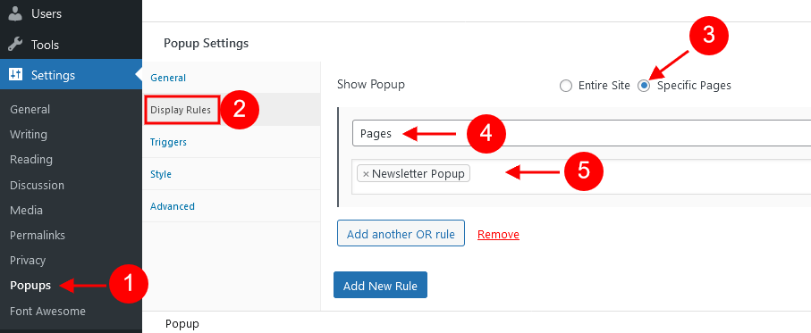
AI Engine
This plugin allows you to create a chatbot like ChatGPT (or any other), generate content and images, let you organize everything in templates, quickly suggest titles and excerpts, track your OpenAI usage stats, and much more! It can also significantly help you with translation, correction, SEO, suggestion, WooCommerce product fields, etc.
Currently, the AI Engine plugin supports ChatGPT, GPT-3, GPT-4, and GPT-4 32k models.
Please view the links below for more information about the AI Engine plugin:
- Official plugin page;
- Official WordPress plugin page;
- Official plugin documentation;
- Our video review;
Contact Form 7
Contact Form 7 can manage multiple contact forms, plus you can customize the form and the mail contents flexibly with simple markup. The form supports Ajax-powered submitting, CAPTCHA, Akismet spam filtering, and so on.
Check this link for more information. More guides are available here (video tutorial) and here.
The theme comes with pre-built contact forms that can be customized in Contact (WP Dashboard) > Contact Forms. Below, you can find an example of one of them.
[contact-form-7 id="42316ea" title="Contact form 1"]
PLEASE NOTE! According to General Data Protection Regulation, you need to make your forms compliant. Some pre-built forms, that come with this theme, already have the corresponding "I agree..." checkboxes.
For newly created forms you should add the consent checkboxes in ONE of the following ways:
- Use
[acceptance acceptance-...]or[checkbox* privacy...]tag, like in the example below:![The [checkbox* privacy...] tag in a contact form, back-end view](https://doc.themerex.net/chronicle/images/cf7_acceptance.png)
- Use any external GDPR plugin, like The GDPR Framework or Cookie Information (may not be provided with the theme).
CookieYes | GDPR Cookie Consent
This is a WordPress GDPR compliance plugin that will assist you in making your website GDPR (RGPD, DSVGO) compliant. It adds a customizable cookie banner to your WordPress website to the header or footer. The plugin also allows you to display the list of cookies on your cookie policy page using a shortcode.
Please view the links below to find out more information regarding plugin functionality:

The back-end settings can be found in the WP Dashboard > CookieYes menu.
Elementor Page Builder
To make your customization even easier we have added the Elementor Page Builder to this theme. Before you start, please check these Elementor-related tutorials. They will give you a basic understanding of how to build a page properly.
- Official plugin page;
- Official Elementor Tips page;
- Getting started with Elementor;
- Official documentation for Elementor page builder;
- Official Elementor video tutorials;
- Elementor Flexbox Containers - our video tutorial;
- How to Create a One-Page Website with WordPress & Elementor. And How to Convert a Multipage Site. - our video tutorial;
Kadence Blocks (free version)
This Gutenberg addon expands the functionality of the Gutenberg page builder. This plugin provides you with a suite of professional page-building content blocks (with row and column layouts) and customization tools like responsive margins/paddings for content sections, backgrounds, overlays with gradients, vertical alignment, and much more. Please click here for more information about the plugin. The official documentation can be found here.
Custom Blocks:
- Row Layout
- Advanced Gallery
- Form
- Advanced Heading
- Advanced Button
- Tabs
- Accordion
- Testimonials
- Icon
- Spacer/Divider
- Info Box
- Icon List
Please follow this link to view the official tutorial.
Limit Modified Date
This plugin allows you to update single posts without changing the modified date. This can be useful for minor changes in the content. You can find the "Don't update the modified date" checkbox in the "Status & Visibility" section of your post. In our theme, this functionality works for posts only!
Limit Modified Date plugin is compatible with Gutenberg and the classic editor. Please click here for more information about this plugin.
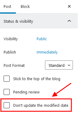
MailChimp
MailChimp is a newsletter service that allows you to send out email campaigns to a list of email subscribers. MailChimp is free for lists of up to 2000 subscribers, which is why it is the newsletter service of choice for thousands of businesses.
This plugin acts as a bridge between your WordPress site and your MailChimp account, connecting the two together.
Check this link for more information.
More guides are available here.
Example:
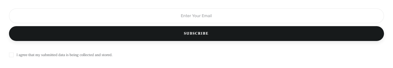
[mc4wp_form id="13347" element_id="style-1"]
Please find the back-end settings under the WP Dashboard menu > MC4WP > MailChimp tab.
We have used different styles of the same subscription form in our demo. The element ID (like: element_id="style-1") stands for the styles that are available, ranging from 1 to 6.
Style 1
[mc4wp_form id="13347" element_id="style-1"]
Style 2

[mc4wp_form id="13347" element_id="style-2"]
Style 3
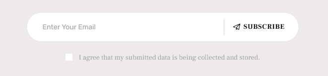
[mc4wp_form id="13347" element_id="style-3"]
Style 4

[mc4wp_form id="13347" element_id="style-4"]
Style 5
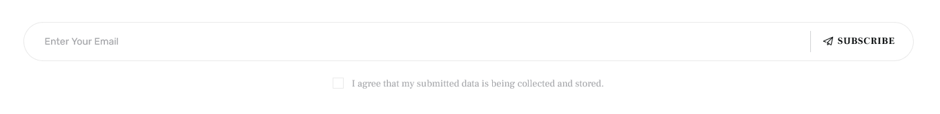
[mc4wp_form id="13347" element_id="style-5"]
Style 6
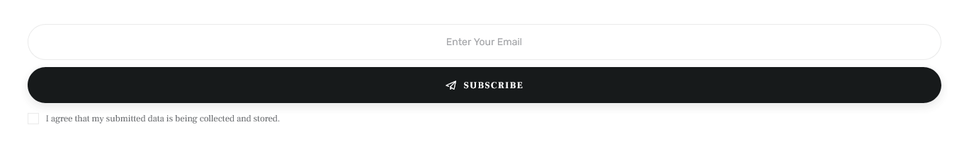
[mc4wp_form id="13347" element_id="style-6"]
Powerkit
This plugin adds social integrations to your website: Facebook, Twitter, Instagram, and Pinterest integrations; share buttons, and social links. The components have a modular structure and can be easily enabled, or disabled in the Powerkit (WP Dashboard) section. We have used the "Social Links" module in the theme. Check this link for more information.
We have used the "Social Links", "Twitter Integration", and "Author Box" modules in the theme. You can enable/disable the modules in the Powerkit (WP Dashboard) section.
In order to manage the social links and connect to your social networks accounts, navigate to Settings (WP Dashboard) > Social Links.

[powerkit_social_links labels="false" titles="false" counts="true" template="default" scheme="default"]
If you want to add social icons not supported by Powerkit plugin, replace the Powerkit shortcode with Elementor "Custom Socials & Share" or "Socials & Share" widgets and expand the list of available icons by adding new ones from the fontello website.
To use the Twitter widget ("Twitter Integration" module), please connect to your Twitter account in Settings (WP Dashboard) > Connect > Twitter.
The "Author Box" module adds an "Author" widget to the Elementor widgets panel and to Appearance (WP Dashboard) > Widgets. The module displays available users from Users (WP Dashboard). The images and the names of the team members on our demo are for example only! You will get the placeholders and default names, like "User 1", "User 2", etc. in the theme package.
ThemeREX Updater
This is our self-made plugin that allows you to update the main theme as well as the bundled plugins through the WordPress admin panel. Once any plugins or theme updates are available for download, you will receive a corresponding notice in WP Dashboard > Updates.
The process of updating a theme
-
Optional! If you have activated your theme copy (entered a purchase code in the Theme Panel (WP Dashboard) > Theme Dashboard > General tab) you can omit this step.
Otherwise, navigate to Appearance > ThemeREX Updater and enter your purchase code to get the latest versions of bundled plugins and theme updates through the WordPress admin panel.
To get the code, please navigate to your ThemeForest "Downloads" page and click on the theme download link. Check this guide for more details.
Please note, this section requires a purchase code ONLY!
- We recommend that you check the "Create backups" option (Appearance > ThemeREX Updater tab) to allow the system to create backups for plugins versions and the theme automatically.
-
Proceed to WP Dashboard > Updates and check if any updates are available.
The system automatically checks for updates, but you can also click the "Check Again" link to manually search for updates to your installed themes and plugins, not just the WordPress version.
- Choose the options for an update (plugin, theme, etc.) and click on the Update button.
Restoting backups
If you have checked the "Create backups" option before the update (Appearance > ThemeREX Updater tab), you can restore the backups created by the system in WP Dashboard > Updates or in Appearance > ThemeREX Updater.
WooCommerce
WooCommerce is an industry leader e-commerce plugin for WordPress. Our theme is fully compatible with this great tool, allowing you to turn your website into a sales machine in just a few clicks. You simply need to install this plugin and allow it to create a set of pages to display categories, products, etc. Then you need to add a set of products.
We highly encourage you to read the great documentation files WooCommerce offers. These manuals help to create effective and reliable online stores providing more features than you can imagine. Here is a list of really useful links to help you create and polish your shop.
- Documentation - official plugin documentation;
- Free and Premium extensions - powerful toolbox bringing more features to your shop;
- iOS app for WooCommerce - this application gives you full control over your shop;
WooCommerce Advanced Product Labels (free version)
WooCommerce Advanced Product Labels plugin allows you to promote your products by adding labels with some specific information to single products. The labels are customizable, including the font size, size, position, background color, etc. You can also assign advanced conditions for the product labels that are attached to particular products. The plugin offers 3 types of templates: CSS, Image and Advanced.
Please check the links below for more information about this plugin:
All demo labels can be managed in the WP Dashboard > BeRocket > Advanced Labels tab:
Theme Translation
We recommend using Poedit software for translation-related purposes.
To translate the theme into your language, please follow these steps:
-
Download and install Poedit software.
-
Navigate to the
chronicle/skins/default/languages/folder and locate the.potfile. Copy it to your desktop for editing.
-
Double-click on the
.potfile. In the Poedit window click on the "Create New Translation" button, choose the necessary language of the translation from the dropdown list, and click "OK."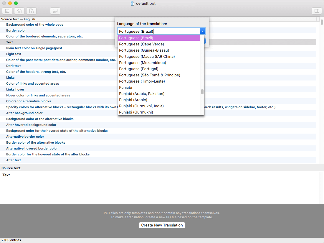
-
Now select the constant text string you need to translate from the "Source text - English" field and type in the necessary translation into the "Translation" field.
You can translate as much as you want, just go through the file and click on each string in "Poedit" and add your translation.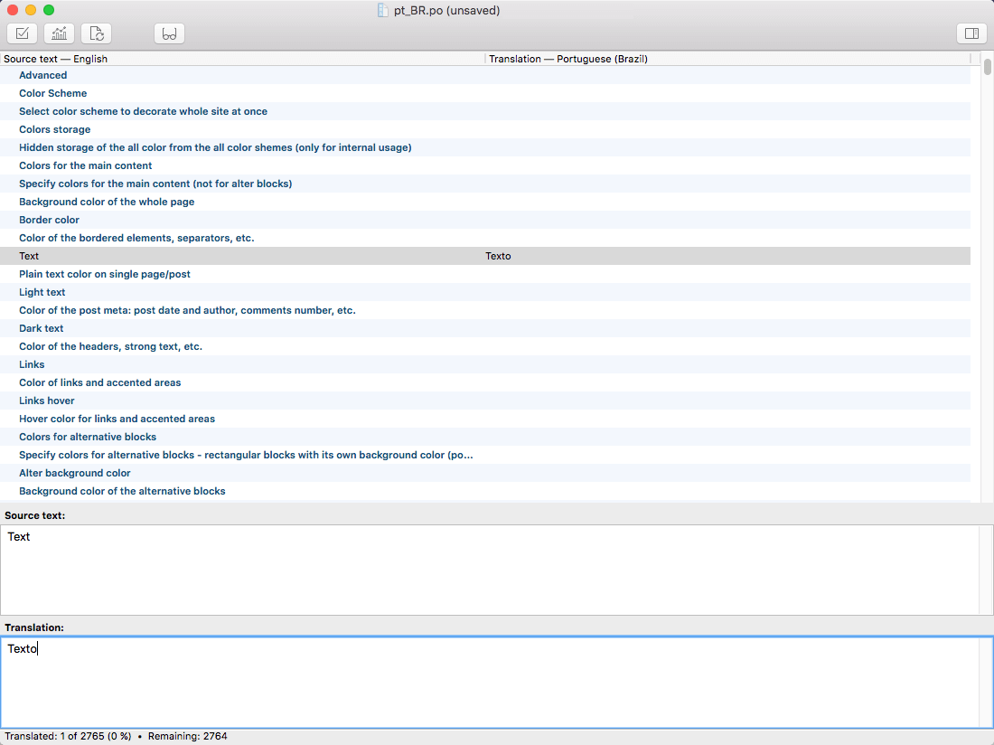
-
Next, you have to save the changes to your
.pofile using the naming convention based on the language code (e.g.ptfor Portuguese) followed by the country code (for instance_BRfor Brazil). To do that click on the "sheet" icon (you can also use hotkeysCMD+Shift+Sin OS X or Win+S in Windows) and type in the name according to the screenshot below.
The first lower-case letters define the language, whereas the second upper-case letter defines the country. In most cases, the language and country are the same, likede_DEfor Germany.
However, there is a difference between languages like English or Portuguese, which are spoken in several countries natively. In this case, the difference is in the first and second letter pairs; for the UK, the code would been_GB, whereas theen_USstands for the USA. If you are not familiar with the codes for your native language and country, then visit the GNU website. See Language Codes and Country Codes for the lists of codes.
PLEASE NOTE! If you use the wrong naming convention WordPress can not process your translation.
-
When saving your
.pofile, Poedit automatically creates a new.mofile, with the same naming convention. According to the example above, the file would be called pt_BR.mo.
-
Upload the
.poand.mofiles you just created to the.../languagesfolder. Make sure these files are in the same directory as thedefault.potone. -
Our theme is using the ThemeREX Addons plugin, so some translation should be done in language files of this plugin in the
.../wp-content/plugins/trx_addons/languagesdirectory. There is also atrx_addons.potfile in this directory.
Generate the.poand.mofiles according to your language. See the file names in the example below:
trx_addons-pt_BR.po,trx_addons-pt_BR.mo.
Make sure that the language of your files is the same as in your WordPress admin panel > Settings > General Settings section.
For more information on how to use Poedit, please check the following resources:
Sources and Credits
In this section, you can find additional information regarding fonts, clipart, .XD files used in this theme.
-
Fonts:
-
Default Skin:
"'Rubik', 'sans-serif'";
"'Frank Ruhl Libre', 'serif'"; -
You can also check the
chronicle/skins/default/skin-setup.phpfile for more detailed information on this matter. -
Please note! To manage fonts quantity available for upload edit
'max_load_fonts' => 5variable in thetheme-specific/theme.setup.phpfile.
-
Default Skin:
- Icons:
- Fontello icons set. You can expand the list of available icons by adding new ones from the Fontello website. To add new icons proceed to
wp-content/themes/chronicle/skins/default/css/font-icons/config.json. Watch this video guide for more information.
Please note that the location of theconfig.jsonfile and website page builder with the available set of widgets/shortcodes in your theme may vary from the video provided! - Powerkit plugin with Facebook, Twitter, Instagram and Pinterest integractions.
- https://www.flaticon.com
-
You can specify the type of icons (font icons/images/SVG) you want to use in the
theme-specific/theme.setup.phpfile.
- Fontello icons set. You can expand the list of available icons by adding new ones from the Fontello website. To add new icons proceed to
-
Clipart:
-
Images were taken from:
https://unsplash.com/
https://www.pexels.com/ - IMPORTANT! By getting this WordPress Theme you get all the images FOR FREE. Moreover, you can use them on ANY OF YOUR PROJECTS!
-
Images were taken from:
-
XD Files:
IMPORTANT! Please note that we do not include theme related.XD filesinto the theme package, because it might significantly increase the size of a downloadable archive. In case you need these files you can always request them by contacting our support department as well.
Page Speed Optimization
This chapter is for those who would like to speed up their websites and care about the page loading speed. There are a lot of different ways to make your website work faster, but we will focus on caching plugins we have used in our demos, though they are not provided with the theme.
A lot of users access the website at the same time. This makes the server work slowly and takes more time to load the web page for each user. Caching is the way to store the current version of your web page on the server and prevent sending requests to the server for each user each time.
PLEASE NOTE! There is no unique recommended configuration of the plugin’s settings, suitable for every website. The same settings can work differently on different websites. By default, some settings may be activated or disabled, depending on your individual WordPress setup and hosting. Please treat the screenshots with the main plugins settings as examples only! Feel free to play around with the plugins settings yourself to receive a better result.
Below, you can find a short description of the caching plugins we have used in our demo.
WP-Optimize - Clean, Compress, Cache (not provided with the theme)
WP-Optimize is all-in-one WordPress performance plugin, that is responsible for cleaning your database, compressing images and caching your website.
Please check the links below for more information about this plugin:
Once the plugin is active, the WP-Optimize section will appear in your WordPress Dashboard.
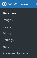
Database
Images
Cache
Settings
Compatible Plugins
PLEASE NOTE! The plugins described in this chapter are not included with the theme package. To use them with this theme, you will need to purchase a separate subscription or enter an existing site key/purchase key to activate the plugins.
WPML
Our theme is compatible with the WPML plugin, which includes a core plugin and several optional add-ons. WPML makes it easy to create and manage a multilingual website using a single WordPress installation. You can choose from over 65 languages and start translating your content immediately.
The WPML Multilingual CMS plugin is the core component. It provides essential translation controls and enables you to translate your website’s content. Click here for more information on how to translate your website using WPML.
Attention! To make your multilingual site work properly, we recommend:
- Installing add-on plugins alongside WPML Multilingual CMS;
- Advanced theme file configuration (for developers)
Thewpml-config.xmlfile is provided with the theme.
Recommended WPML Add-on Plugins
- WPML String Translation (core component) - lets you to translate interface strings directly within WordPress, without the need for .mo files. It supports both static and user-generated texts outside of posts and pages (e.g., taglines, widget titles, and SEO metadata).
- WPML Media Translation - allows you to display language-specific images on your site, helping you tailor visual content to match the cultural and linguistic context of your audience. Additional components can be installed optionally to support the plugins used in the theme:
- WooCommerce Multilingual & Multicurrency - enables multilingual and multi-currency support for your WooCommerce store, making it easy to localize your shop for a global audience.
- You can view the full list of available WPML add-on plugins here — availability may vary based on your account type.
Advanced Theme File Configuration (for Developers)
IMPORTANT! All static text strings used in the theme are already included in its translation files. You only need to handle dynamic strings — these are texts entered by users, such as shortcode parameters, widget content, or text fields in the theme options.
To ensure that WPML recognizes and translates these dynamic strings, you'll need to register them. This can be done in two ways (we are using both):
-
Mark Theme Options as Translatable in PHP
Edit the following file:/wp-content/themes/chronicle/skins/default/skin-options.php. For each text option you want to make translatable, add the parameter'translate' => true,. This ensures that the option is stored separately for each language, allowing full control over translations per skin (if your theme supports multiple skins).
Here’s how the copyright string is marked as translatable in the theme file.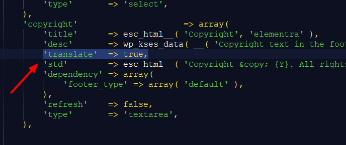
-
Register Translatable Options in
wpml-config.xml
Alternatively, use thewpml-config.xmlfile that comes with the theme to define which theme options should be available for translation.
This file should include:- Not only text strings, but also structural elements such as header, footer, sidebar, and widget selections — so you can assign different header/footer/sidebar layouts per language.
- All translatable options from all supported skins (if the theme supports several skins).
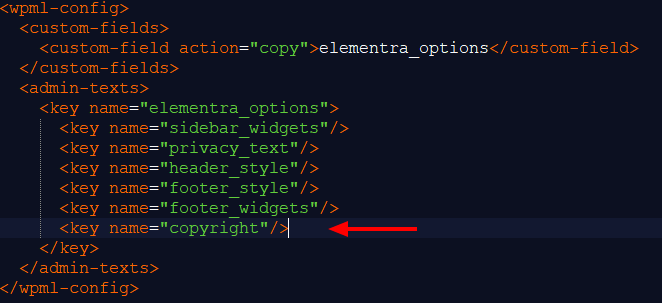 You can refer to the official WPML documentation for more details.
How to Set Up WPML Plugin with Your WordPress Theme
- Install and activate WPML plugin:
- Log in to your WordPress Dashboard.
- Go to Plugins > Add Plugin. Click "Upload Plugin".
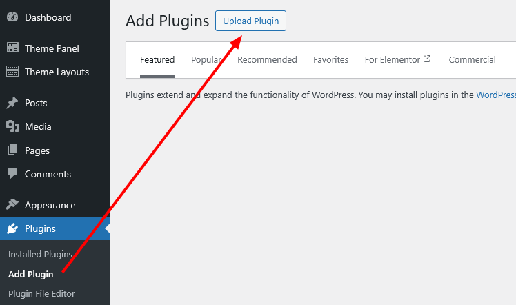
- Then upload the WPML
.zipfile (you'll receive it after purchasing from wpml.org, just log into your account and go to the "Downloads" section to get the archive). - Click "Install Now", then activate the plugin.
- Install and activate required WPML add-on plugins in the same way as it was described above. You can get these plugins from the Commercial tab in your WordPress admin (Plugins > Add Plugin > Commercial) if you have registered WPML, or from WPML’s Downloads page. Please click here for more information.
-
Follow the WPML Setup Wizard to configure the plugin. If you accidentally dismissed the wizard notice, you can reopen it by navigating to WordPress Dashboard > WPML > Setup.
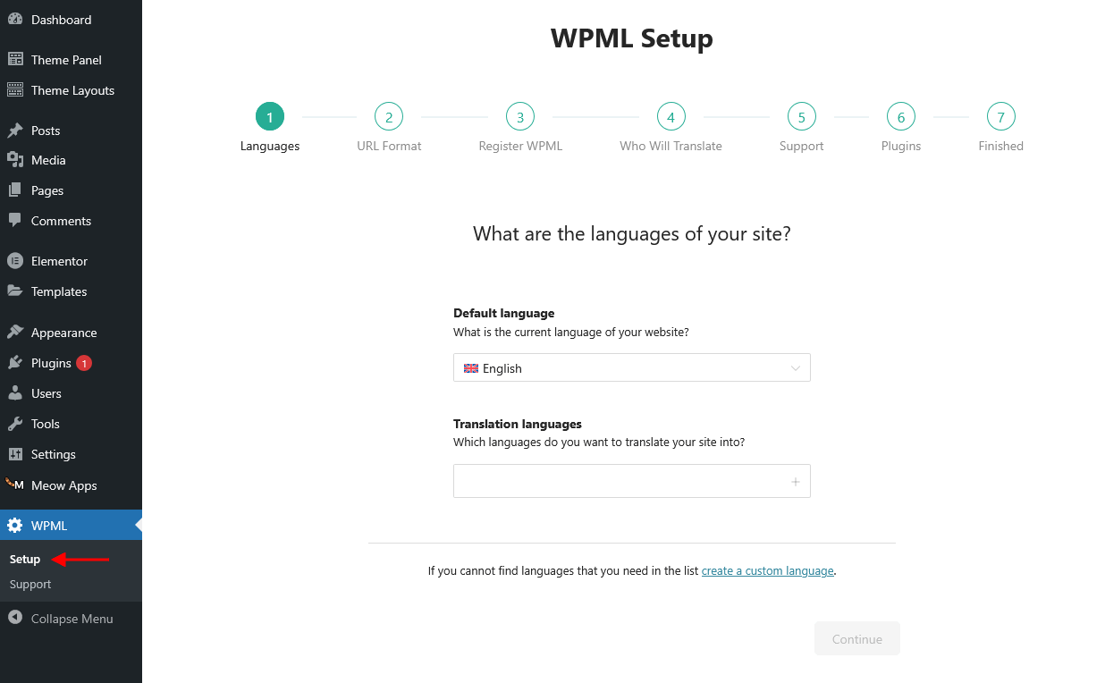 Helpful Official Articles for Each Setup Step:
- Languages - If your language isn't listed in WPML’s default language options, you can manually add a custom or country-specific language. Learn how to add a custom language.
- URL Format - WPML supports different URL structures for multilingual content. Read more about the available URL format options.
- Who Will Translate - WPML allows you to assign translation responsibilities to different users. See this guide on WPML user roles and permissions.
- Plugins - During setup, WPML will recommend and let you install the appropriate components included in your purchase plan based on the plugins your theme uses.
- Translate theme content - proceed to WPML > Translation Management > Translation Dashboard:
- Choose content for translation: pages, posts, templates, and any other content on your website.
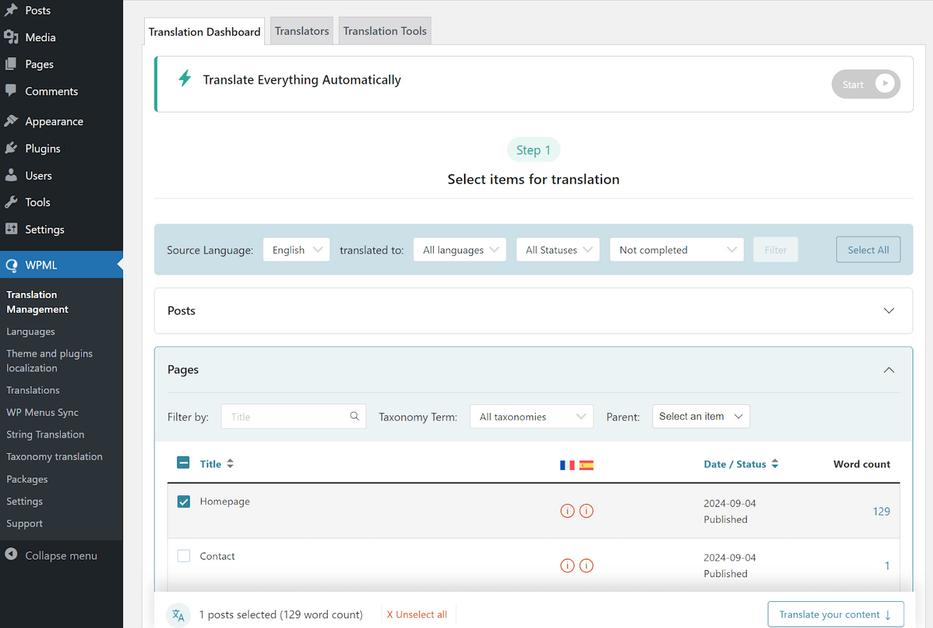
- Select a translation method: translate by yourself, with your translators, automatic translation, or professional translation services and proceed with translating.
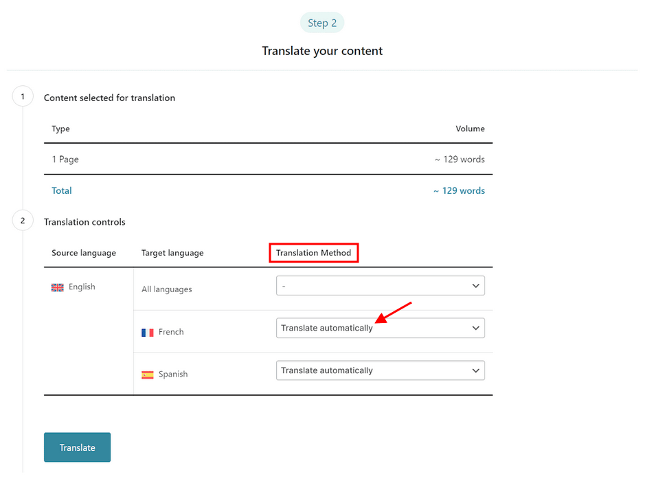
- Choose content for translation: pages, posts, templates, and any other content on your website.
- Translating Strings - not all text on your site may translate automatically - some pieces, known as "strings", need to be handled separately. To translate them, simply expand the Other texts (Strings) section in Translation Management, select the ones you need, and send them for translation.
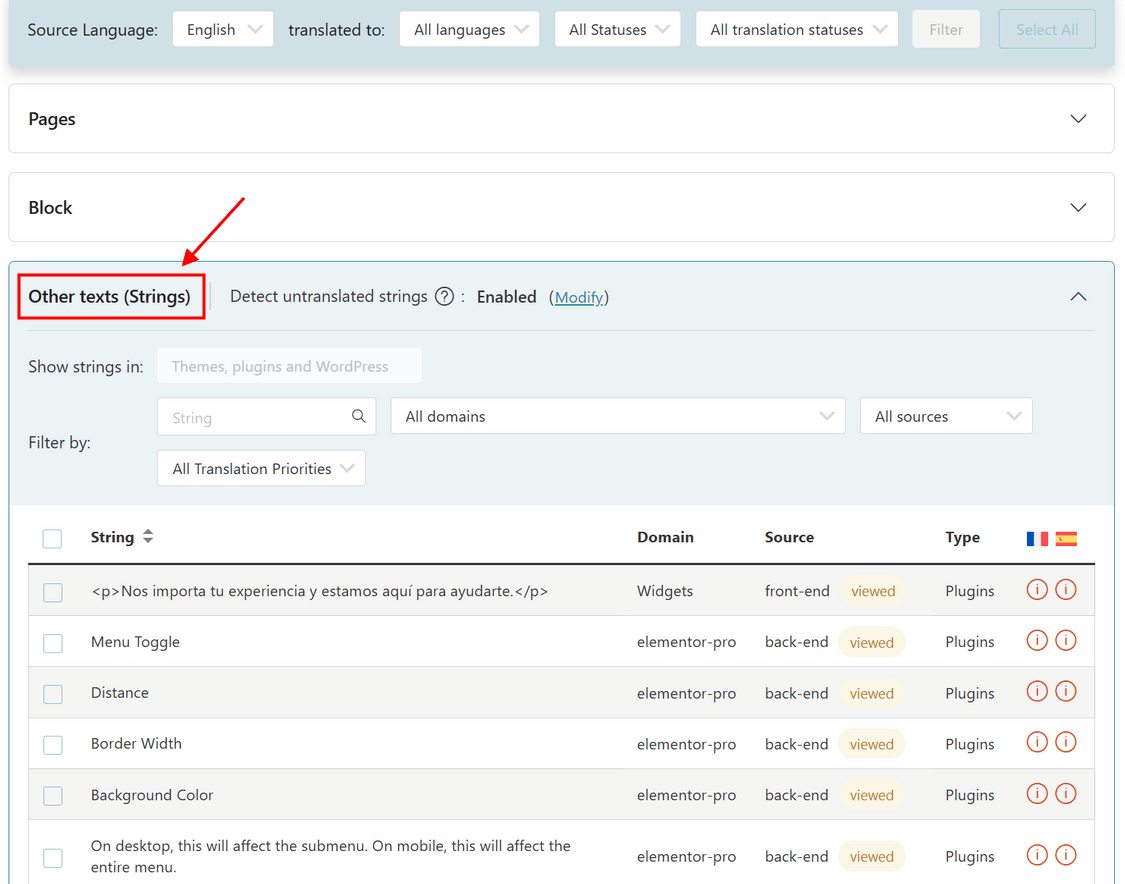 WPML automatically detects untranslated strings as you browse your site. If something’s missing, visit the relevant page, switch languages, and wait briefly — untranslated strings will appear under Other texts (Strings).
If they still don't show up, use the WPML String Translation plugin to add translations manually. - Reviewing Translations - this step is optional but recommended for key content, such as your homepage. To review translations, navigate to WPML > Translations.
- Translating Your WooCommerce Store (Optional Step) - you can translate store content with the free WPML add-on, WooCommerce Multilingual & Multicurrency. Just like other content, products and shop pages can be translated via WPML > Translation Management, with additional settings available to fully localize the shopping experience.
Alternatively, you can follow their setup wizard.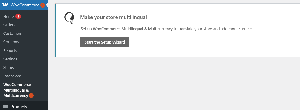
Explore these helpful official resources below:
Website Customization
Custom Websites are usually the most important part of an online marketing campaign. A properly built custom website can help you get the most results from your marketing efforts. Our team can do it for you.
Please, find some of our offers below:

Theme installation
Get the theme installed on your website with all the dummy content.
BUY THIS OPTION
Ready-To-Use Website
The theme setup including data and images replacement for 6 pages.
BUY THIS OPTION
Must have plugins
Installation and configuration of the plugins for SEO, security, and cache.
BUY THIS OPTIONYou can check the full list of offers here.
Thank you for purchasing our theme. We are happy that you are one of our customers.
If you come up with any theme-related questions that are beyond the scope of this help file, feel free to contact us. We will respond as soon as possible (within 24 – 48 hours, usually faster). We are open from 10 am to 7 pm (CET), from Monday to Friday.